User-Centered Design: How Sandstorm Helped Rush Health Put Users First to Transform the Digital Experience
In recent years, the role of technology in healthcare has grown significantly, with the consumerization of healthcare and patient access to health data and information at their fingertips. And with the increased demand for digital services, healthcare organizations need to keep up with the ever-evolving technological landscape to provide better services to their users. One crucial aspect of this is having an accessible, intuitive website that meets the needs of its users. Through our work with Rush Health, a clinically integrated network of more than 1,900 professional providers in 136 practices and four hospitals in Chicago, we helped transform their website's user experience.
The Challenge
Rush Health’s website was more than 10 years old, and it was becoming increasingly difficult for users to find critical resources and transition from public to gated content. The organization realized it needed to improve its website to provide a better user experience to a wide range of users - members, providers, practice, and hospital staff. They embarked on a UX research phase to uncover key usability issues and develop solutions to improve their website's overall user experience and engagement opportunities.
The Approach
The website redesign project began with in-depth UX research and UX test plan and included:
- 1:1 interviews with Rush Health stakeholders to help identify and gain alignment on business goals and objectives for the redesign.
- 1:1 in-depth interviews with physicians and members of the practice staff to understand their needs and preferences.
- Analytics analysis and content audit to get an inventory of the current state content.
- Virtual card sort, prompting users to drag and drop their preferred location of key features and content for the new site.
- Moderated tree test, where users were randomly presented with A/B versions of the new navigational model and asked to complete the same set of tasks, which helped determine which navigation was more successful.
- Usability study with users on clickable prototypes in advance of development.
The UX testing showed that users preferred navigation items grouped by type of content rather than overall purpose. Based on this feedback, the website's navigation schema was then updated to better meet users' needs. And the updated site map made it easier for users to find critical resources and transition from public to gated content, which was a key goal.
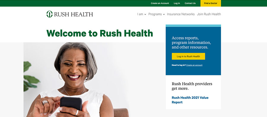
Sandstorm then developed creative UI design concepts using the "Yes, And..." approach, in addition to designing key page layouts on mobile and desktop. Sandstorm delivered UI patterns and worked closely with Rush Health's in-house development team for implementation and launch. The new design and navigation schema were aimed at making the website more visually appealing, modern, and intuitive.
The Results
After the launch of the new website, there were significant improvements, including:
- Pageviews increased by 13%
- Number of pages per session increased by 5%
- Average session duration increased by 38%
- The bounce rate, which measures the percentage of visitors who leave the website after viewing only one page, decreased by 11%
Overall, Rush Health’s commitment to improving its website's user experience, coupled with Sandstorm's UX expertise, resulted in a more visually appealing, modern, and user-oriented website. The increased page views, number of pages per session, and session duration all indicate that users are engaging more with the website's content. The lower bounce rate is also an encouraging sign that the website's users are finding the information they need more easily, making it more likely they will return in the future.
Rush Health's commitment to improving its website's user experience using an insights-driven model is an approach that other healthcare organizations can follow. We’d love to talk through your UX challenges and see where can help!