How Prioritizing Accessibility and Usability Helped Deliver an Inclusive Web Experience
Virtually every organization today has made improving website usability and accessibility a priority for their users. Often this can feel overwhelming based on the long list of priorities within the organization. But what if you could utilize UX research and testing to address both simultaneously, while also tapping into a more diverse audience?
Recently our UX team had the honor to present at axe-con, the pre-eminent conference dedicated to education on how to build, test, monitor, and maintain digital accessibility.
At the event, we shared key insights and challenges of our client, one of the largest global Cloud Service Providers, who was seeking to improve the usability and accessibility of its training and certification content. The team understood there were issues with web accessibility, users were reporting trouble with navigation and overall findability, and they needed help on where to start.
Usability challenges our research plan needed to answer:
- Can users easily find and access what they need in an intuitive way?
- What are the low-hanging fruit accessibility areas that we can address right away?
- What are the usability standards the client can “own” and implement across its training and certification digital experience?
- And in turn, how can we turn the dial on increased consumers of content?
What were our limiting factors?
- There were multiple sites with very different user experiences (separate marketing site, learning management site, etc.)
- Complicated information architecture, including a confusing primary and secondary navigation that couldn’t be changed easily (secondary navigation was sticky and need to stay consistent with the global brand).
- Our teams were restricted in access to the administration of the site, so we needed to focus on elements that could be easily controlled.
Sandstorm crafted an approach centered on UX research and usability testing to understand the real friction that users were encountering in using the sites, while also addressing both accessibility and usability issues. The research and analysis resulted in actionable recommendations that the team could implement and continue to apply over the long term.
Our Solution
Sandstorm focused on a 3 Step Approach:
- Automated accessibility audit, which provided a baseline, caught “low-hanging fruit”, and issues in code, in addition to conducting a manual review to identify accessibility areas that were not captured in the automated audit.
- Usability studies with 2 different user groups on the existing website, including users with disabilities to ensure we had a diverse audience. From the findings, we delivered an actionable report the team could implement.
- Deliver accessibility training for content administrators, so the organization could improve upon the existing content and apply accessibility standards to ensure WCAG 2.1 AA compliance.
Most importantly, our goal was to prioritize accessibility at every step - not just during the “accessibility-focused" areas of our work.
Step 1:
Automated accessibility scans were run using the Pa11y NodeJS tool. Tests were run using aXe as the test runner, and according to the WCAG 2.1 AA standard.
Sandstorm conducted an automated accessibility scan across the site. What we found was many of the top hits overlapped with the usability issues that were uncovered in Step 2 below. The issues also helped to further confirm issues uncovered during the qualitative research (usability studies and 1:1 interviews).
Most commonly, we identified issues with the proper use of image alt text, form element labels, color contrast, use of link text, unique IDs for labels, proper implementation of H1 tags, unique landmarks, etc.
The report identified the top areas that the client could address, along with prioritization and level of severity, so the team knew where to focus efforts first.
Step 2:
For the Usability Studies, Sandstorm and the client saw an opportunity for a '2 for 1', where we could develop a “smart” usability study participant screener, that identified users that met the criteria of the cloud provider’s user groups, while also capturing key demographic data on disability and use of assistive technologies.
Core information collected:
- Age
- Gender identity
- Racial or ethnic identity
- Disability/ability
- Assistive technology/adaptive strategy use
- Pronouns + Name
Based on the detailed screener we used, the breakdown of our participants included:
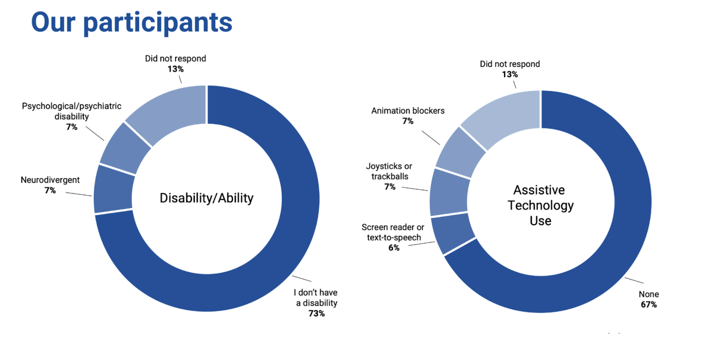
As you can see, we were able to capture a good percentage of diverse and accessible-needs participants, which also helped the client satisfy its own DEI and equity metrics. The cloud provider was initially concerned with experiencing drop-offs in the screening process because of the use of a more robust screener, or that we would be forsaking a higher quality of participants.
But by prioritizing the most important screener questions and working collaboratively with our client, we were able to get them to understand the value of a diverse participant set and what that would bring to the table.
More = more .
Step 3:
Now that we had a much deeper understanding of the accessibility and usability issues of the current experience, our team was able to deliver hands’ on accessibility training for content administrators. This allowed the organization to improve and refine the existing content according to WCAG 2.1 AA compliance standards, while also empowering them to continue to apply to the website and content governance process ongoing.
As a result, Sandstorm delivered customized accessibility training sessions, designed to deliver best practices for content language, text, headings and subheadings, link text, use of color, contrast, typeface, alt text/image, multimedia, navigation; and considerations for mobile vs desktop.
Key Learnings From Our 3-Step Approach
- The 3-pronged approach was successful!
- Combining automated and manual accessibility scans uncovered the most critical areas.
- Many accessibility issues were also usability issues uncovered in the usability studies, further confirming that accessibility + usability go hand in hand.
- It was easier than you would think to include people with disabilities in the research - even a small shift left is still a shift left.
- Providing hands' on accessibility training delivered the tools to the staff to continue its commitment to accessibility and usability.
Good UX is Accessible UX. Have you been looking to improve the usability and accessibility of your site, while reaching a more diverse audience?
We’d love to help! Contact us today to learn more!