How to Make Websites Accessible, Part 1: Audit, Usability, and Prioritization

According to the WHO, 15% of the world's population has some disability, however, 96% of websites were found to have accessibility issues. With tech becoming more ingrained in our lives, it's more important than ever for folks to have access to digital platforms and content. Recently, WCAG updated to version 2.2 (WCAG 2.2 AA+), which means there’s now an even wider range of recommendations for making web content more accessible.
Often the thought is, “If we can just improve our SiteImprove scores or if we install this third-party web accessibility tool, we’ll at least be moving the needle forward.” However, making websites and digital applications accessible requires attention, focus, and consistent effort. This process of improving your website’s accessibility over time can also help to make the process affordable, scalable, and doable amongst so many competing priorities. One way to gradually meet WCAG standards is to develop a process that can become a daily habit for your content admins and web developers, vs seeing it as a one-time optimization project.
Over two blog posts, we will focus on a repeatable process to continuously improve the accessibility and inclusiveness of your site. This first post will focus on starting your accessibility journey.
An Iterative Approach to Accessibility in Web Design
After many years of working with associations, global non-profits, and healthcare organizations, we have found that most organizations thrive with a gradual, ongoing approach to web accessibility that can lead to long-term success.
‘Everyday’ accessibility practices that can lead to long-term success include:
- Identify the optimizations that will give your website the ‘biggest bang for your buck’ – for instance, adding aria labels to form elements or updating website colors to make sure there’s sufficient color contrast
- Group remaining accessibility issues by priority level for future updates
- Incorporate ongoing content admin feedback and training; like providing videos and tutorials for reference, as well as monthly sessions to review work and discuss areas of improvement.
- Schedule ongoing accessibility scans regularly - this can be quarterly - and make additional updates as needed
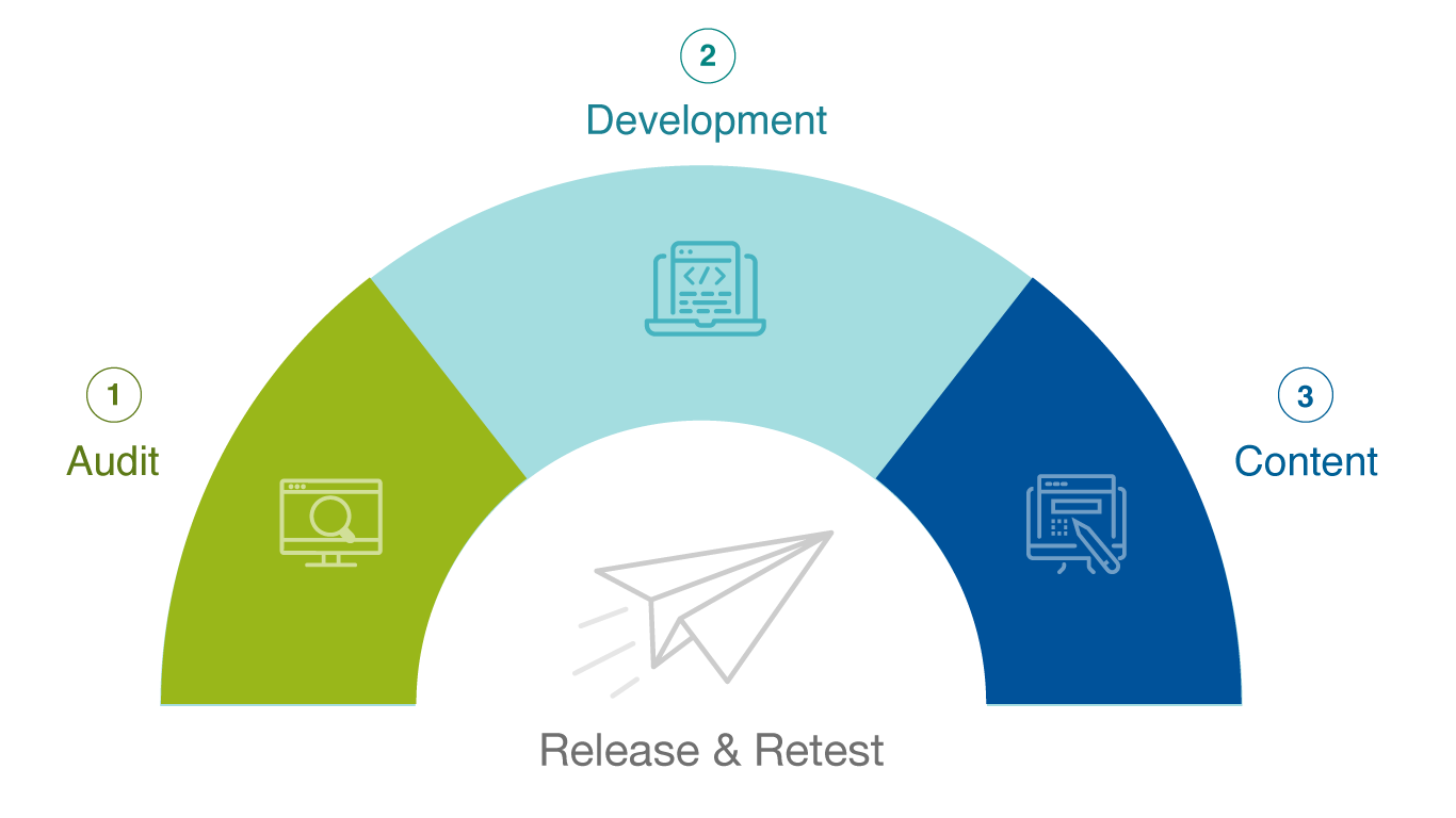
Key steps in the accessibility process include:
This iterative approach has helped many of our clients start and continue their accessibility journey. For example, The Society for Vascular Surgery (SVS), the leading professional medical association for vascular surgery, recently embraced this iterative process. It was important to establish an accessibility baseline via an audit, collaborate with the SVS and Sandstorm teams to prioritize improvements and work iteratively to roll-out updates and retest.
Finally, it’s important to note that there are actually 3 levels of WCAG accessibility standards: A, AA, and AAA. For each level, there are different success criteria. So, your organization may want to start by working toward A or AA compliance, then eventually aiming for AAA. In other words, you can start slow and build up over time.
Step 1: Audit, Usability & Prioritization
Begin with an automated accessibility audit of the website to uncover major issues. We use tools like the Pa11y NodeJS tool to evaluate and compare a website’s markup and WCAG 2.2 for compliance issues, however, there are other popular web accessibility checker tools available, such as:
One thing to keep in mind though, is that these automated tools can only capture so much. Automating your testing and accessibility checks lack a human perspective, which can lead to issues being overlooked. Working with accessibility consultants can help ensure that your website or digital application is meeting WCAG and ADA compliance standards. For example, our IAAP CPAAC-certified accessibility experts combine the automated findings with a manual review of your site to:
- Consolidate issues
- Remove false positives
- Identify potential solutions
- Define the level of effort to make updates
As part of the audit, a design assessment is also included, using a combination of keyboard testing, cross-browser/cross-device testing, and design review. We look at:
- Keyboard operability
- Cross-browser compatibility
- Color and contrast
- Perceivability of focus states
This is usually a good opportunity to also conduct usability testing, which helps to improve overall usability and assess the experience of the site for real users. Ideally, conducting 1-on-1, in-person, task-based usability tests on the current site with users whose disabilities and/or use of assistive technologies might impact their experience of the website.
What to Do With the Accessibility Audit Findings
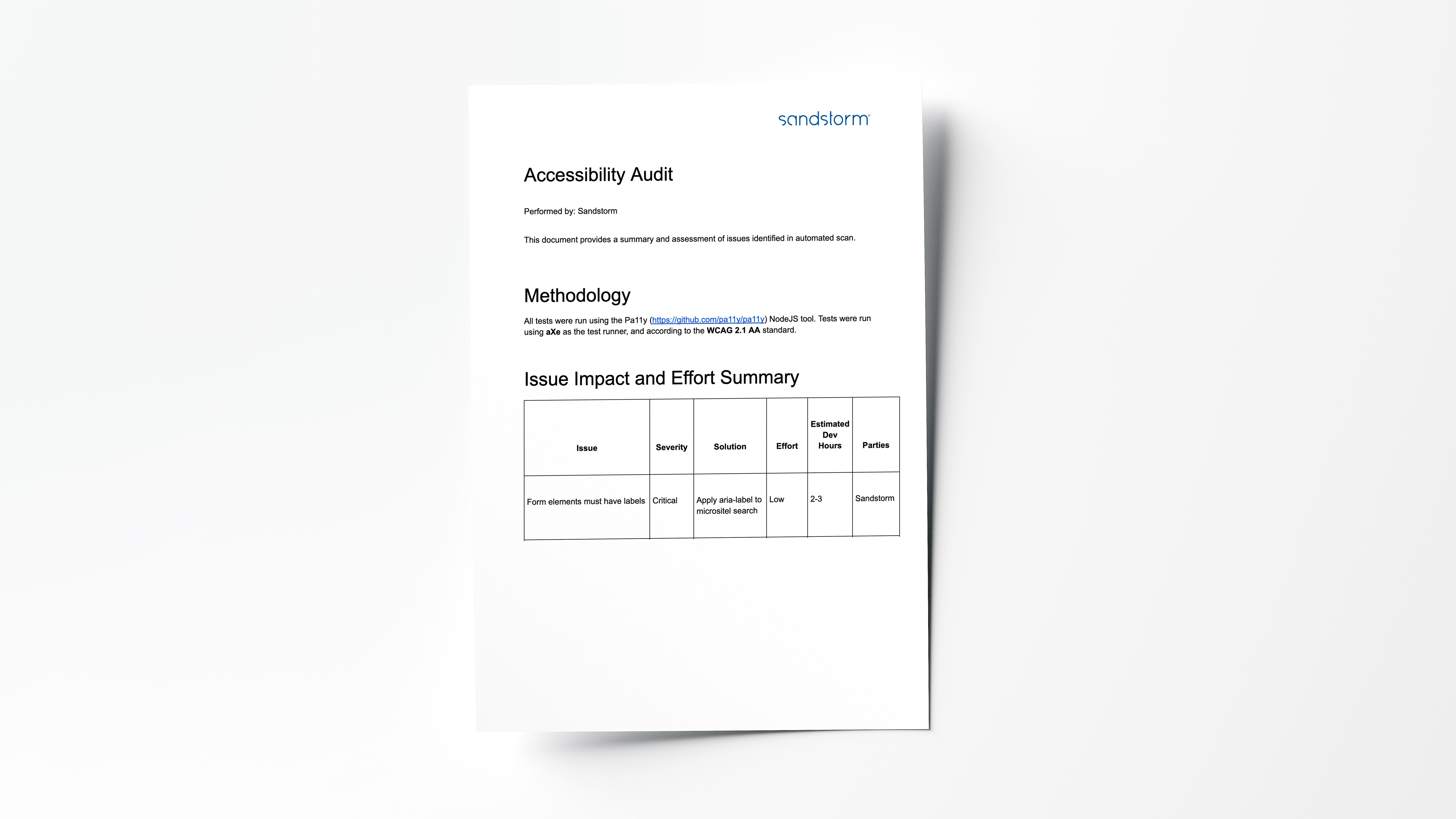
Once inputs are analyzed (automated audit, manual review, and usability findings), we share an actionable report that identifies:
- Issue impact and effort summary including issue summary, severity solution, relative effort
- Issue matrix organized by severity with explanations, page links, and assessments
- Usability findings and recommendations, including improvements to content organization, labeling, findability, and task completion.
This allows us to make decisions on prioritization: focusing on the biggest impact, lowest effort items that will quickly improve usability scores, or focusing on the biggest usability and accessibility areas of the site (areas that are causing the most friction and biggest accessibility violations).
For example, a common challenge for SVS and many healthcare organizations is ensuring design elements have sufficient color contrast. In SVS’s case, they were using buttons without a color background. Although the site had a variety of button options, the wrong button style was being used, resulting in inadequate color contrast between the button and the background color. This is an example of a big impact, low effort that will directly improve accessibility and usability.
Now that we have our full list of prioritized issues, we create a phased and iterative plan for remediation, which accounts for three streams of work:
- Development
- Design
- Content
For SVS, the audit uncovered 15+ issues that ranged from minor to critical.
Some of the identified issues included:
- Elements must have sufficient color contrast. Making sure elements have enough color contrast is always a concern and a very common finding in our audits. Many people know green is a challenging color to make accessible since it is the most common form of color blindness. You usually have to make it very dark to be legible. Blue is another color that is inherently hard to use, which we find most frequently in healthcare and medical associations. As we age, the lens on our eye becomes yellowish which makes the color blue harder to see or differentiate from other colors.
- Links must have discernible text. Links need to be clearly understood as links. The language should be descriptive so the users know where they will go when they click the link. Using vague language or subtle language links does not drive the user to click with confidence and is often overlooked.
- Ensure headings are in a logical order. Headings on the page need to be in a logical order so all users can read the content as intended. For example, if you have an H1, followed by an H3, then the next is an H2, the heading order is incorrect. This may cause a screen reader to read the content out-of-order resulting in a confusing experience.
- Alternative text of images should not be repeated as text. Alternative text should not be repeated as text in the content. Alt text is used to describe the photo or graphic for screen readers or it will display if the image does not load. Having the alt text repeated as text becomes redundant and confusing for your users.
What's Next?
Armed with a summary report, level of severity, and type of violation, can help tackle prioritization of accessibility fixes and build the remediation plan while also having a clear understanding of roles and assignments.
In part #2 of this two-part series, we’ll discuss the development approach to remediation and strategies for taking an iterative approach to rolling out continuous improvements.
If you’re interested in starting your journey through an accessibility audit or want to talk through ways to address your accessibility issues, let’s connect today!