
Interactive Program Tools and Streamlined Multi-Site Navigation for CASEL
We partnered with CASEL to redesign and rebuild its nonprofit digital ecosystem—centralizing resources into a scalable WordPress hub, introducing interactive program and school guides, and improving usability through research-driven design and testing.
The Collaborative for Academic, Social, and Emotional Learning (CASEL) is the nation’s leading nonprofit advancing social and emotional learning (SEL) research, policy, and practice in education.
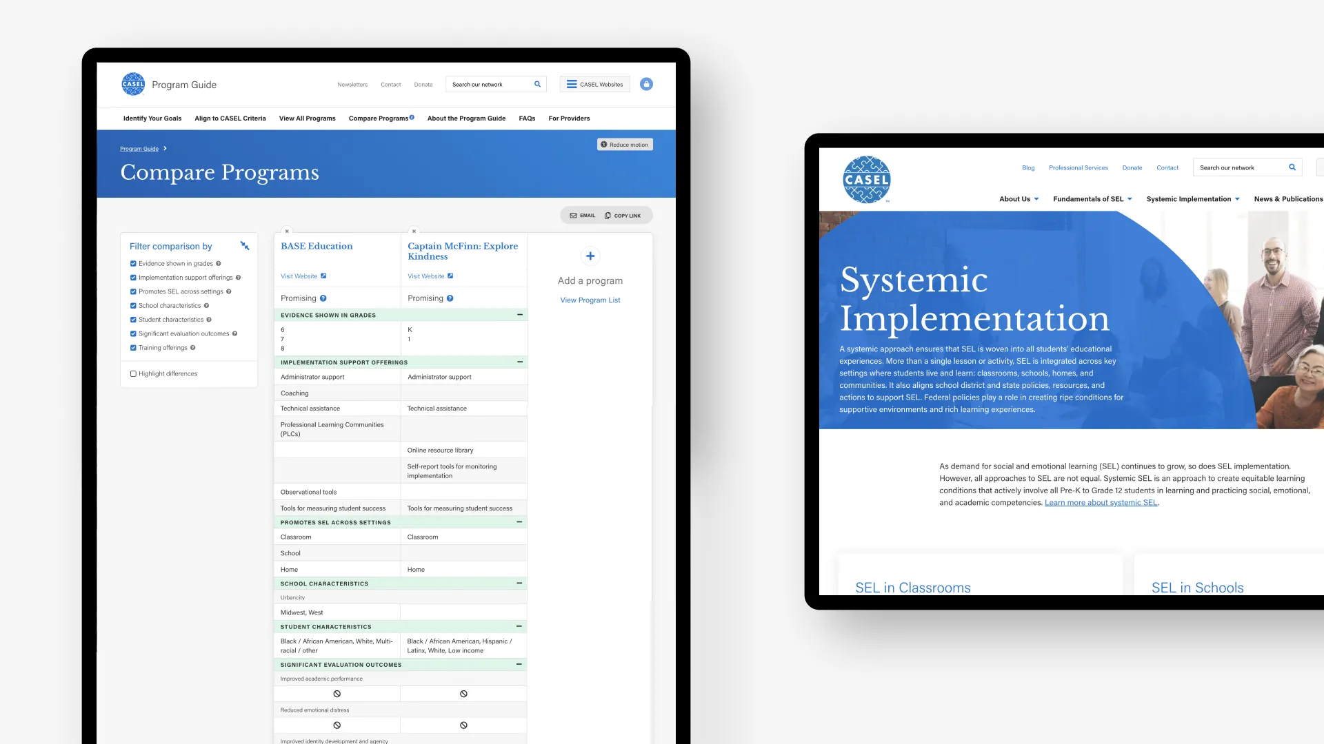
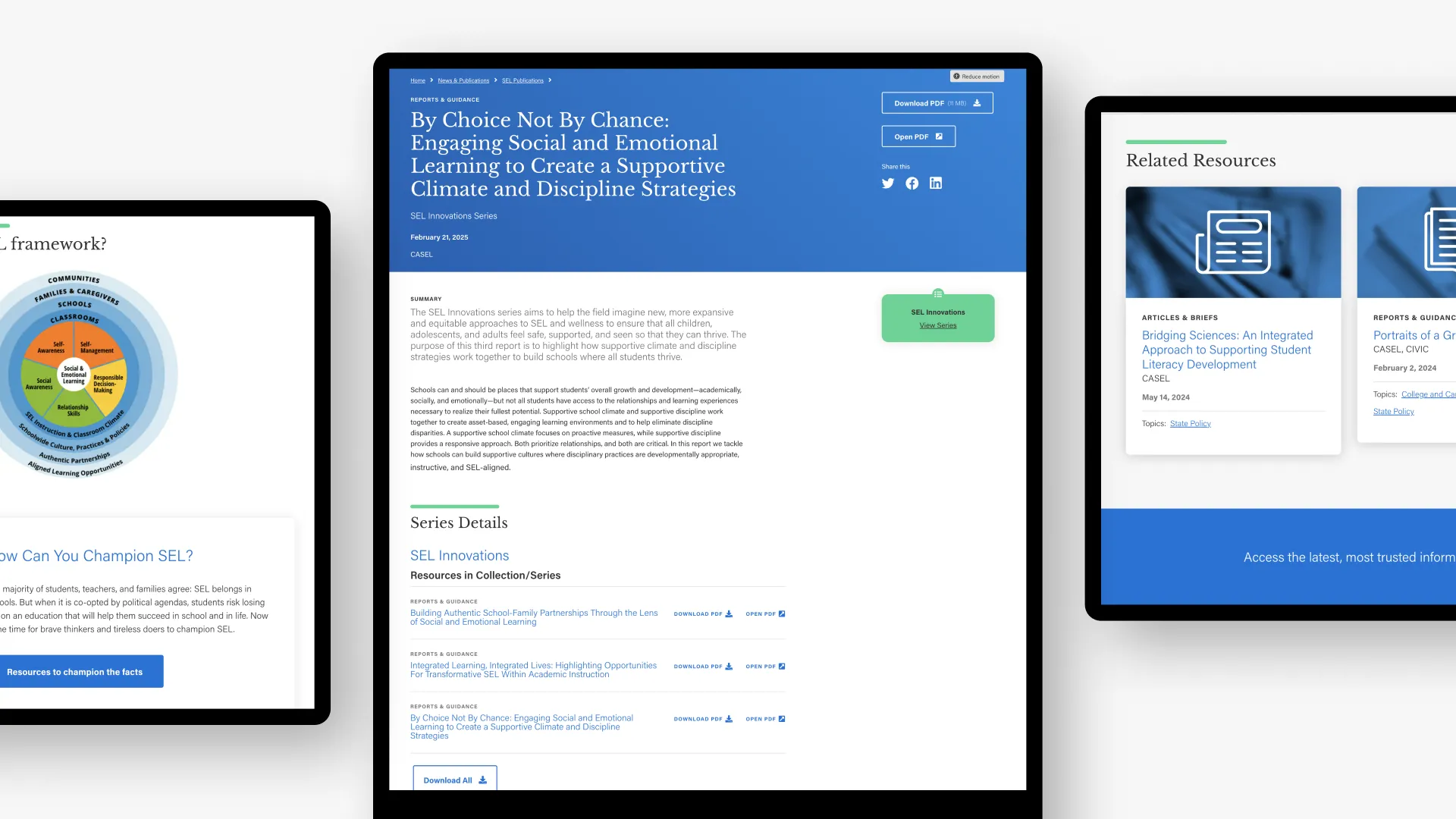
CASEL’s extensive SEL content was spread across multiple microsites, making it difficult for educators, policymakers, and school leaders to find and use critical resources. The flagship Program Guide existed as a static PDF, making program comparison and decision-making cumbersome.
- Consolidate multiple microsites into a centralized, scalable WordPress platform.
- Improve navigation with a universal header and multi-site menu.
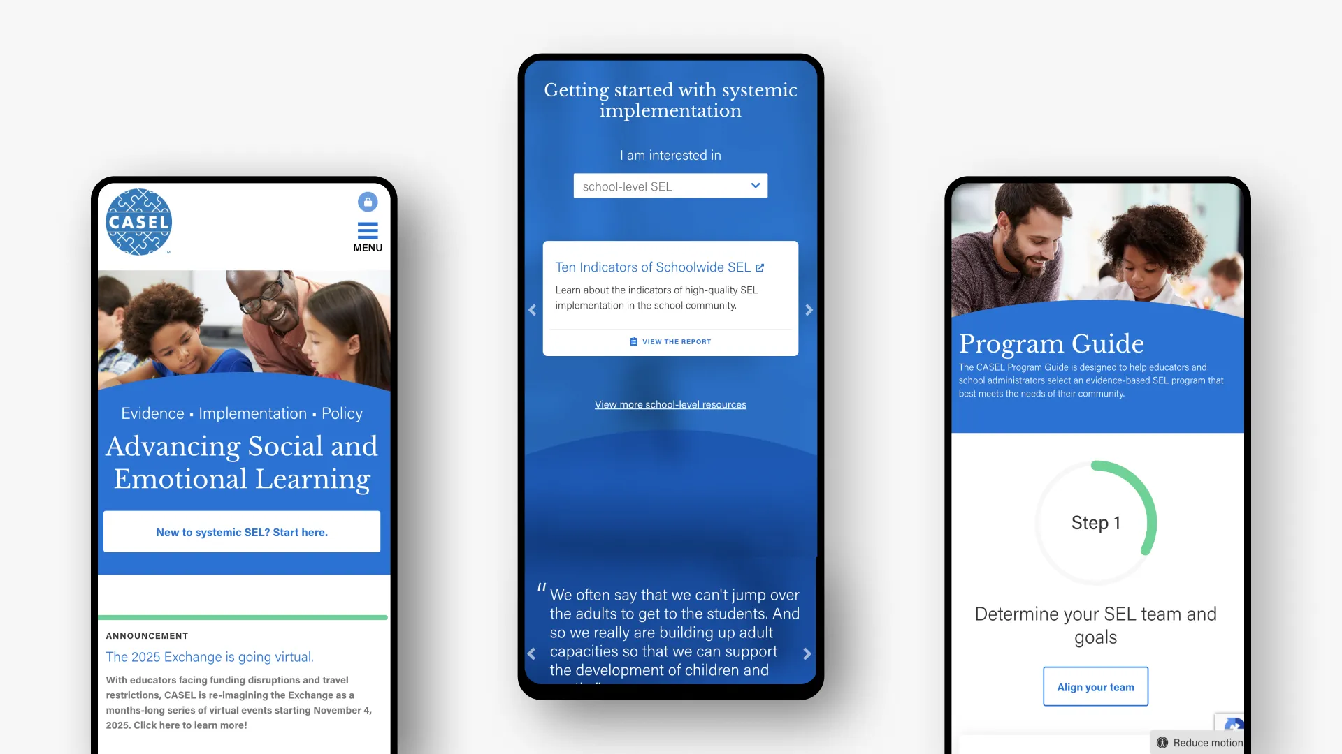
- Create self-service tools like program and school guides to reduce friction in accessing resources.
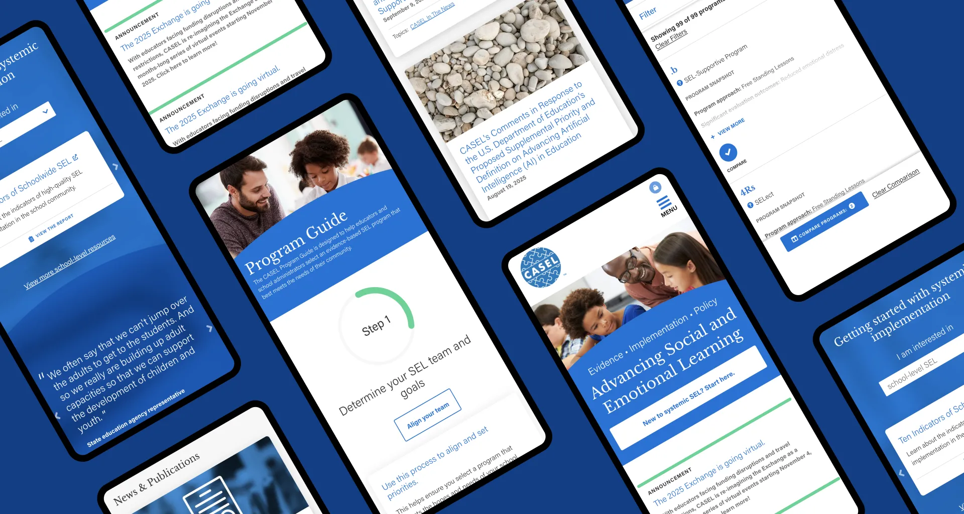
- Ensure accessibility, responsive design, and a cohesive brand experience.
- Conducted UX research, usability testing, and tree testing to inform site map, navigation, and functionality.
- Designed a clean, cohesive UI with a focus on accessibility and consistency across sites.
- Developed interactive tools, including a Program Compare feature and a School Guide Quick Start process.
- Migrated and optimized content for SEO, ensuring educators could find resources quickly.
- Built an integrated WordPress website supporting multiple CASEL programs under one brand umbrella.
- Implemented an interactive Program Guide that lets users filter, sort, and compare SEL programs side-by-side.
- Created a School Guide quick start functionality, providing tailored recommendations based on user inputs.
- Established ongoing support, security updates, and analytics tracking to inform continuous improvements.


By transforming static PDFs into interactive tools and consolidating scattered resources under one brand hub, CASEL can now serve educators, policymakers, and school leaders with a streamlined, engaging, and accessible digital experience. The result is not just a better website, but a more effective way to support SEL adoption at scale.
CASEL’s redesigned websites position the organization as both a thought leader and a practical resource hub for the SEL community. With intuitive navigation, self-service program tools, and an accessible, responsive design, educators can now find and act on critical information faster—driving broader implementation of SEL in schools and districts.
