Imagine It's Your First Time: Giving Users a Great Experience Every Time
Imagine it is your first time. You are probably excited, anxious, hoping everything will go right and you don’t do anything too embarrassing.
Afterward, you may think “overall not bad,” but you should have tried a different technique, approach or way to make the experience better or maybe closer to what you expected.
Now, get your mind out of the gutter…
These same emotions and concerns can be said about the first time you visit a new web site. Users have high expectations and feel anxious, hoping they can find everything they need and will be able to perform all necessary tasks quickly and easily.
During the initial visit, users may try trusted approaches in using the site until they stumble upon or otherwise discover how to complete the task at hand. If the process takes longer than expected, users often berate themselves thinking they did something wrong or are not savvy enough to use the site. If they become frustrated enough, users lose their patience and leave.
I have seen this emotional rollercoaster first hand in usability studies. No matter how challenging the task, web site or overall experience was, the users usually blamed themselves for failing and expressed they “just need more time to learn how to use the site.”
In a recent blog post, Jakob Neilsen wrote, users invest a lot of time “learning” sites they often visit. That is, by spending time “mastering” the site, the user will be able to quickly and easily complete what they need to do each and every visit.
As UX experts, we strive to create user-centered web sites that are easy and intuitive the first time, no handbook required.
Knowing users are willing, and at times expect, to spend time learning a new site, adding teaching moments to key steps enables the first-time user to be guided, even taught how, to use the site immediately.
Here are some areas of your site’s experience that might need some first-time love:
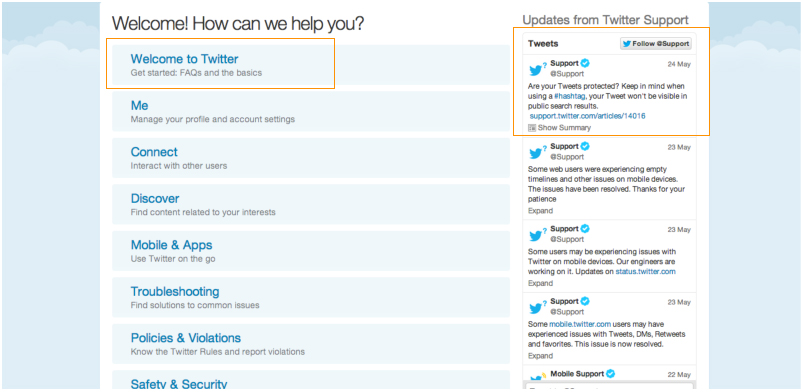
Key Tasks: You don't need an instruction manual.
- Break long, key tasks into stepped processes for quicker completion
- Integrate a robust help and search functionality

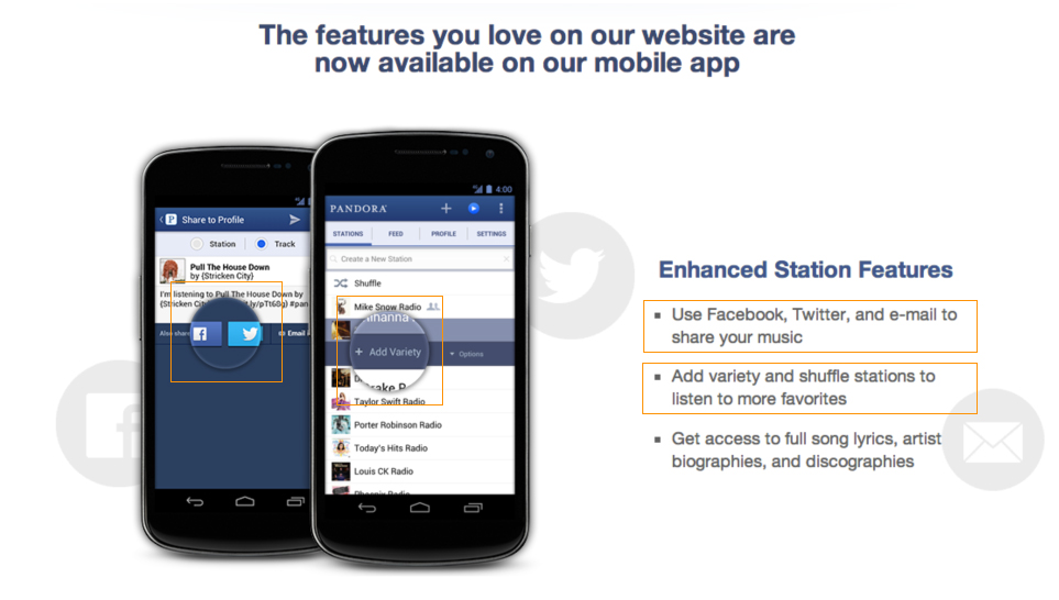
New Elements: It's strange at first, talk them through it.
- Tutorial-style pop ups for new features
- Microsites and/or videos to explain larger new features (FB on open graph)

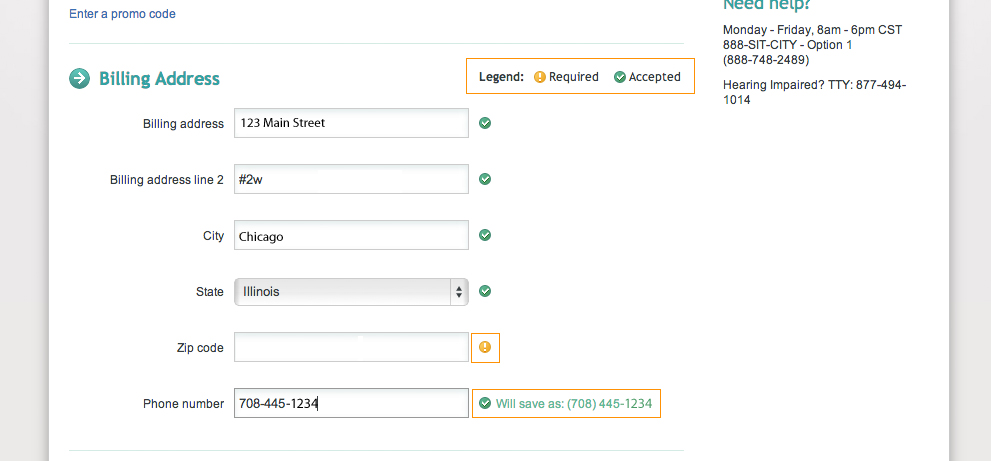
Forms: Keep it simple and don't be afraid to give suggestions.
- Indicate required fields clearly
- Include inline tips and suggestions
- Provide formatting prompts for dates, phone numbers and zip codes

By using these tactics along with other UX techniques, users will not have to learn the web site, instead they will be free to use it. Each and every web site encounter will be exciting, engaging, intuitive, informative… and, perhaps, earth-moving.


