
Hamburgers Menus: A Matter of Taste
[This is Sandstorm's 2015 April Fool's Day post. Enjoy!]
Anyone involved in mobile usability or mobile user interface design is familiar with the hamburger menu icon.
But where did this icon come from? Why is it called a "hamburger"? Today we uncover it's interesting origins and how you can change how you use it on your sites to be more user friendly.
Hamburgers and Navigation are Linked Historically
The connection between hamburgers and navigation has a long history. Hamburg the city from which the sandwich derives its name, was once known as one of the busiest port cities in all of Europe. Located on the Elbe, it has easy access to the North Sea and ultimately the Atlantic Ocean. As a hub for shipping commerce for centuries, Hamburg became well known for the production of accurate maps, compasses, and astrolabes.
Thus, the best way to get from one port to the next was, in effect, to use “Hamburger Navigation.” In fact, it is believed that the beloved sandwich came to the U.S. as the Hamburg steak served to passengers on the Hamburg-America Line steamships.
Its "Iconic" Origin
The history of the hamburger menu icon is quite unclear. While conducting our research, we encountered the earliest depiction of three parallel lines being clicked. Below you will be this example from Egyptian hieroglyphics. We are unsure whether actually touching these would have triggered a secret passage or simply were used as a guide for readers, i.e. “you are going in the right direction.”
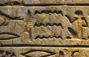
At the time of hieroglyphics, hamburgers didn’t exist (nor did Hamburg the city). How did these Egyptian and German roots “stack up” to be the icon we know today?
One hypothesis is that while most Egyptian tombs were being excavated in the early 20th century, the popularity of the hamburger as a sandwich was rising. The more likely hypothesis is that that three horizontal parallel lines looks like a hamburger, albeit a minimalist one. (Taken literally, it looks much more like a grilled cheese or a filet-o-fish.) Or so we thought.
Finding the hamburger menu online
We did some Internet excavation of our own using the Wayback Machine. We reviewed a number of websites related to fast food burger joints. Here we encountered a revelation, the first McDonald’s website and what did we find? A hamburger menu.
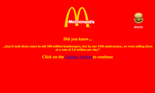
While this icon directed users to the restaurant menu to order food, it’s clear that this is the first, and most literal use of this now beloved means of getting from page to page on a website. This visual cue being paired with with the historical aspect of “Hamburger Navigation,” is quite possibly the result of a happy accident.
Even today, Five Guys Burgers and Fries uses a hamburger icon for all iterations of their responsive websites.
How can we make these icons more appealing to users?
You may also be aware of some of the research related to the position of the hamburger menu and whether or not including a label with the word ‘menu’ above or below the icon increases users understanding of the icon (it does).
While we’ve adopted the practice of including labels with icons to improve user understanding and reduce the cognitive load, we’ve been experimenting with a variety of designs for the hamburger menu icon. In particular we wanted to answer the question, can a more realistic hamburger icon affect the site’s user experience? If so, what factors contribute to a better experience? Below are some of the icons we tested along with their results.
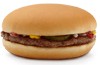
Hamburger
Result: Users experienced minimal usability issues but felt the overall site experience was missing something.
Recommendation: Consider toppings to improve visual appeal. Remember, users navigate with their eyes!
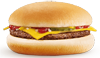
Cheeseburger
Result: Very few usability issues uncovered. 85% of users tested found this to be the most satisfying version.
Recommendation: Your go-to icon for most audiences. Consider adding a fried egg and bacon to enhance the experience.
Double Cheeseburger
Result: Users anticipated a longer menu due to the additional layers. Some users felt tired after navigating.
Recommendation: A/B test to determine the appetite for site pages from your users.
Triple Cheeseburger
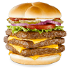
Result: Inconclusive, very few users were able to complete all tasks in the study. Caused confusion among international audiences.
Recommendation: Less is more. May be useful when you need to increase the size of your user base.
Hot Dog
Result: Tested well with children.
Recommendation: Avoid the use of ketchup.
Chicken Sandwich
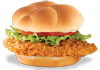
Result: Great usability but the experience came across as dry.
Recommendation: Consider toast as possibility instead of a kaiser roll or spice it up with some hot sauce!
Veggie Burger
Result: No usability issues uncovered but users were generally dissatisfied with the experience.
Recommendation: Not suitable for the main menu. Save this for the side navigation on the desktop version.
Conclusion
The more delicious the user perceives the hamburger to be, the better the user experience. Get to know your users, preferences vary depending on the use case.
Sources:
If you haven’t realized yet, this post is a complete joke. Happy April Fool’s. Here’s the real history of the hamburger icon.


.jpg)