They’re Bringing Serifs Back (in Web Design)
For awhile there, in the land of web design, it seemed that sans serif fonts were taking over. Arial, Verdana, Geneva, and even san-serif itself. Google got in on the action too, ditching its long time faith in serif fonts for its new logo a few years back.

Serif fonts have come back into vogue. Errol Morris, filmmaker and author, ran an experiment in the New York Times in 2012. Readers thought they were merely reading an essay and deciding whether or not they agreed with a statement about security. This was, supposedly, to tell whether they were optimists or pessimists, however Morris was actually testing something else. He was testing fonts. He chose several serif and sans-serif fonts to see if readers showed a favoritism toward any type of font. Which font was more convincing? Baskerville, a serif font, won hands down.
I’m guessing one study from 4 years ago isn’t enough to get you back on the serif train. Well, just this year, another serif font Times New Roman, was voted “most trusted typeface” by UK company, solopress, following a survey of 1,000 people (Comic Sans came in second place, so no survey is perfect).
That’s not all, though. The US National Library of Medicine, the Centers for Disease Control, as well as others in the crossroads between government and medicine recommend a serif font: “Serif fonts are usually easier to read than sans-serif fonts. This is because the serif makes the individual letters more distinctive and easier for our brains to recognize quickly” (PDF).
A few google searches will show you that serif fonts have a reputation for readability, but also for conveying nostalgia and authority.
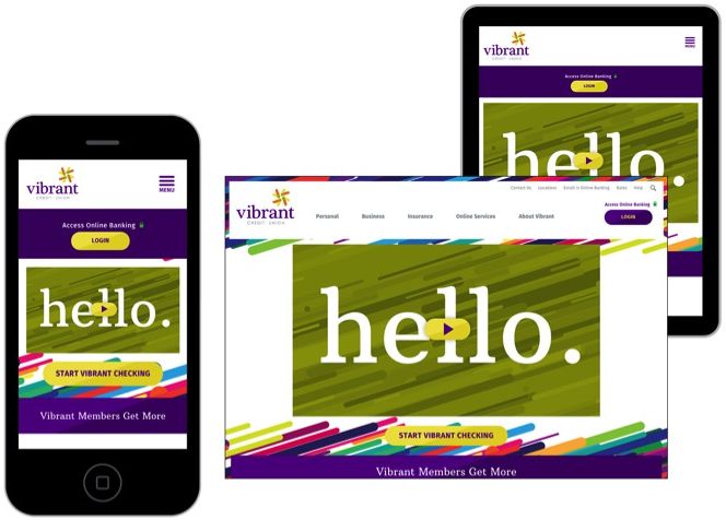
One of our recent clients, Vibrant (Formerly DHCU) came to us with a rebrand. For this client, we needed a way to merge the fun and friendly atmosphere of their business, while not undermining the trust and reliability you’d expect from a financial institution. Our solution was a mix of exciting and engaging color for their brand married with a serif font for their logo to keep their brand grounded in the financial world.
If your website could use a new look, or you're looking to build trust and confidence with your brand, Sandstorm can help.
Now get your serif on (go ‘head, be gone with it).