
5 Usability Lessons To Drive Your Innovation
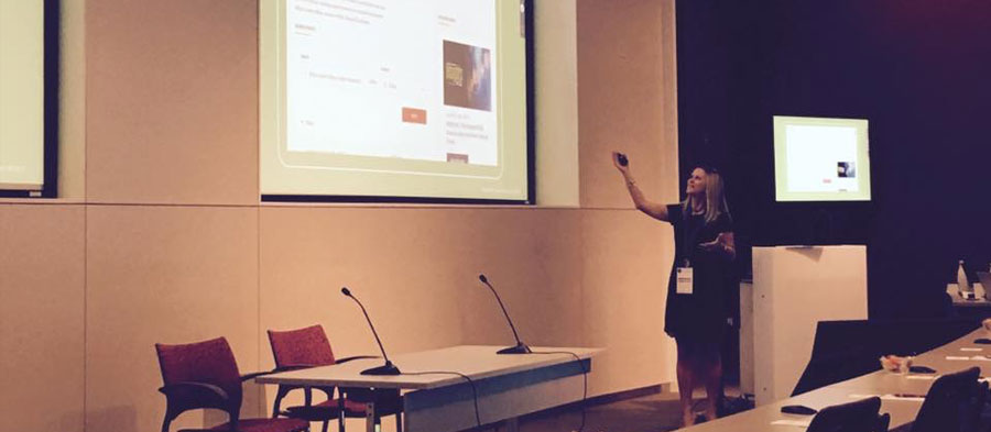
Recently I had the honor of speaking at .orgCommunity’s Solutions Day 2017. Usability testing is a big part of how Sandstorm eliminates subjectivity from the creative process, so I wanted to show attendees how usability testing can help drive significantly improved user experiences.
With as few as 5–6 users, usability testing can identify 80% of user issues on a website or mobile app. Our Sandstormers have learned many lessons while performing more than 3,000 usability studies. These are just a few of the findings that can help you.
1. Members want to see real images of their peers.
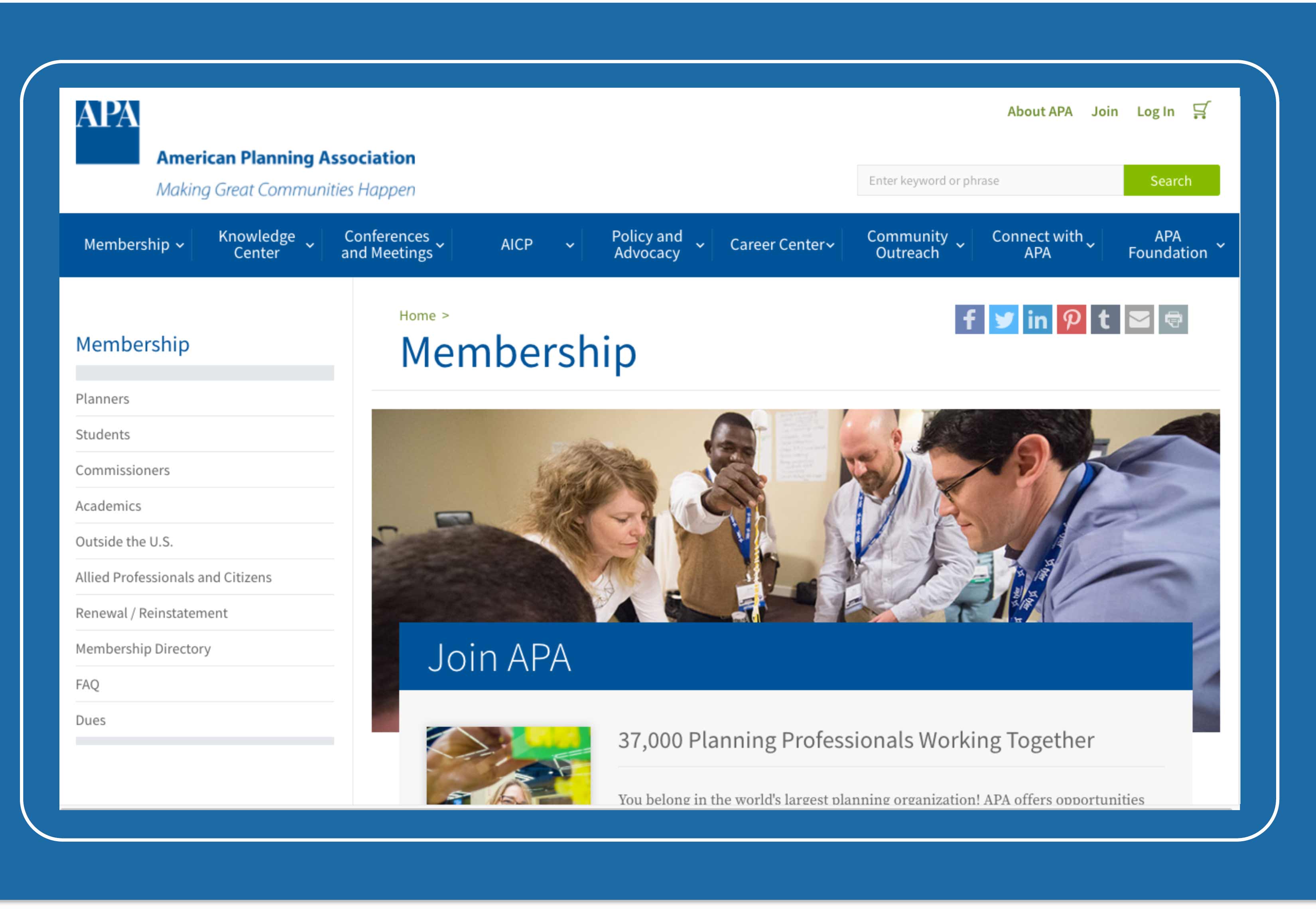
We performed usability testing for the American Planning Association as part of a redesign of their website. During testing, we learned that their members found the stock photography used on their existing site inauthentic and unengaging.
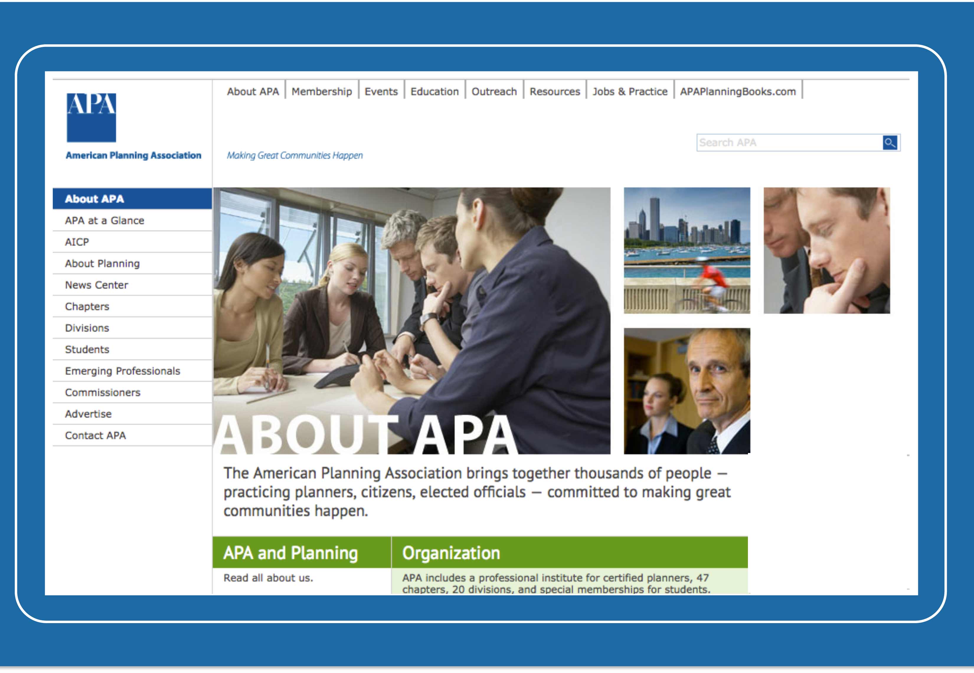
This simple finding led us to use professional photos of real APA members that improved engagement on key pages, including the homepage, Events page, and About Us page.
2. Don’t put too many events on the homepage.
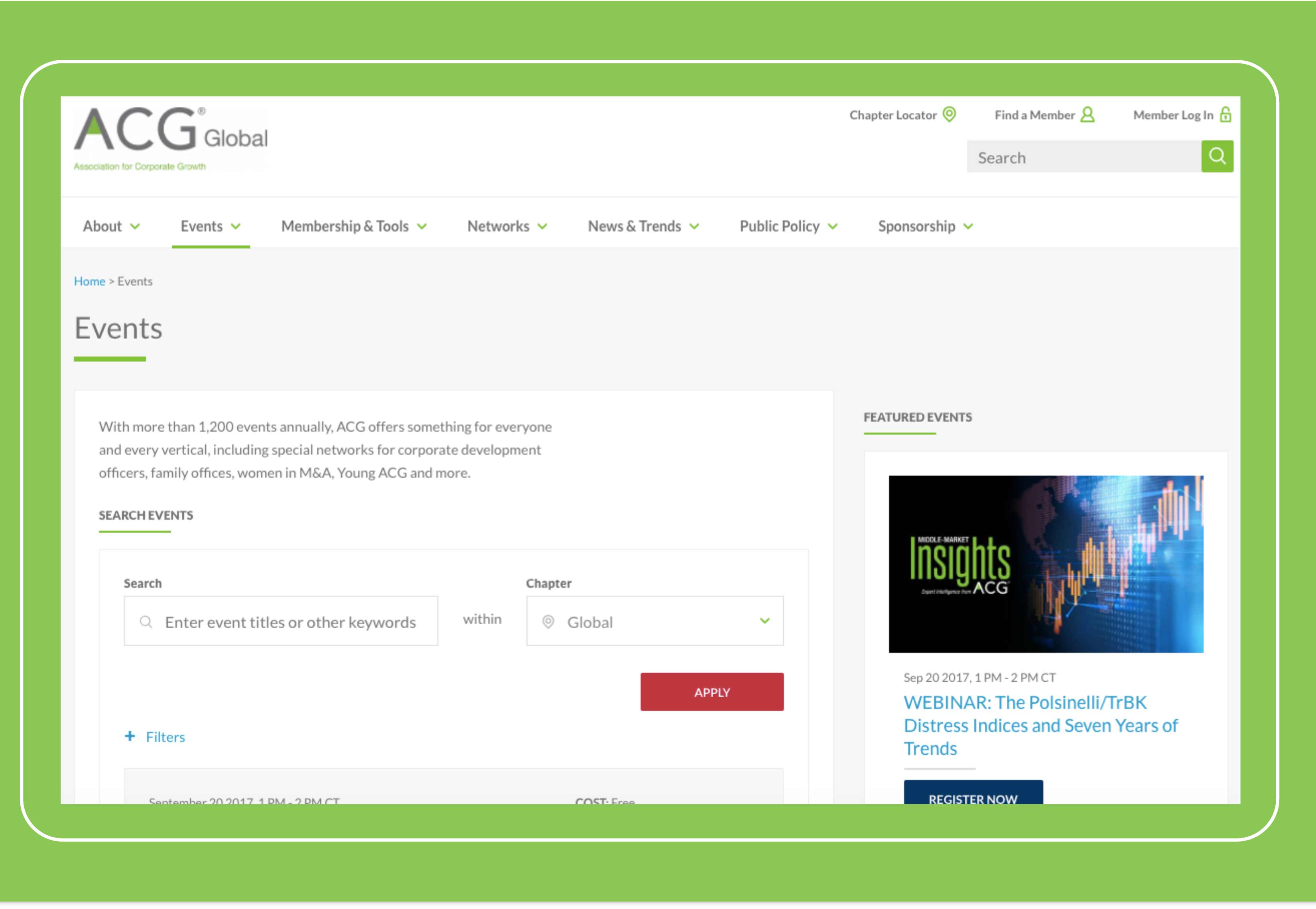
The Association for Corporate Growth (ACG) holds 1,200 events for 58 chapters across the globe each year, and they were struggling to find a way to highlight events.
Before we tested, ACG was including 25 events on their homepage, which was harming the user experience.
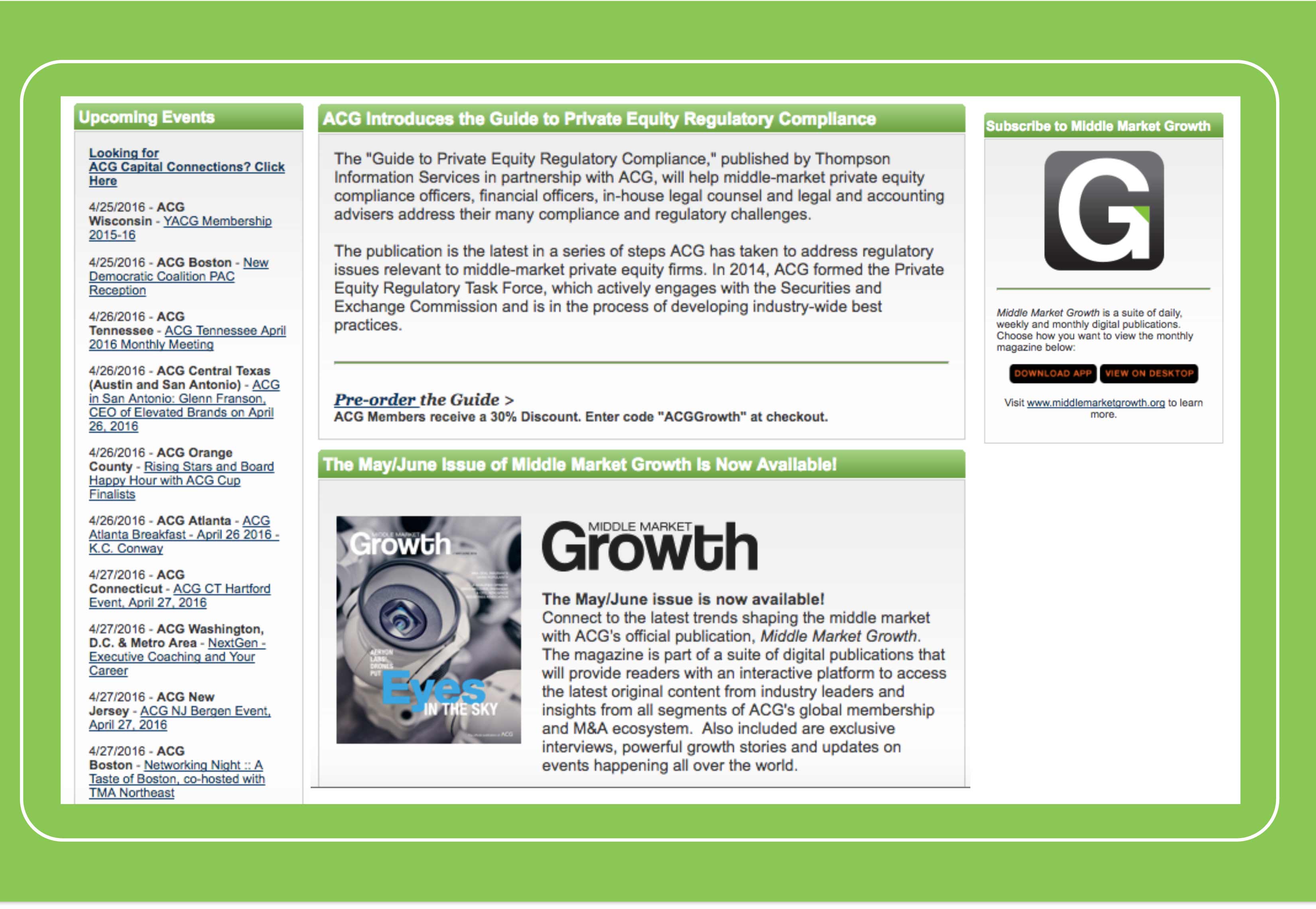
We needed to make it easy for members to find the events that were of interest, in their location, etc. So we created a featured event section on the homepage that links to an events page allowing users to filter by keyword, chapter, date, and event type.
3. Navigation items that require user action need an active verb in the title.
We made a surprising discovery while testing wireframe designs for a large non-profit organization: users thought the navigation items were too unclear and passive.
By adding active verbs to these items—for example, changing “Theft & Fraud Awareness” to “Prevent Theft and Fraud”—we were able to make the navigation clearer to users and let them know what they would be able to accomplish when visiting the page.
4. People miss content when there’s no visual cue.
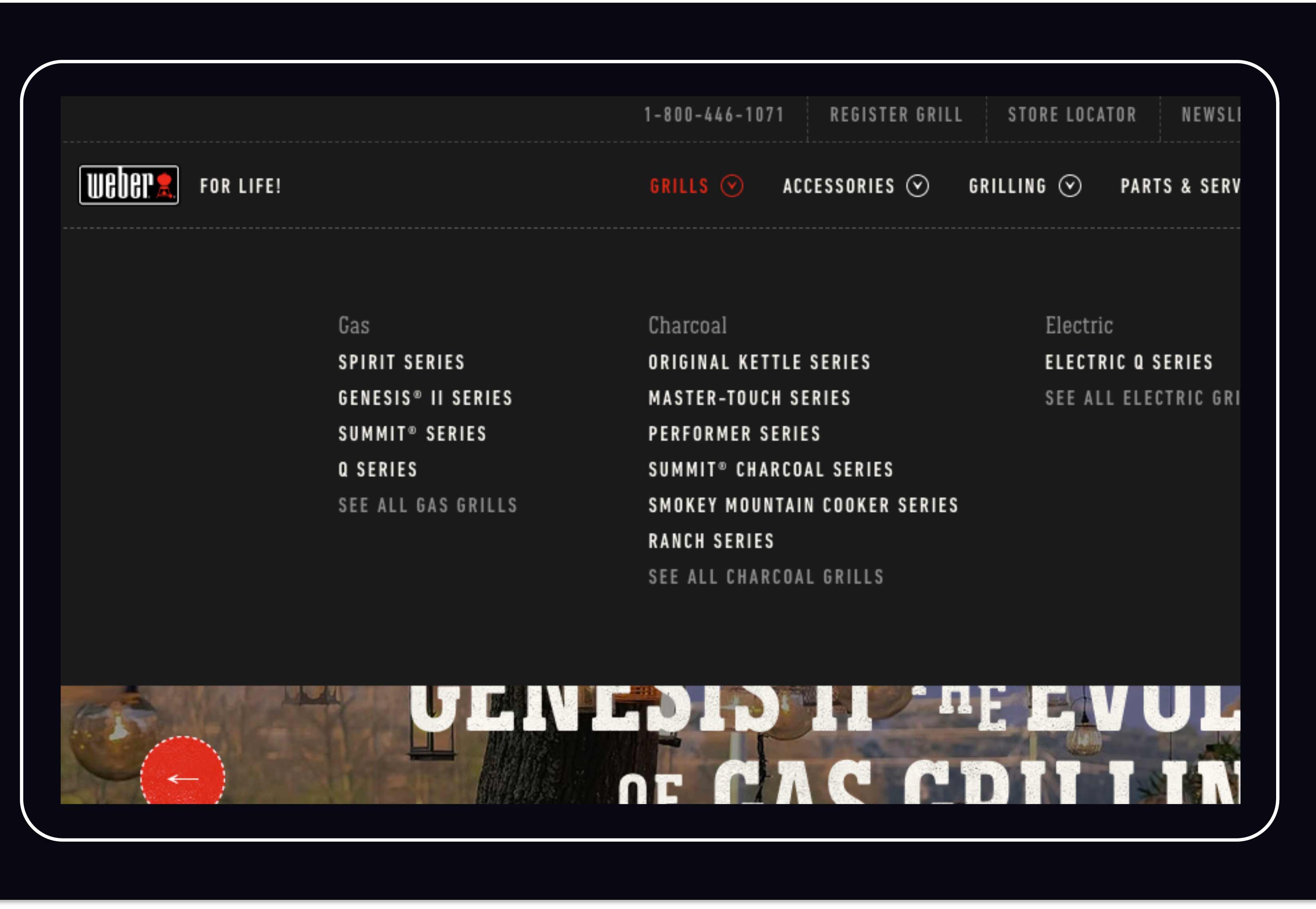
Weber was redesigning the website for their grills and accessories and wanted to test several UX changes on a development environment before going live.
One of the issues we uncovered was that users didn’t know that the navigation items in the main menu expanded.
To solve this, we added carets next to the menu titles to indicate action. After making this simple fix, users clearly understood that they would find additional pages in the menu.
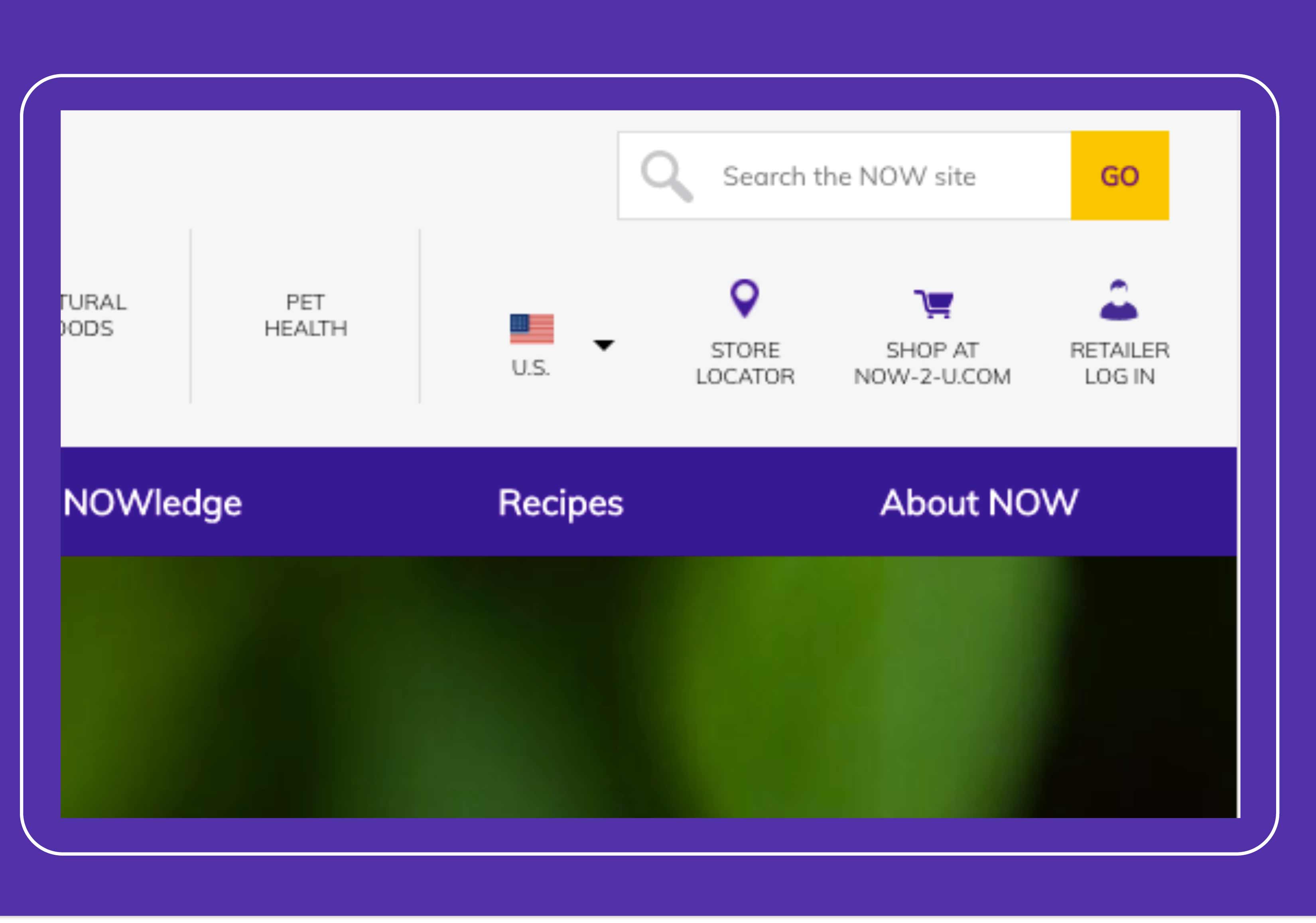
5. Using a search icon without an input field confuses users.
While redesigning the website for NOW Foods, we found that users were confused by a small change: we removed the input field for the search bar.
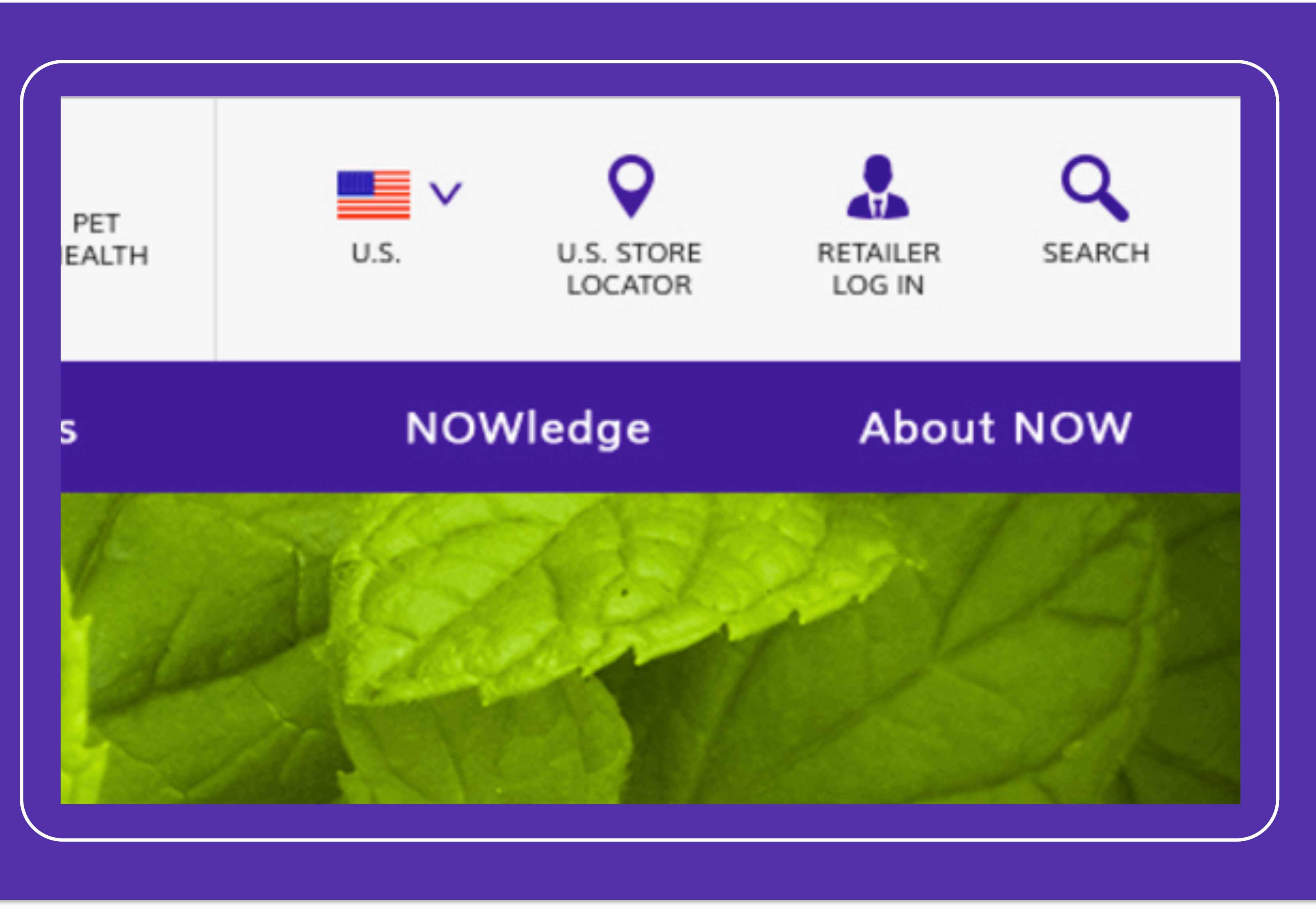
By merely adding the field back to the search area, users could search the site with ease.
Usability testing is a quick, simple way to improve the user experience, whether you’re creating a new site or app or redesigning what you have now. Contact us to learn more about how to execute your own usability test today.