10 of the Best Higher Education Websites to Inspire Your Next Site Redesign

SUMMARY
Discover ten higher education websites leading the way in storytelling, design, and user experience. From engaging homepages to interactive course maps and outcome dashboards, these examples showcase how universities are elevating digital engagement.
Table of Contents
- Best Homepage Experiences
- Best Student Engagement Experiences
- Best Alumni Magazines
- Best Course Recommendations & Academic Pathways
- Best Data Outcome Experiences
What Makes a Great Higher Education Website?
A university website is often the first introduction to campus life and community. It’s where curiosity begins, decisions are made, and lifelong relationships with the institution take root. The best higher ed sites make that journey feel personal and purposeful from the very first click.
We collected 10 standout higher ed examples that address common student needs and institutional challenges to inspire future website updates, refreshes, and redesigns. These examples are grouped by five core areas where most higher education websites struggle: homepage, student engagement, alumni magazines, course recommendations, and student outcomes.
Best Homepage Experiences
Your homepage is your front door. It should instantly convey a digital brand experience that reflects what makes your school unique. The homepage also needs to help prospective students and faculty imagine the future they want to create, while engaging a diverse, global audience with clarity and authenticity. Here are three higher education homepages that deliver beautiful brand experiences while putting user needs front and center.
Yale School of Management
This bold, editorial homepage balances academic credibility with real-world relevance. The experience feels polished and timely, using subtle interactions to engage users without distraction.

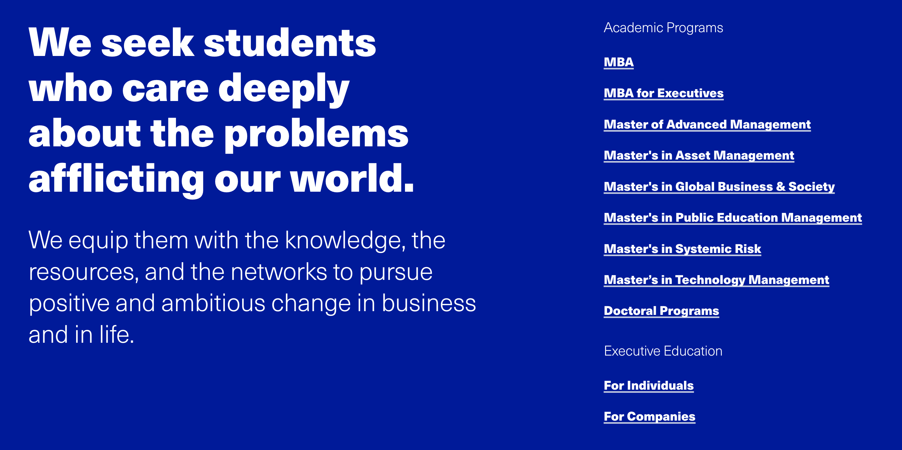
What we love:
- Clear value proposition is prominently displayed at the top of the page.
- Modular layout presents news, events, and stories in a modern, scannable way.
- Concise card content keeps the page clean, readable, and approachable.
- Intuitive audience navigation for prospective students, alumni, and recruiters.
- Thoughtful use of white space and typography that reinforces Yale’s brand.
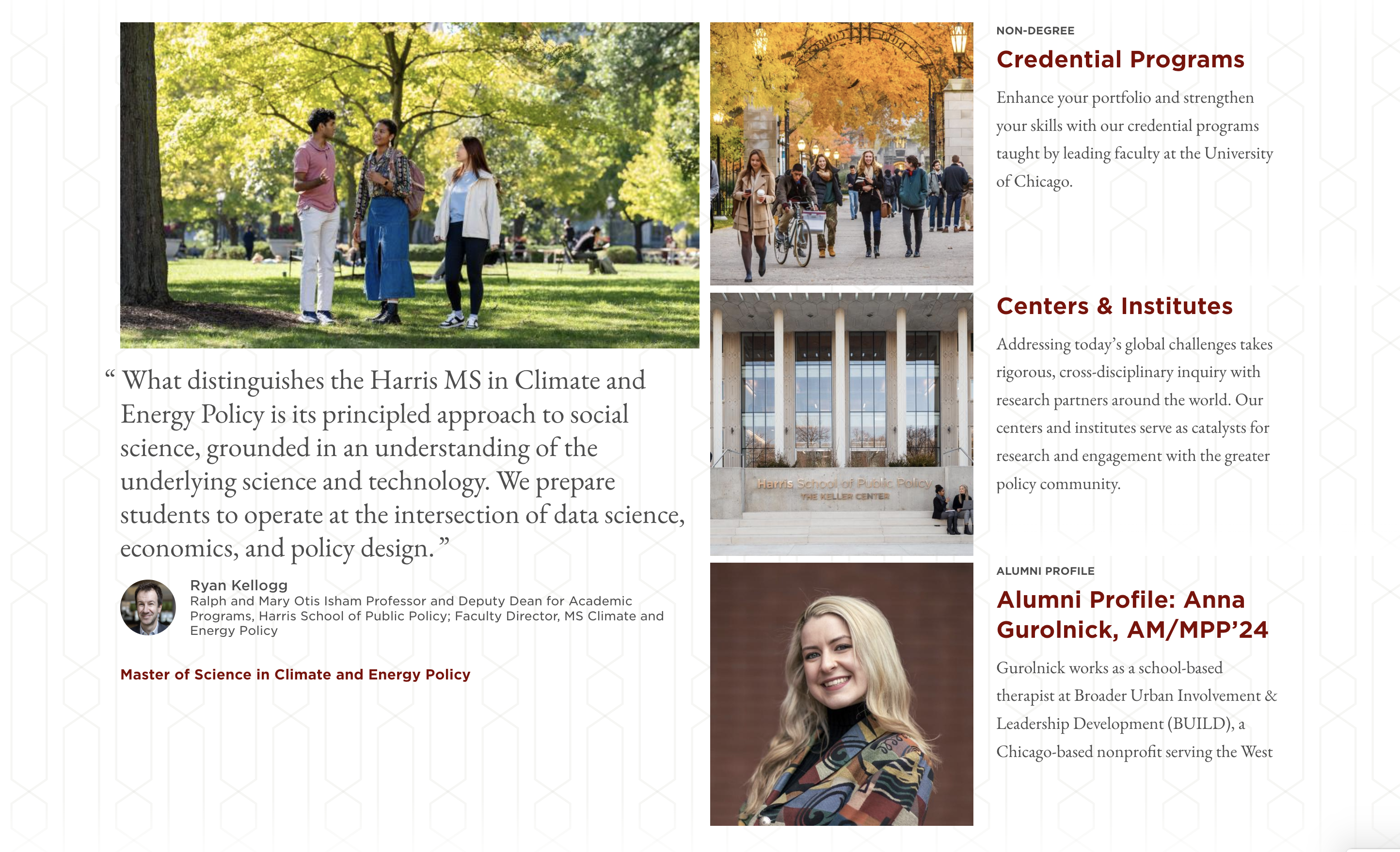
Harris School of Public Policy
The homepage is vertically compact, intuitive, and engaging. A dynamic hero video paired with recent news provides an authentic snapshot of student life, research, and the school’s real-world impact.
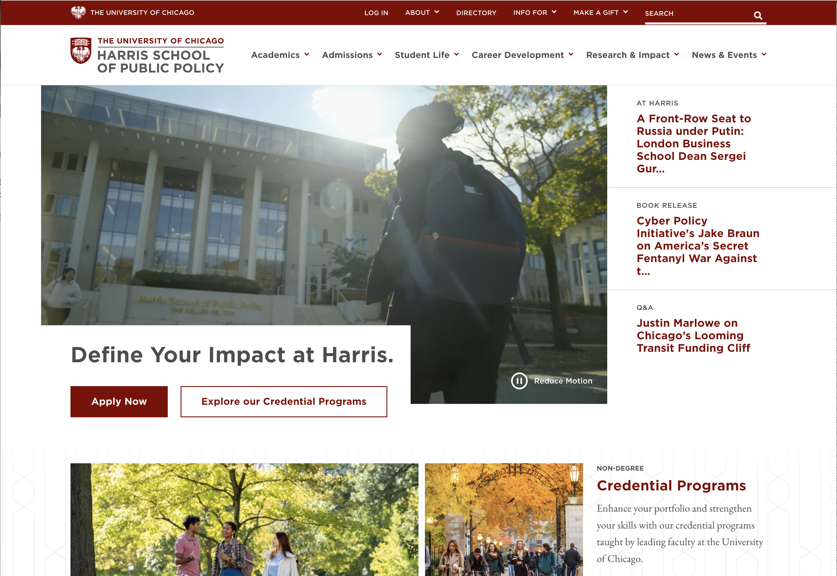

What we love:
- Hero messaging, video, and links create a focused above-the-fold experience, helping users quickly find what they need or scroll to learn more.
- Robust megamenu surfaces deeper pages while offering space to feature key stories and initiatives.
- Smart, retractable navigation bar hides on scroll and reappears when needed, maximizing content space without losing usability.
- Responsive, grid-based design scales beautifully on mobile.
- Student testimonials add authenticity and human connection, exactly what prospective students want to see.
Stanford d.school
The homepage is a creative playground: vibrant, layered, and full of personality. While it also uses a card-based layout like Yale’s School of Management, the subtle motion, filtering options, and textured visuals create a dynamic experience that feels unmistakably “d.school.”
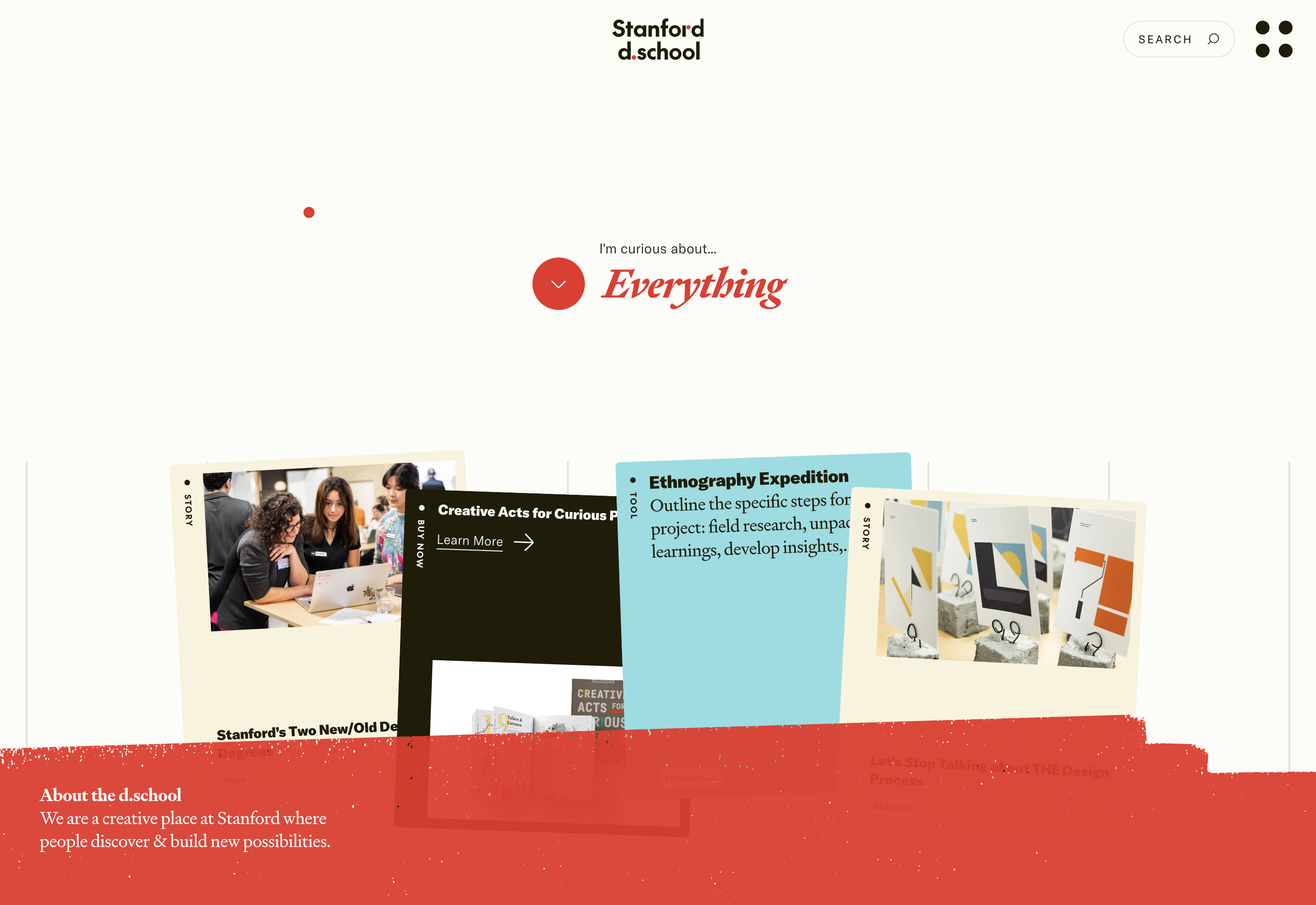
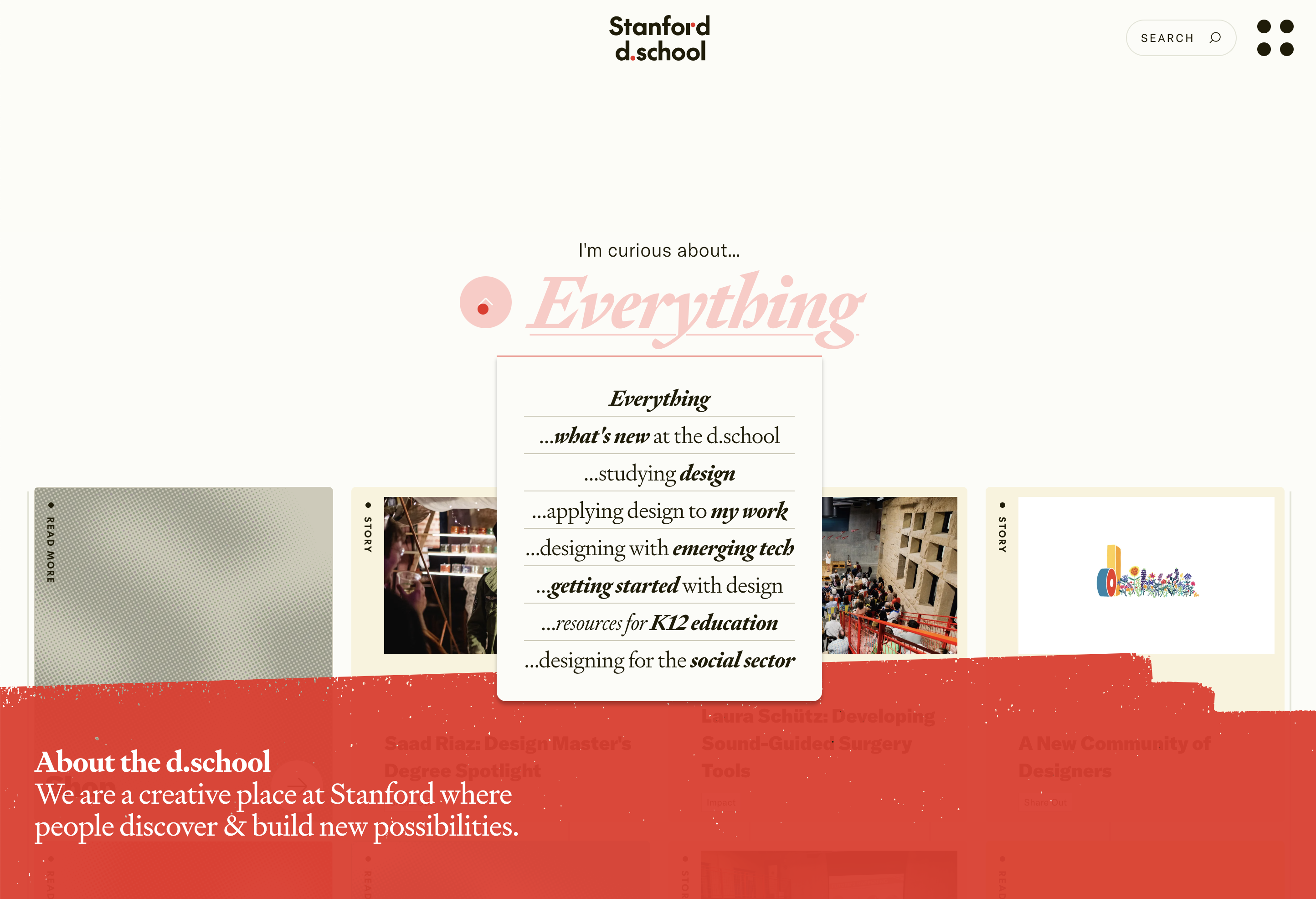
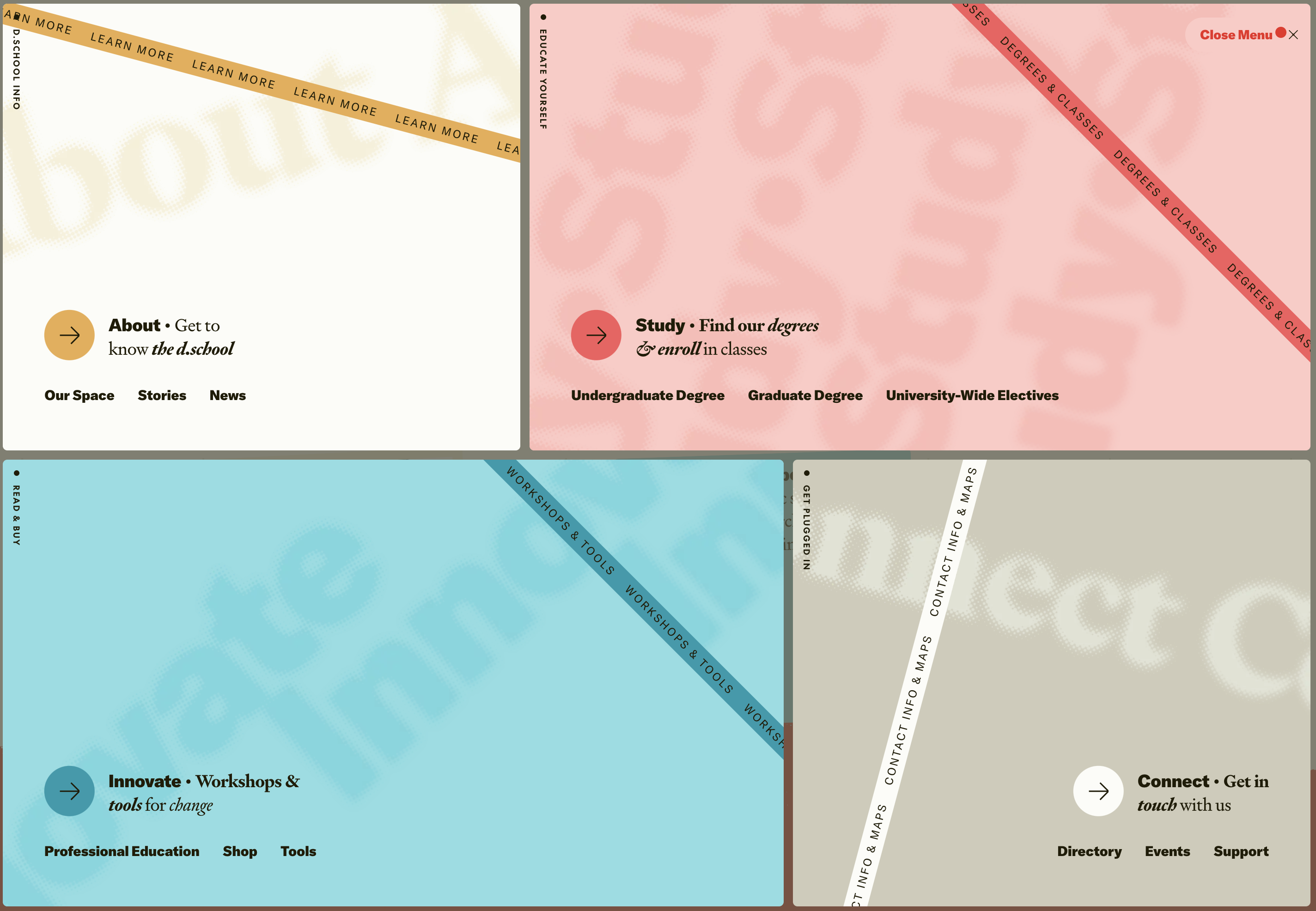
What we love:
- Clear visual hierarchy improves scannability through bold headlines and minimal copy.
- Conversational tone makes “design thinking” approachable and human.
- Interactive storytelling is achieved through dropdown filters that personalize the experience.
- Playful motion tied to mouse movement, adding surprise and delight without distraction.
- A full-screen mega menu that’s visually bold and on-brand without overwhelming the user.
Best Student Engagement Experiences
Your website should help students see themselves in your community. The best higher education sites go beyond information. They create a sense of belonging through storytelling, voices, and visuals that reflect real campus life. Here are two examples we feel create a very unique student experience.
MIT Admissions
MIT Admissions is built around authentic student voices. Instead of polished marketing copy, the site features real blog posts from students who share their journeys, challenges, and campus experiences.
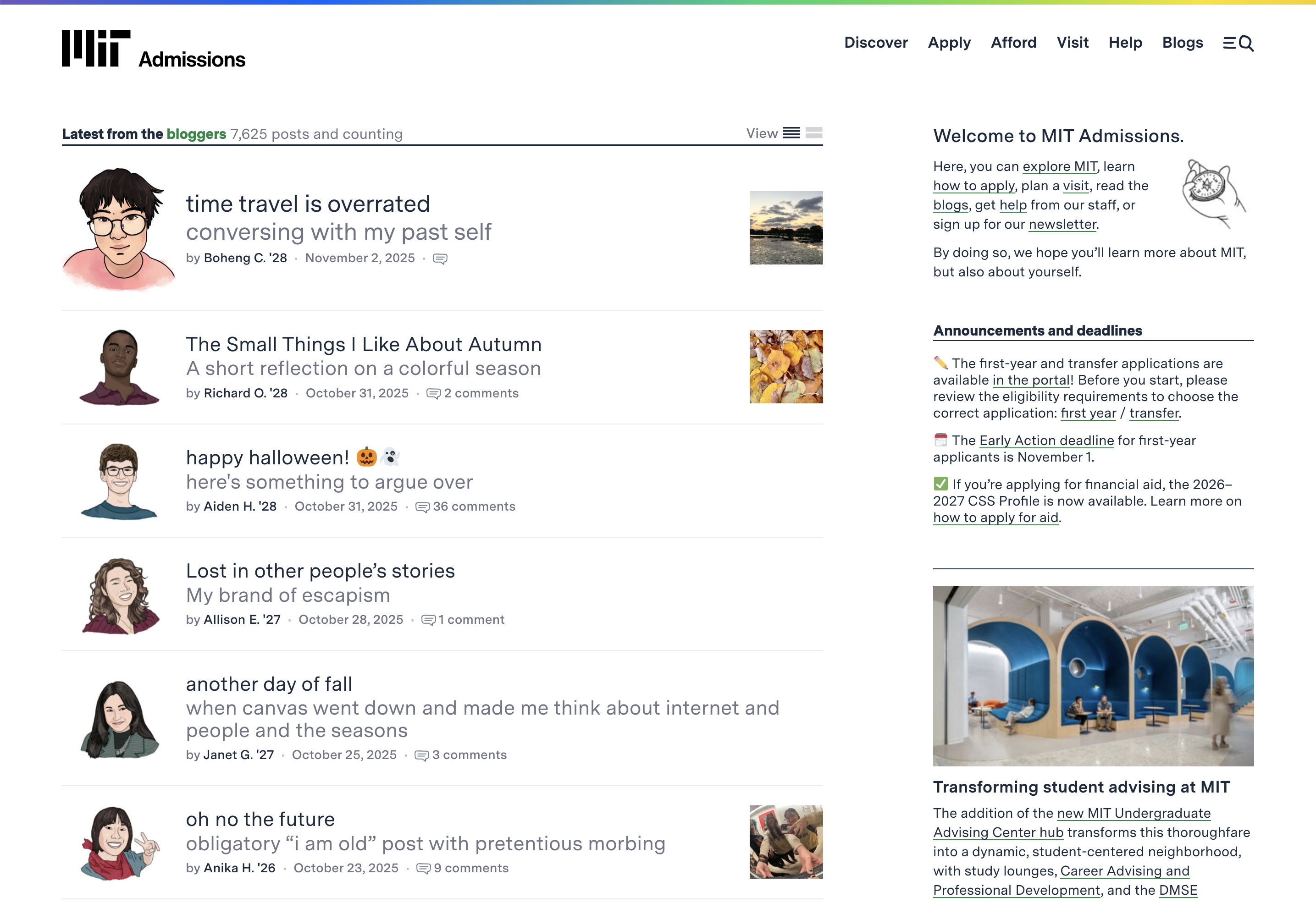
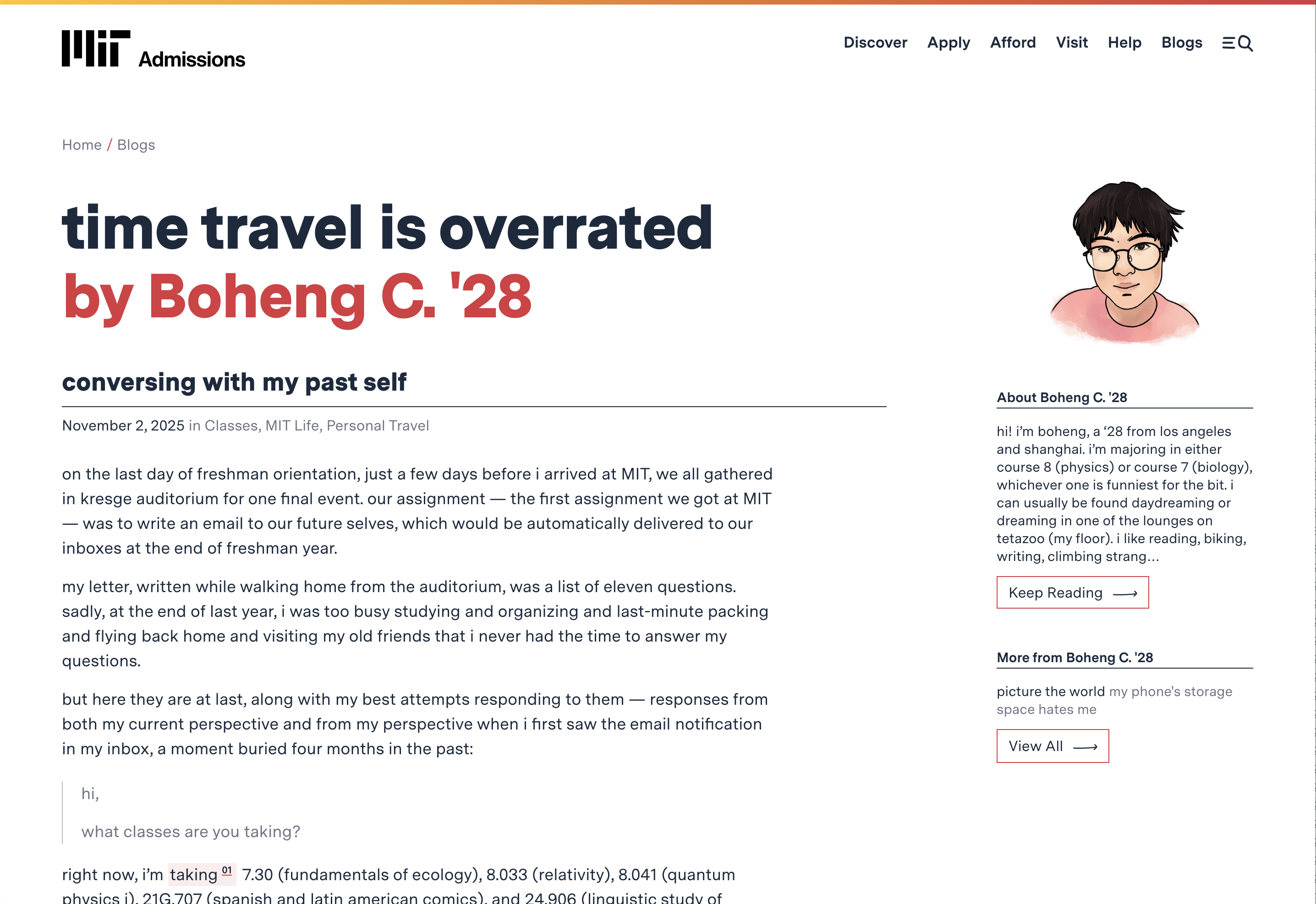
What we love:
- Genuine, first-person storytelling feels personal and transparent.
- Simple, blog-driven structure keeps the focus on the content.
- Inclusive tone and approachable language break down barriers of “elite” academia.
- Modular design balances student stories, events, and admissions content.
- Engaging long-form posts double as both storytelling and recruitment tools.
Brown University Student Stories
Brown’s student stories section feels like a beautifully produced editorial magazine. Each feature showcases how students apply Brown’s open curriculum and collaborative spirit to the real world.
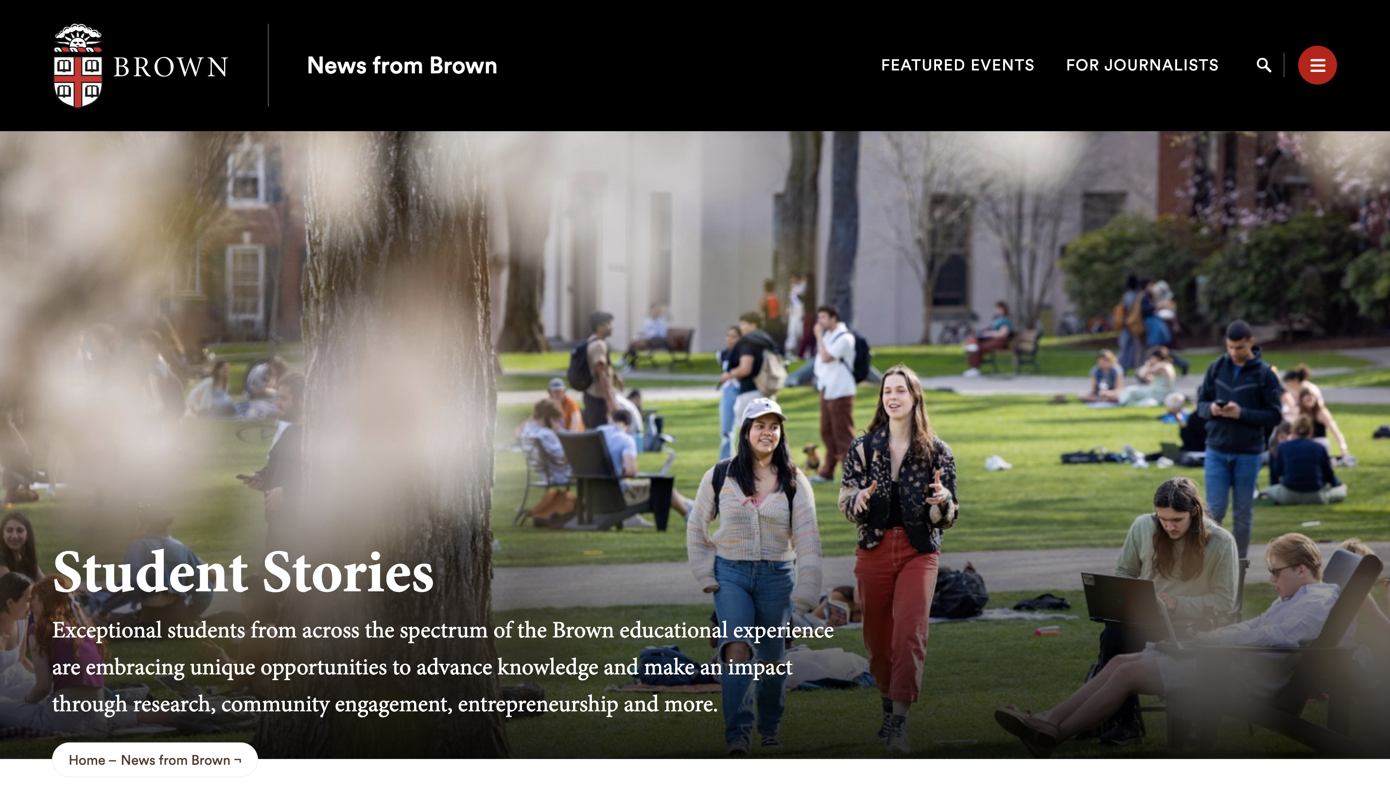
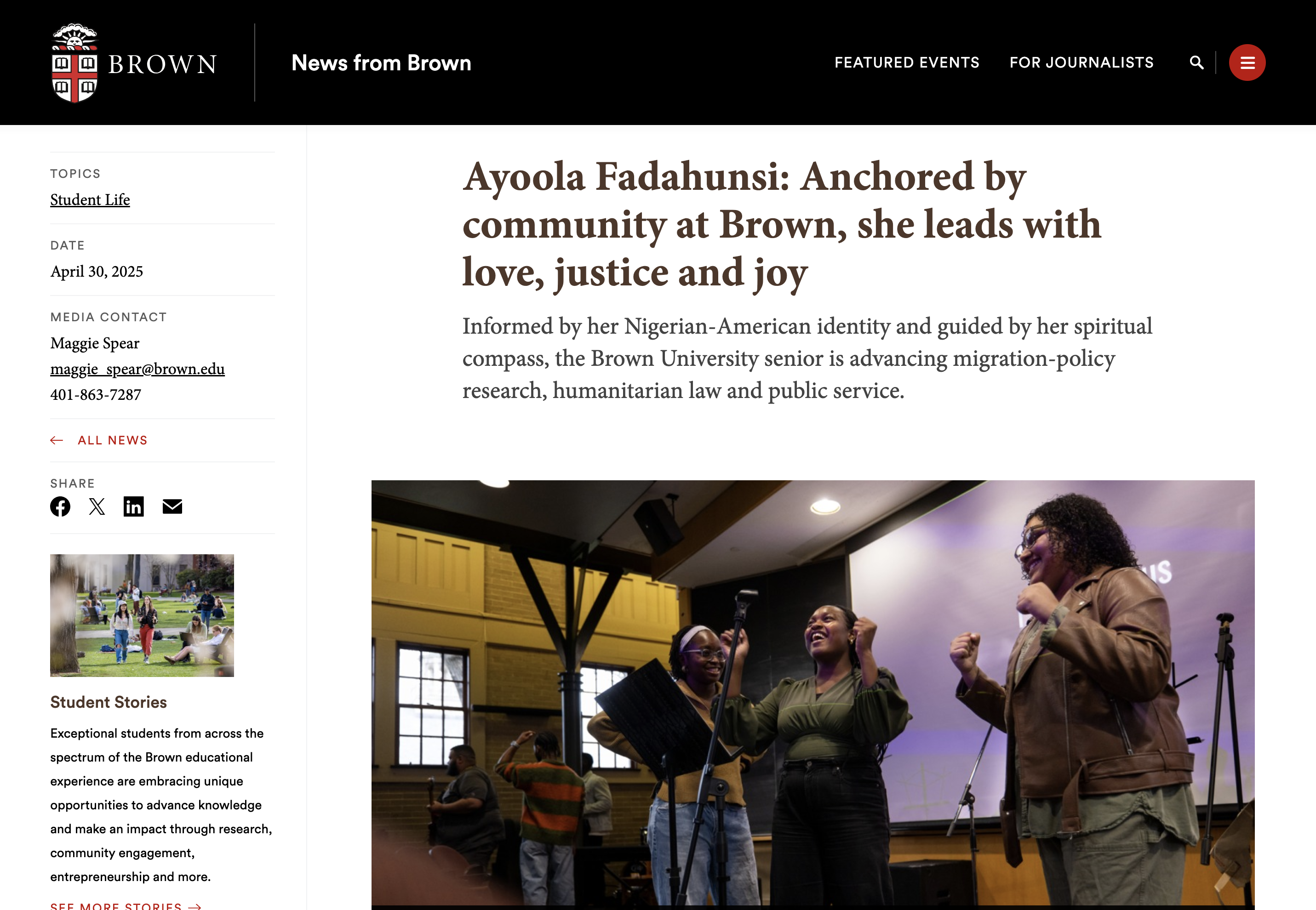
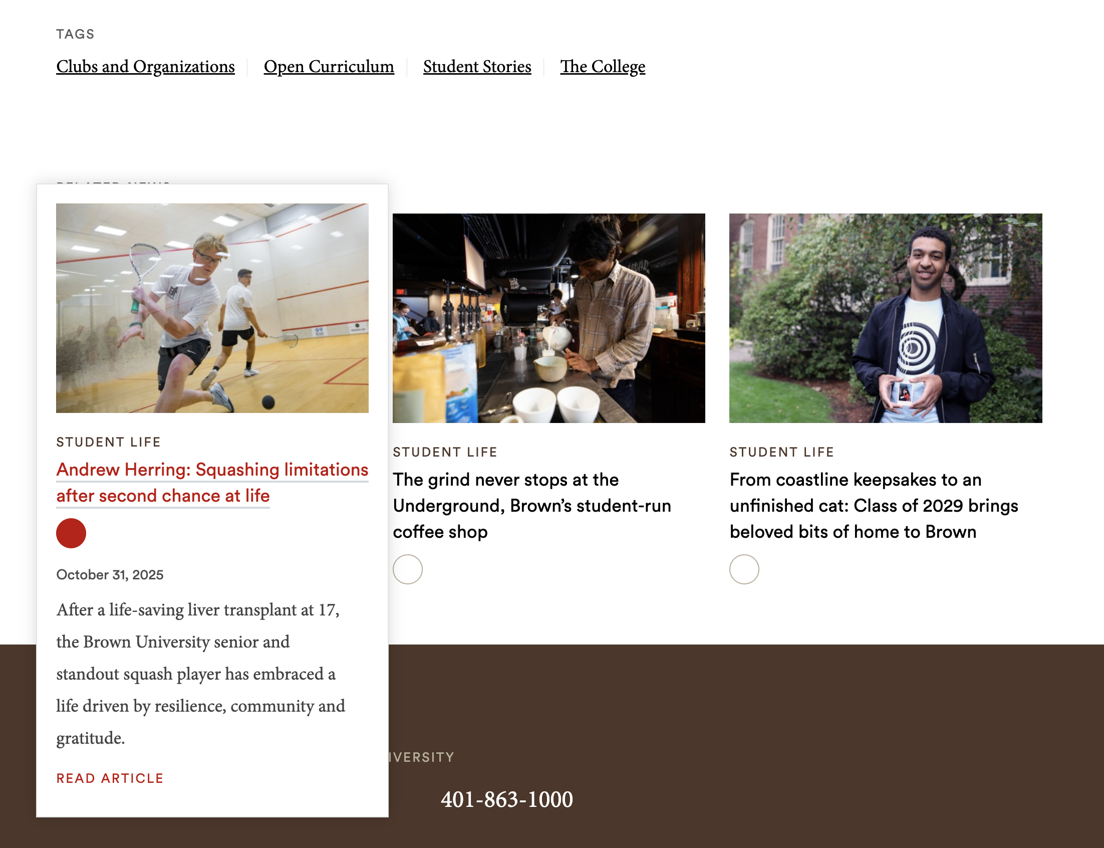
What we love:
- Clean, modern layout highlights strong photography and quotes.
- Ability to browse by interest through clear categorization and content tagging.
- Micro-interaction to read a summary before clicking on an article.
- Thoughtful integration of related news and research stories to show the full university ecosystem.
Best Alumni Magazines
Alumni publications are where storytelling and nostalgia intersect. The best digital magazines feel timeless and sophisticated while still easy to browse. They also celebrate alumni achievements and invite them to reconnect with the school’s mission, values, and people. Here are two examples to inspire your digital magazine experience.
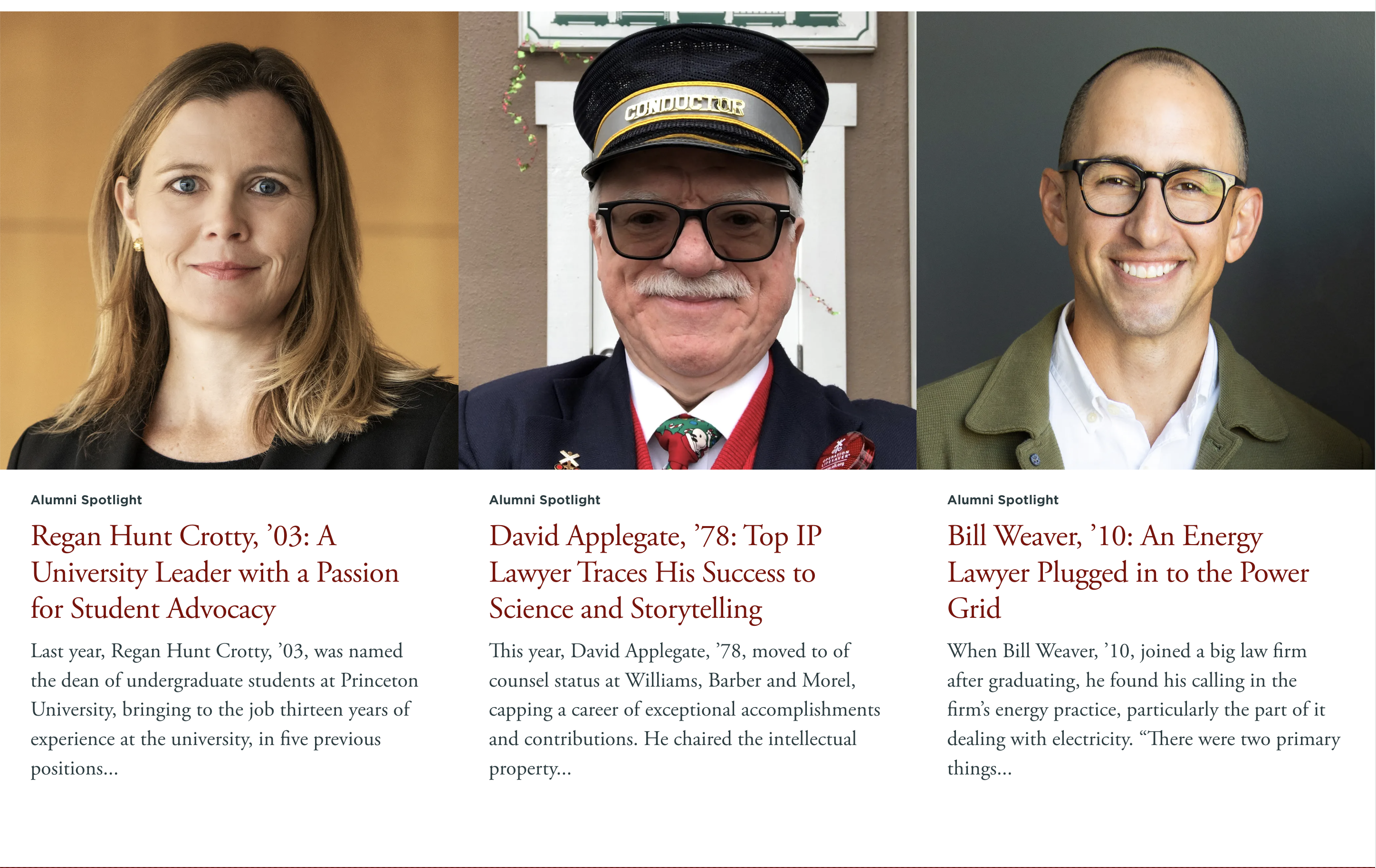
Princeton Alumni Weekly (PAW)
Princeton’s Alumni Weekly brings the tradition of a century-old print magazine into a modern, digital-first experience. It’s rich with stories, beautifully designed, and easy to navigate.
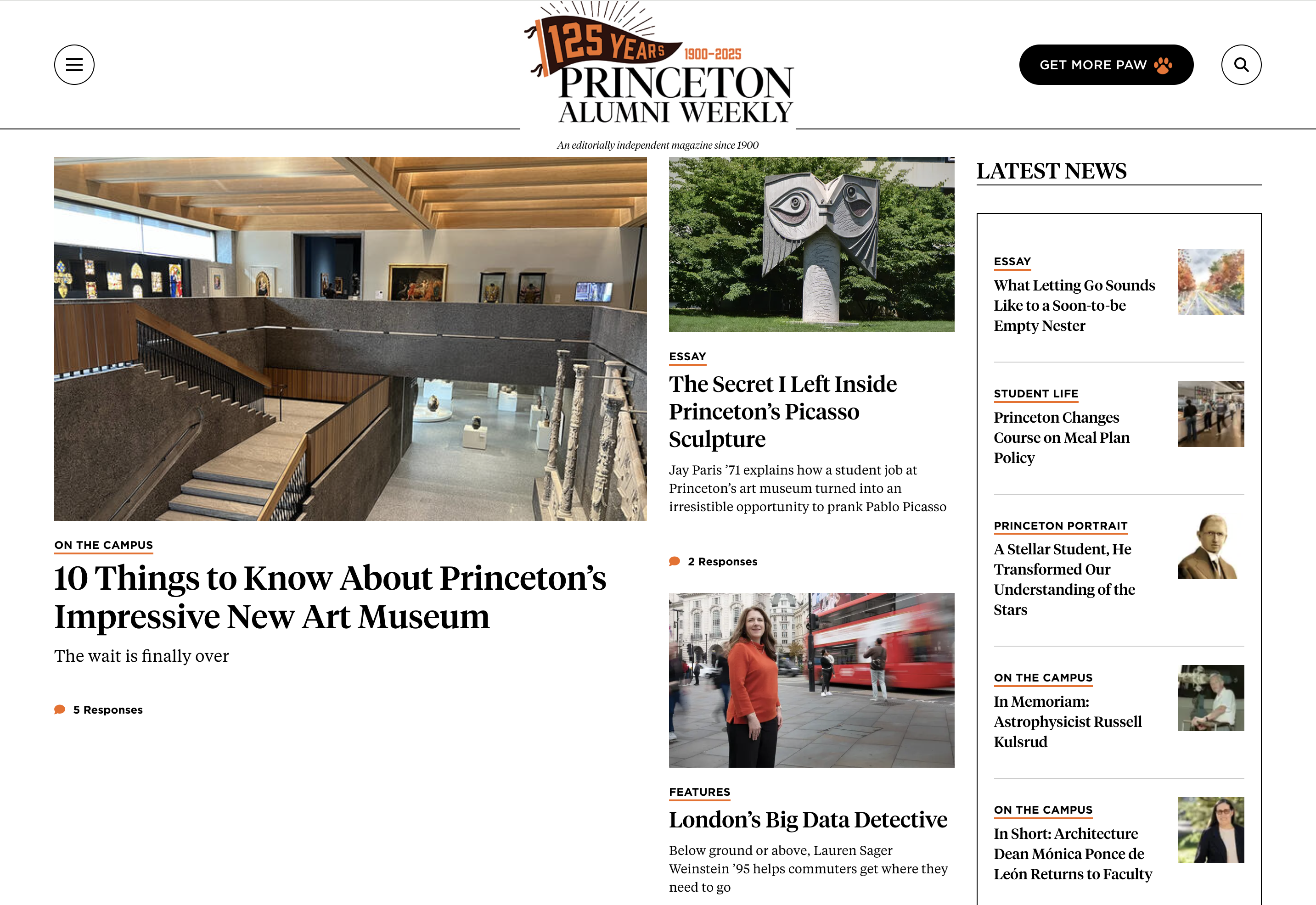
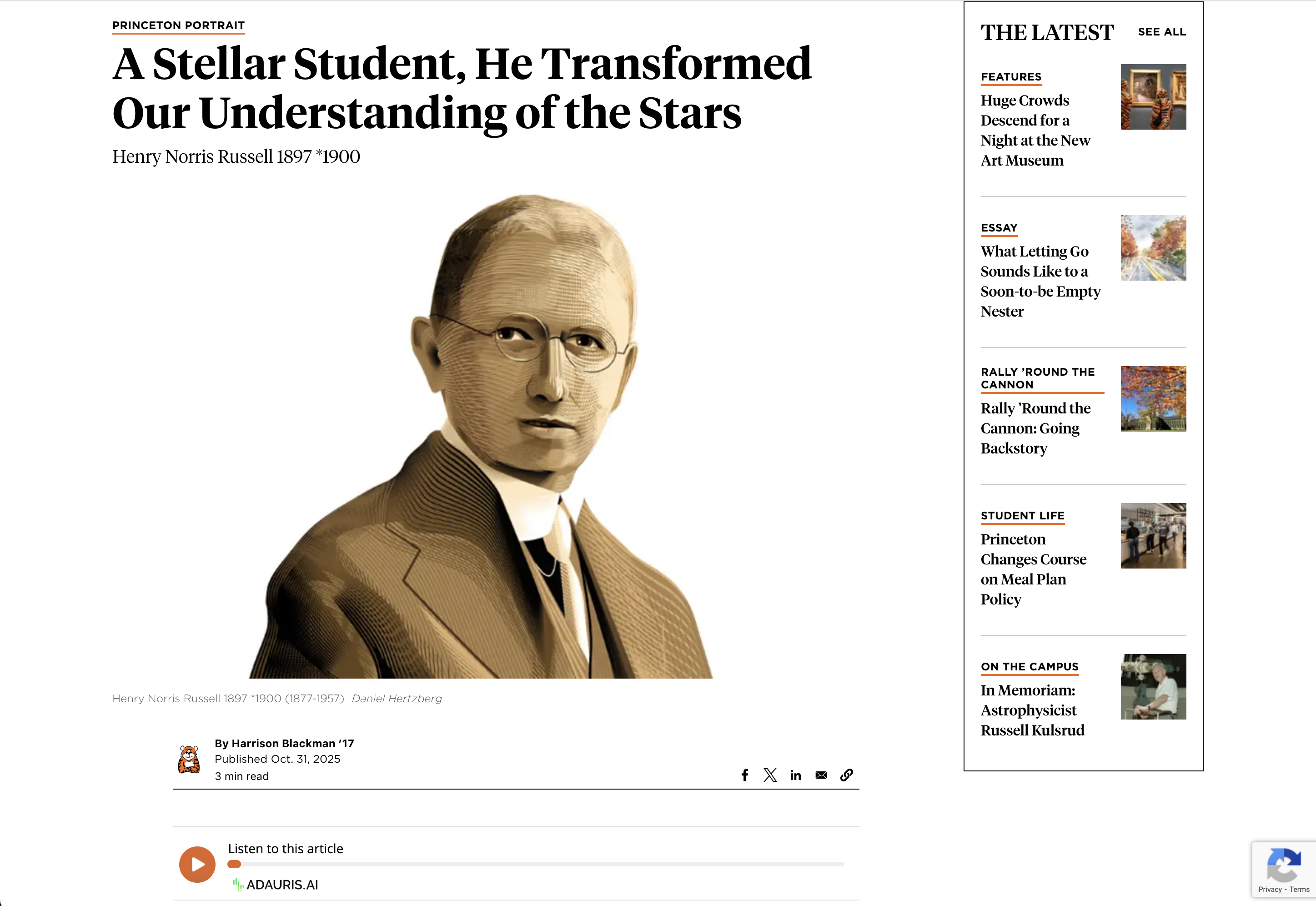
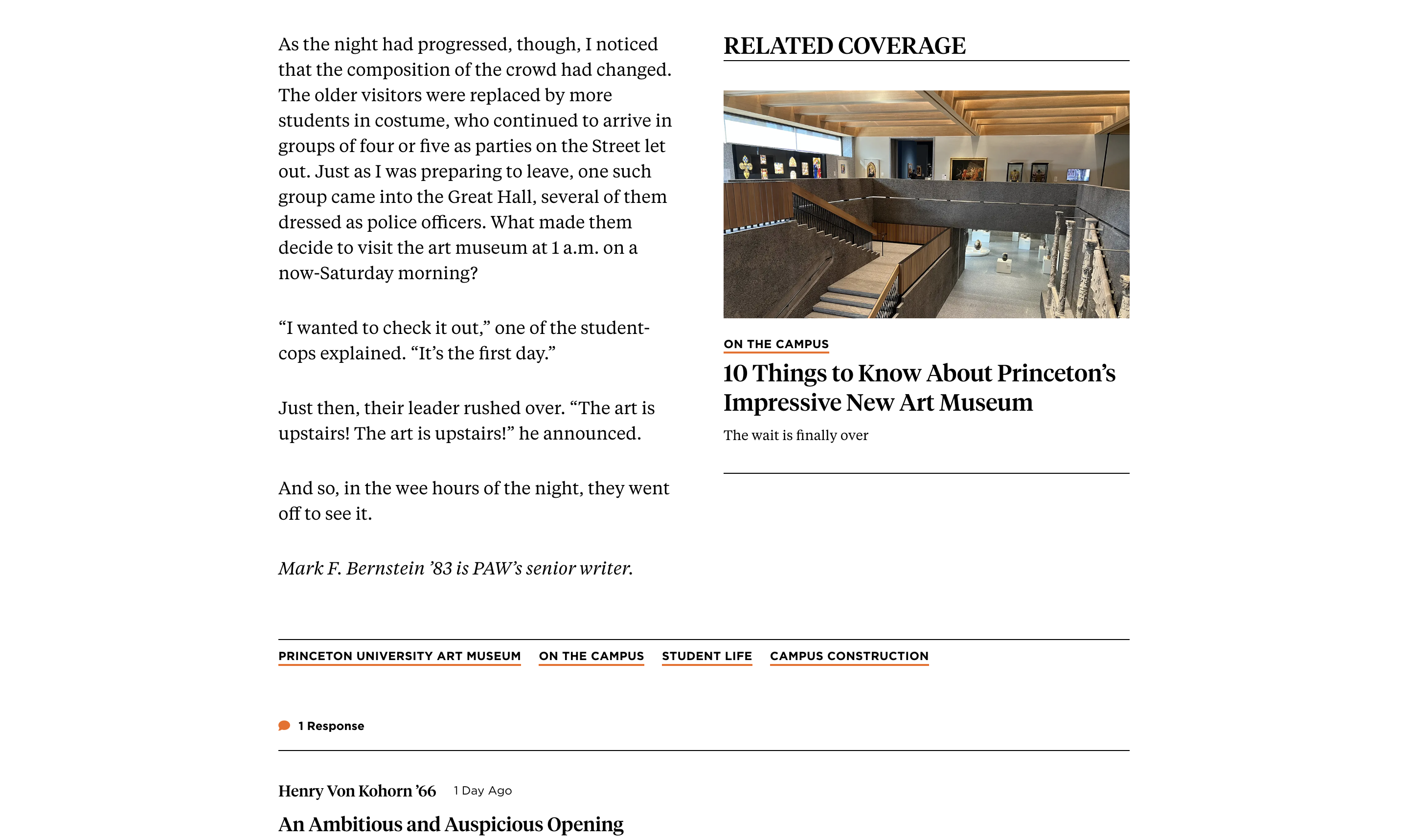
What we love:
- Elegant, editorial layouts translate the magazine's feel to the web.
- A clear visual hierarchy makes long-form content easy to read on any device.
- Strong use of photography and portraiture to create connection and pride.
- Smooth integration of archives, making it simple to explore back issues.
- The ability to share, listen, or comment on the article is easily accessible.
- Related articles are presented within the content for more context and to increase engagement.
UChicago Law: The Record
UChicago Law’s alumni magazine reimagines what an academic publication can be. Its digital format combines striking imagery, immersive storytelling, and a highly readable and responsive layout.
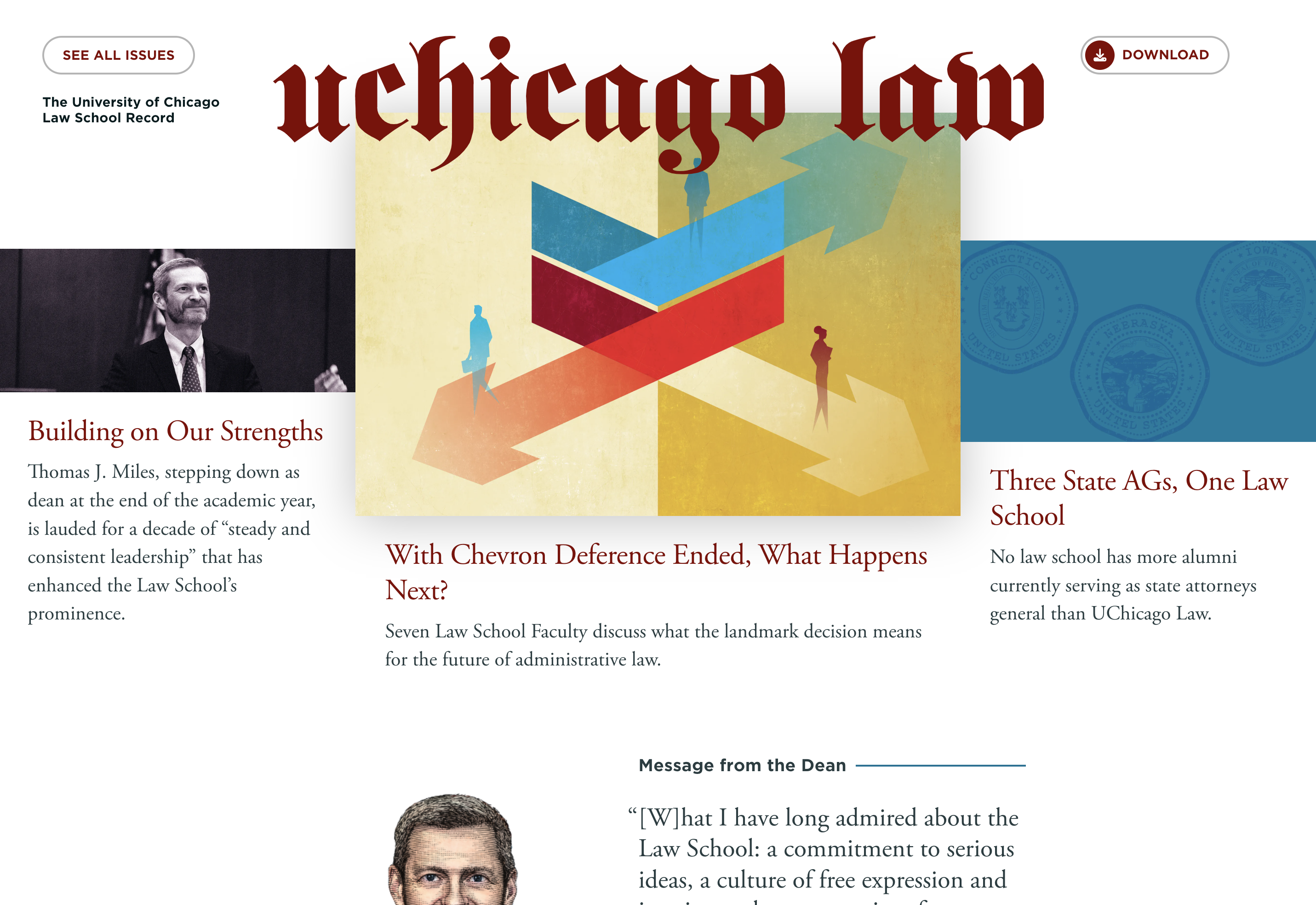
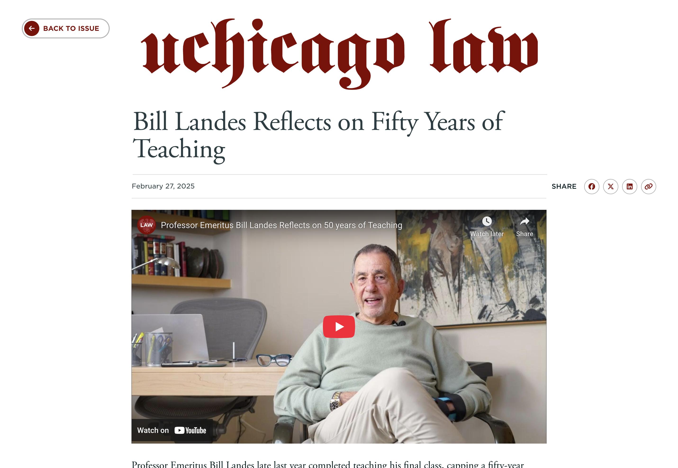
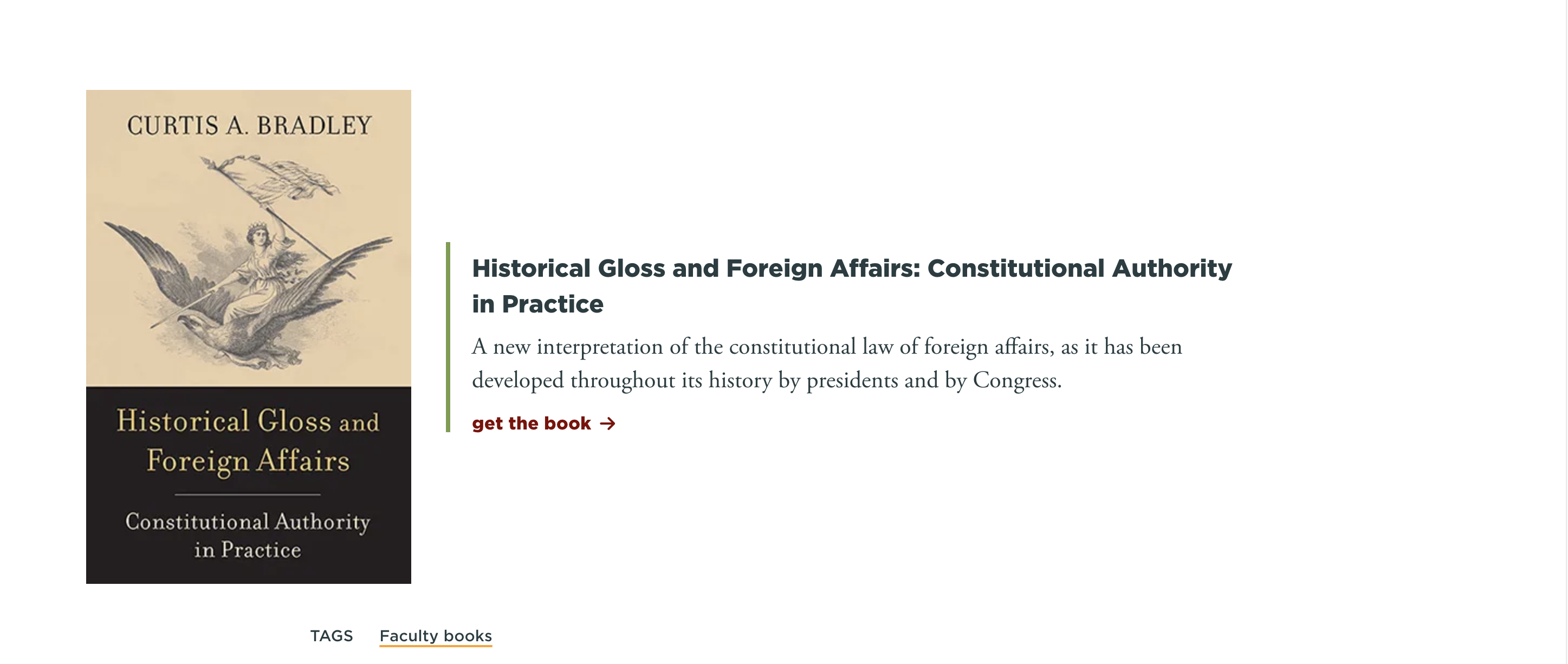
What we love:
- Bold typography and elegant pacing that elevate long-form reading.
- Immersive feature stories supported by crisp photography and design consistency.
- Clear section navigation that mirrors the print experience while enhancing usability.
- Integration of related news and events to extend engagement beyond the article.
- A refined, minimal aesthetic that aligns seamlessly with the Law School’s brand identity.
Best Course Recommendations & Academic Pathways
Helping students choose their academic path is one of the most complex and rewarding digital challenges in higher education. The strongest course recommendation experiences simplify decisions, visualize options, and empower users to see where their choices can lead. Here are two we think are great.
Arizona State University: me3® Major & Career Quiz
ASU’s me3® quiz transforms course and career exploration into an engaging, game-like experience. Students answer a series of visual questions and instantly see majors and career paths aligned with their interests.
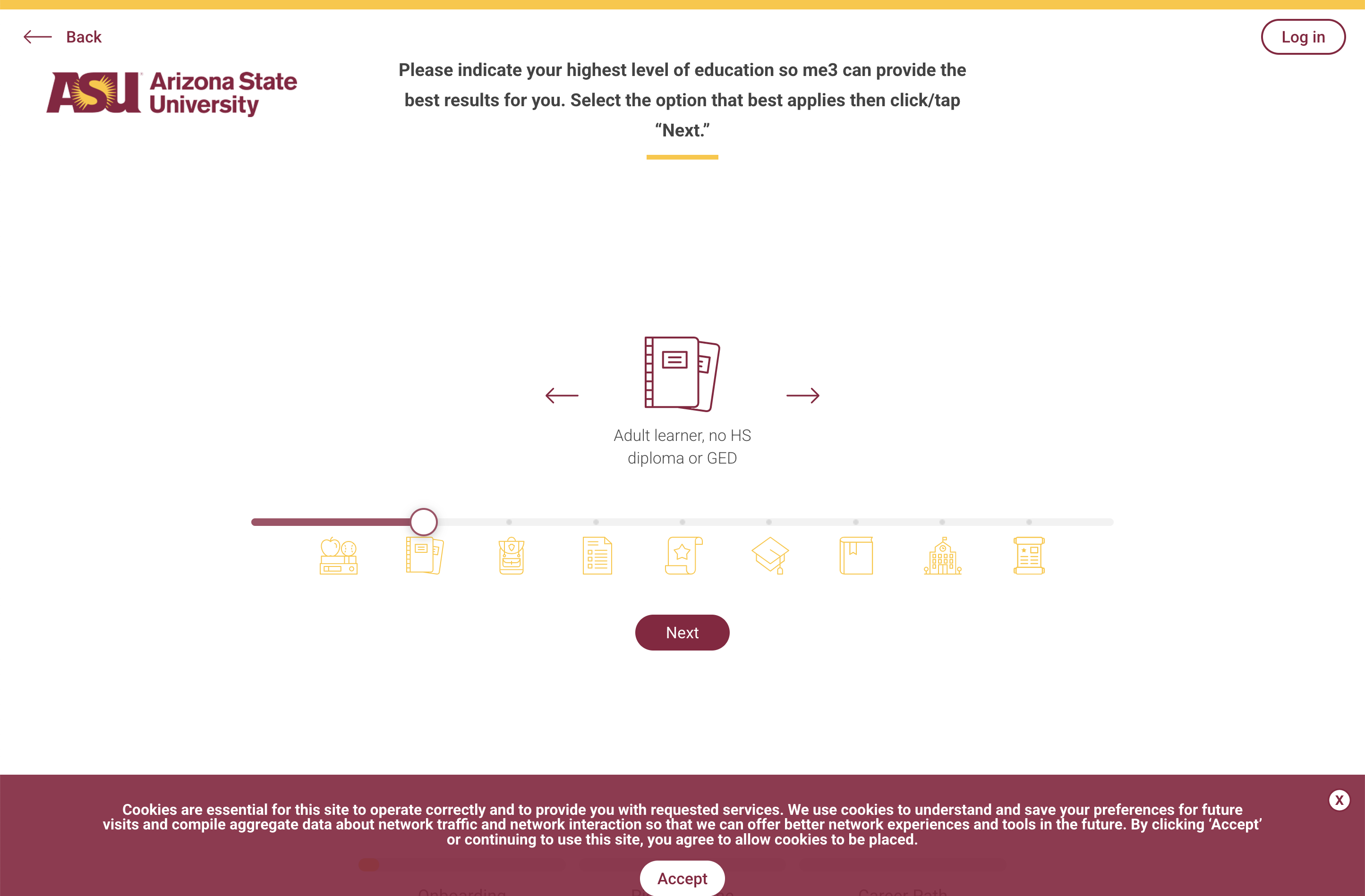
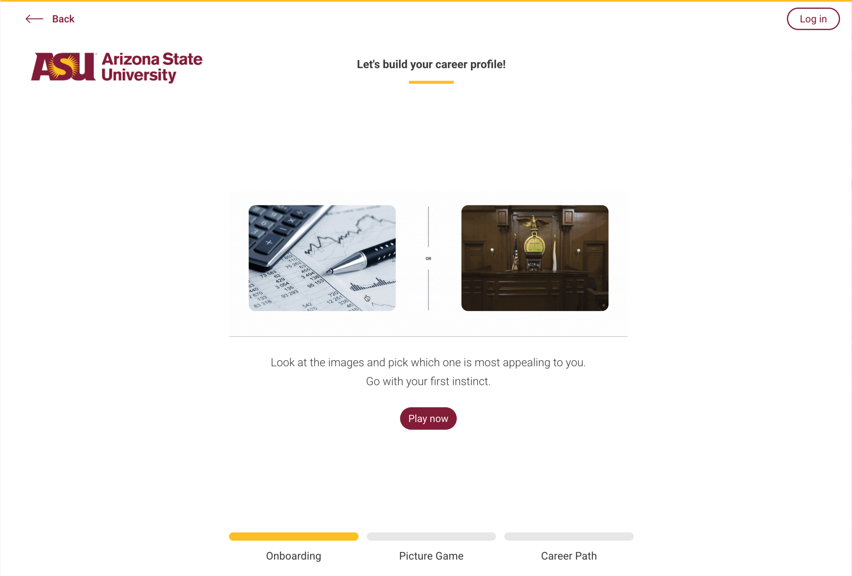
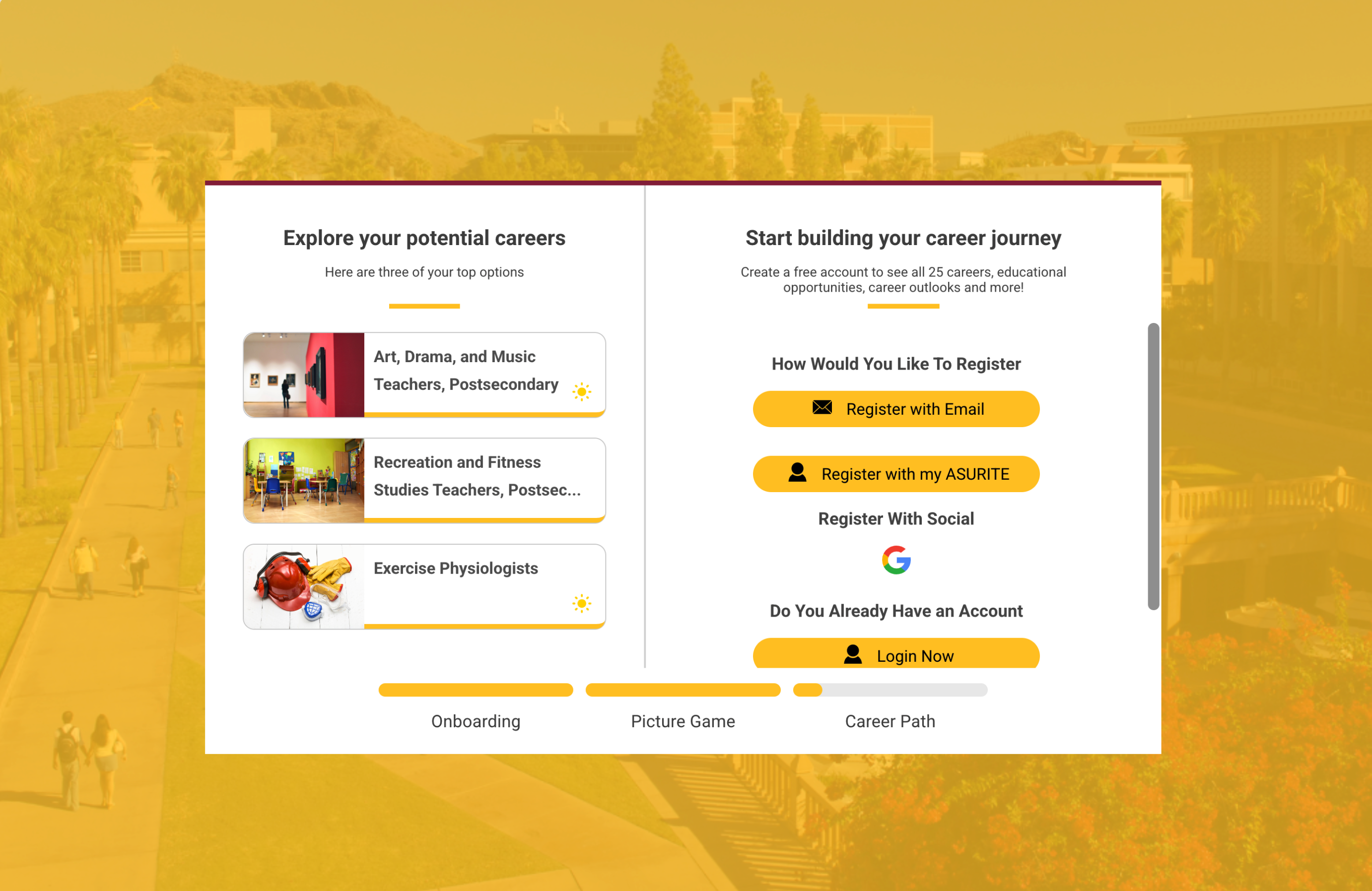
What we love:
- A playful, image-driven interface lowers barriers to engagement.
- Smart integration of personality, major, and career recommendations.
- Fast, mobile-friendly flow makes exploration fun and frictionless.
- Immediate, personalized results with no login required.
- A perfect example of using UX to turn self-discovery into action.
UChicago Crown Family School: Full-Time Curriculum Map
The Crown Family School brings clarity to complex degree requirements through a simple, visual curriculum map. Originally presented in PDFs, the new curriculum maps turn an academic plan into an accessible digital experience.
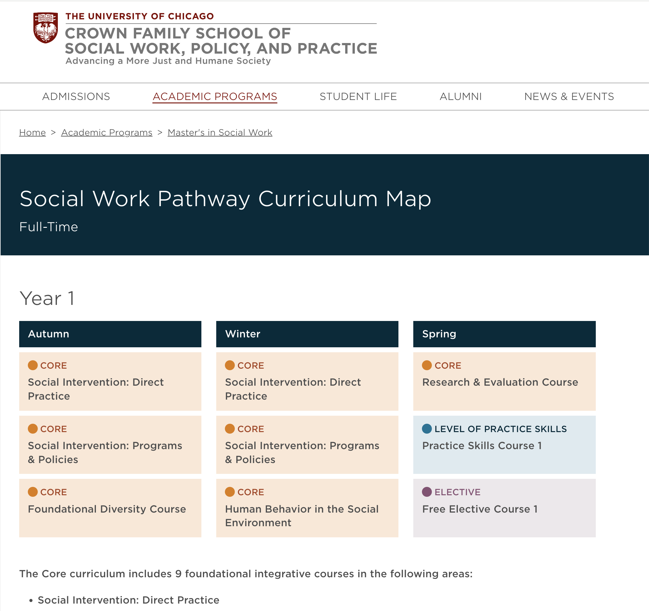
What we love:
- A clean, linear map helps students understand progression quarter by quarter.
- Highly scannable content surfaces course details without clutter.
- Balanced use of color and typography to distinguish categories and timelines.
- Accessibility-minded design keeps academic planning inclusive.
- A model for how curriculum data can be presented as design, not just documentation.
Best Data Outcome Experiences
One of the most important things students look at when evaluating a university is the career outcomes. We hear it over and over again during studies and interviews: What will their career look like when they complete this degree? What have the students who have come before me done? Where are other alumni working? These two websites do a great job of presenting this in-depth data to show potential students exactly what they can look forward to.
Cornell University: Career Outcomes
Cornell’s interactive dashboard transforms post-graduation outcomes into an exploratory experience. Users can filter by college, major, and career path to see how Cornell graduates are making an impact across industries.
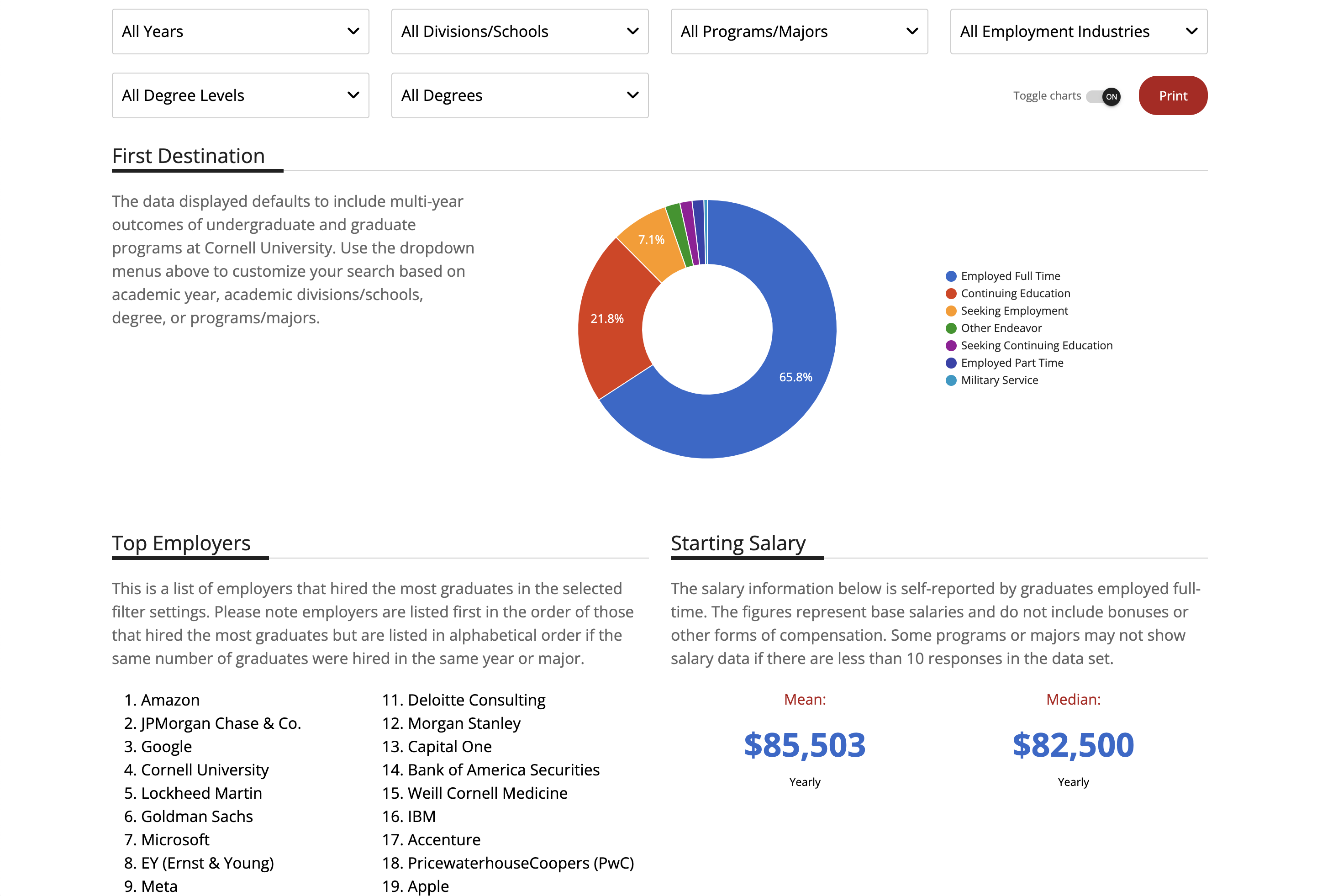
What we love:
- Dynamic data visualizations make complex information engaging and easy to digest.
- Search and filter functionality helps prospective students explore outcomes relevant to their interests.
- Transparent methodology builds trust in the data.
- Integration with career resources and employer partnerships for deeper engagement.
UChicago Harris School of Public Policy: By the Numbers
The Harris “By the Numbers” microsite turns outcomes into storytelling, blending bold typography, brand colors, and clean infographics to communicate the program’s measurable impact.
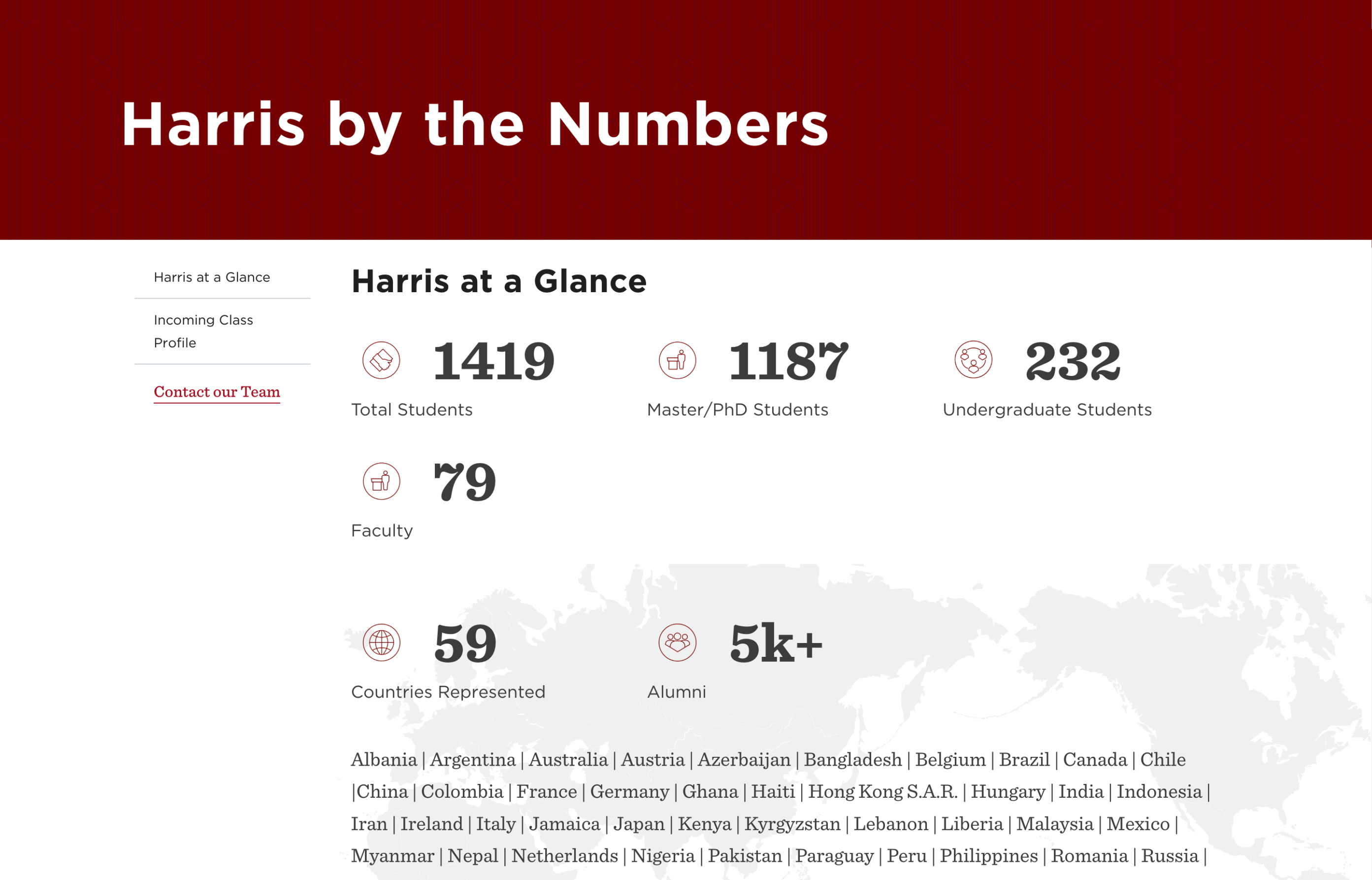
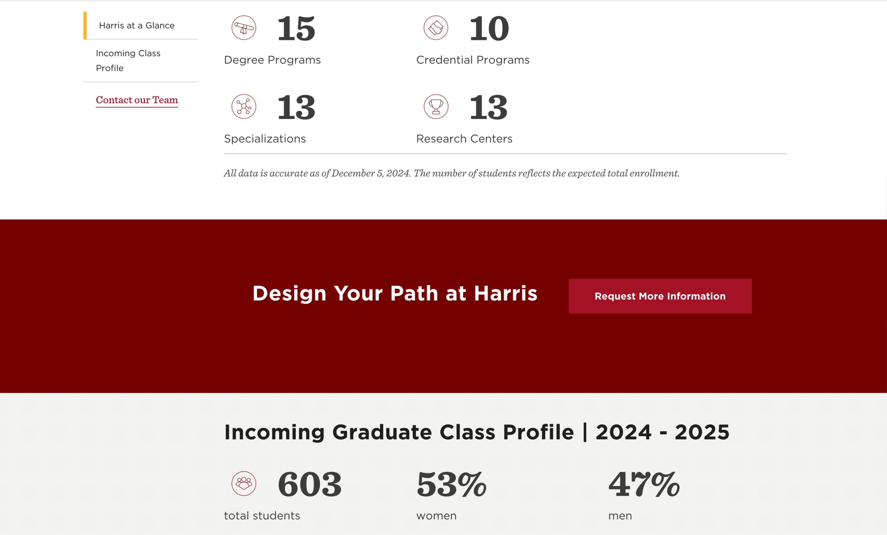
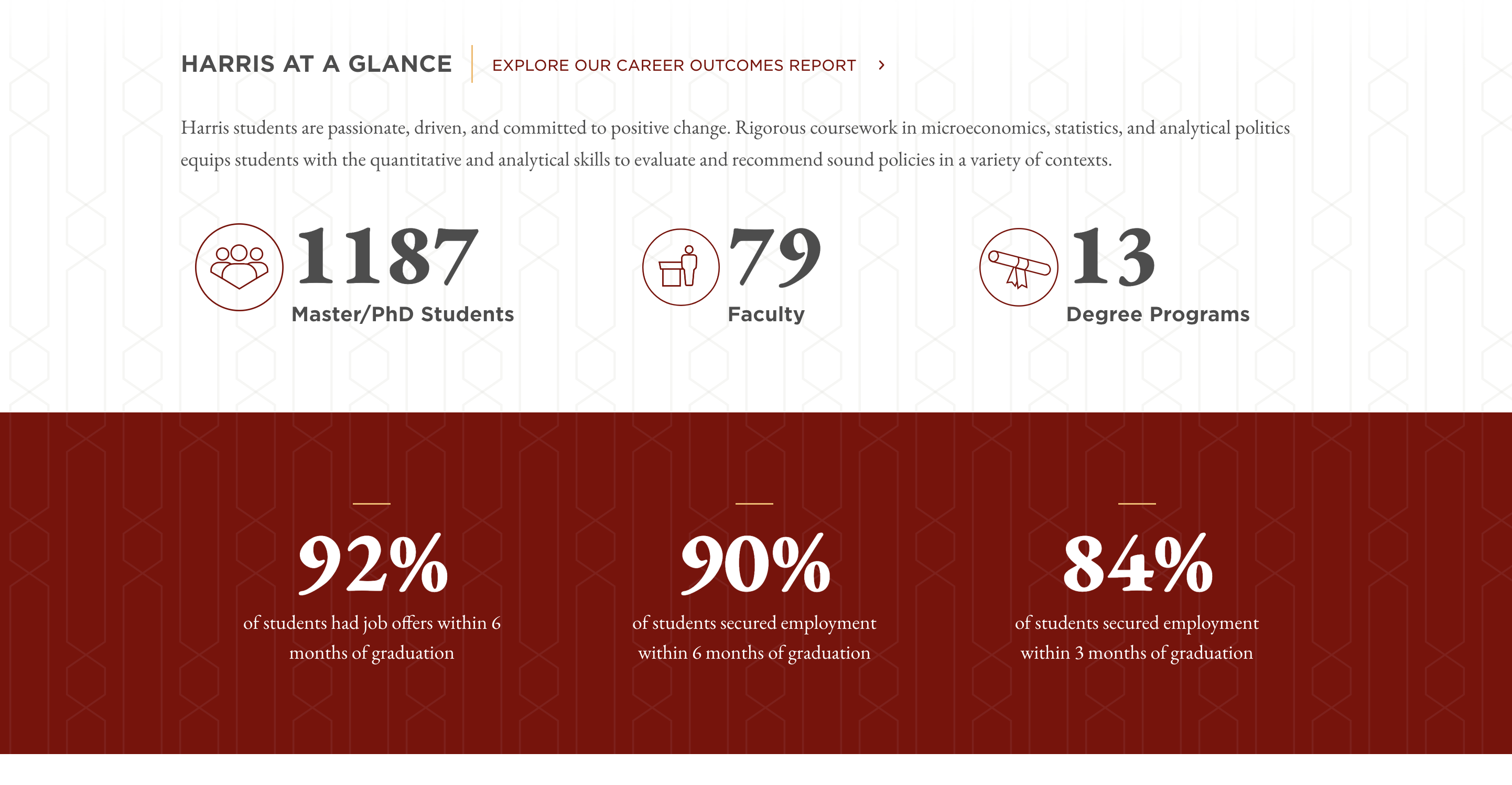
What we love:
- Strong visual hierarchy highlights key metrics at a glance.
- Bite-sized data points paired with a narrative context keep users engaged.
- Mobile-friendly design maintains clarity and readability across screens.
- Specific data points are also presented on the homepage for easy engagement.
Why This Matters for Higher Education Institutions
Your website is more than a digital brochure; it’s the foundation of your institution’s brand experience. From the first homepage visit to exploring courses, stories, and outcomes, every interaction should reflect your mission and inspire your audiences to take action. When design, storytelling, and usability come together, your site doesn’t just inform, it builds connection and trust with students, faculty, alumni, and donors around the world.
What to Do Next
Now is the perfect time to reimagine how your university connects online. Think about where your audiences need the most clarity or inspiration and how your website can meet those needs with simplicity, emotion, and authenticity.
At Sandstorm, we help higher education institutions blend strategy, UX design, and storytelling to create digital experiences that truly engage. Let’s start a conversation.