10 of the Best Healthcare Websites to Inspire Your Next Site Redesign

SUMMARY
Discover ten healthcare websites setting the standard for patient-centered digital experiences. From bold branded homepages to rich patient education hubs and seamless appointment scheduling, these examples show how healthcare organizations are meeting patients where they are and earning their trust before they ever walk through the door.
Table of Contents
- Best Branded Experiences
- Best Emotional Brand Experience
- Best Patient Journey
- Best Trust Builder
- Best Find a Specialist Experience
- Best at Explaining Complex Medical Information
- Best Navigation for Complex Care
- Best Integrated Digital Experience
- Best Accessibility & Inclusive Design
- Best AI-Ready Content Experience
What Makes a Great Healthcare Website?
A healthcare website isn't just a digital brochure. It's often the first place a patient turns when they're scared, confused, or making one of the most important decisions of their lives. The stakes are higher than almost any other sector: the wrong UX decision doesn't just frustrate a user; it can delay care or impact trust in a provider.
The best healthcare websites have to do something unique. They need to balance clinical credibility with human compassion. They make complex systems like service lines, providers, locations, and conditions feel approachable and navigable. And they treat every visitor as a patient first, not a transaction.
We reviewed dozens of healthcare websites to identify ten organizations solving some of the industry's biggest digital challenges. Rather than selecting the "best" overall website, we chose organizations that excel in a specific area, from branding and patient education to AI-ready content and accessibility.
Whether you're planning a full redesign or a focused refresh, these examples offer tangible inspiration.
Best Branded Experiences
Your brand is your promise, especially in healthcare. Patients want to trust their providers before they ever meet them, and a strong digital brand is where that trust begins. Here is our top healthcare organization that has created a compelling, immersive brand experience.
Mayo Clinic
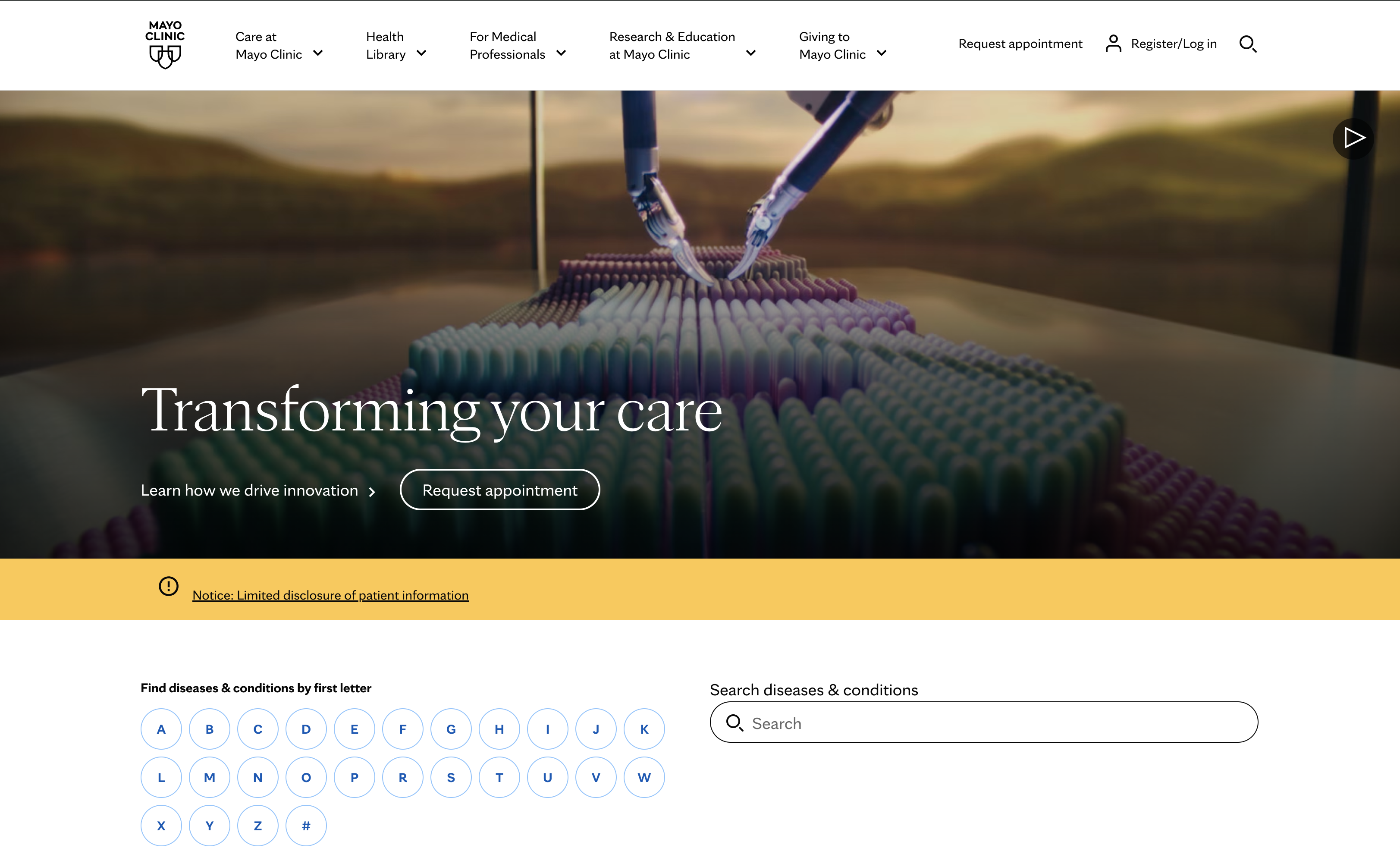
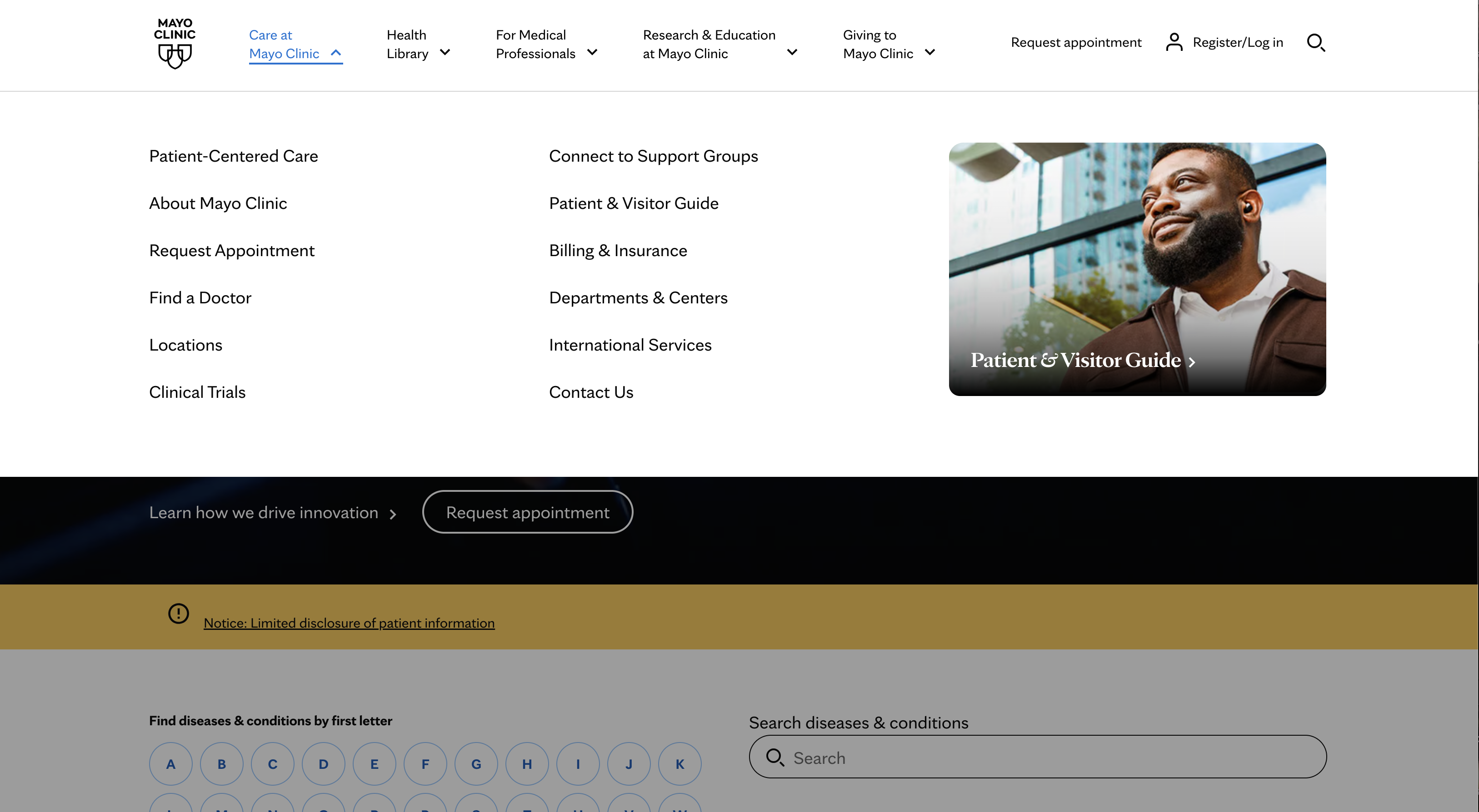
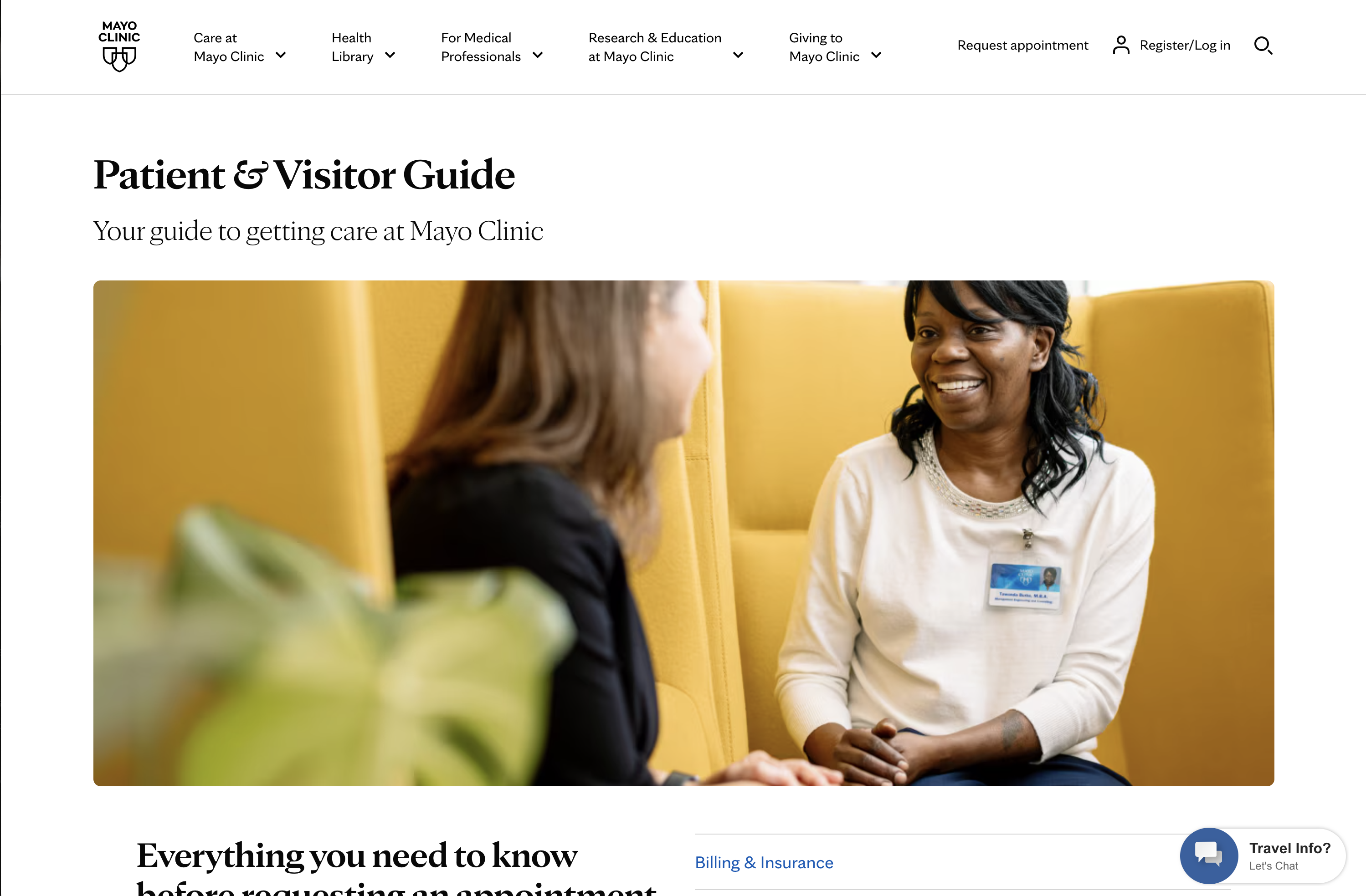
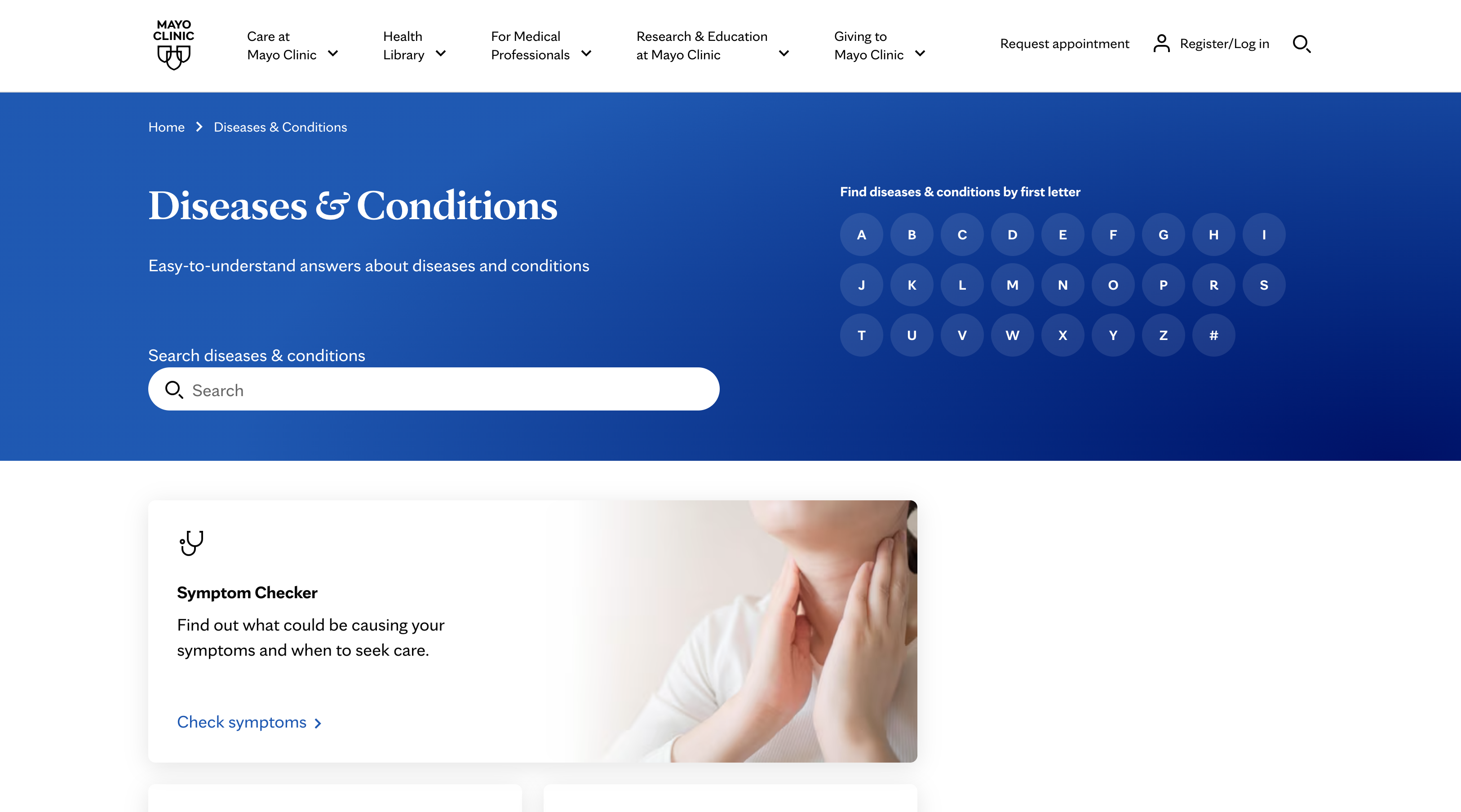
Mayo Clinic is one of the most recognized healthcare brands in the world. The website is clean, editorial, and immediately communicates authority through typography, photography, and an intentional color palette that lets the content breathe.
What we love:
- Calm, uncluttered visual design that reduces anxiety.
- Consistent voice and tone across thousands of pages.
- Patient needs come before institutional messaging.
- Strong balance of education and action.
- World-class content reinforces the brand promise.
- Excellent use of white space and typography.
UX Takeaway
Great brands aren't built with logos and color palettes alone. Every interaction, from photography and typography to content and navigation, should consistently reinforce who you are and why patients should trust you.
Best Emotional Brand Experience
Patients remember how a healthcare experience makes them feel as much as the information it provides. Many visitors to healthcare sites can be in a heightened emotional state. Using visuals, colors, and language can help the visitor feel seen, connected, and even hopeful. Here is our top pick for an emotional healthcare branded experience.
Memorial Sloan Kettering Cancer Center (MSK)
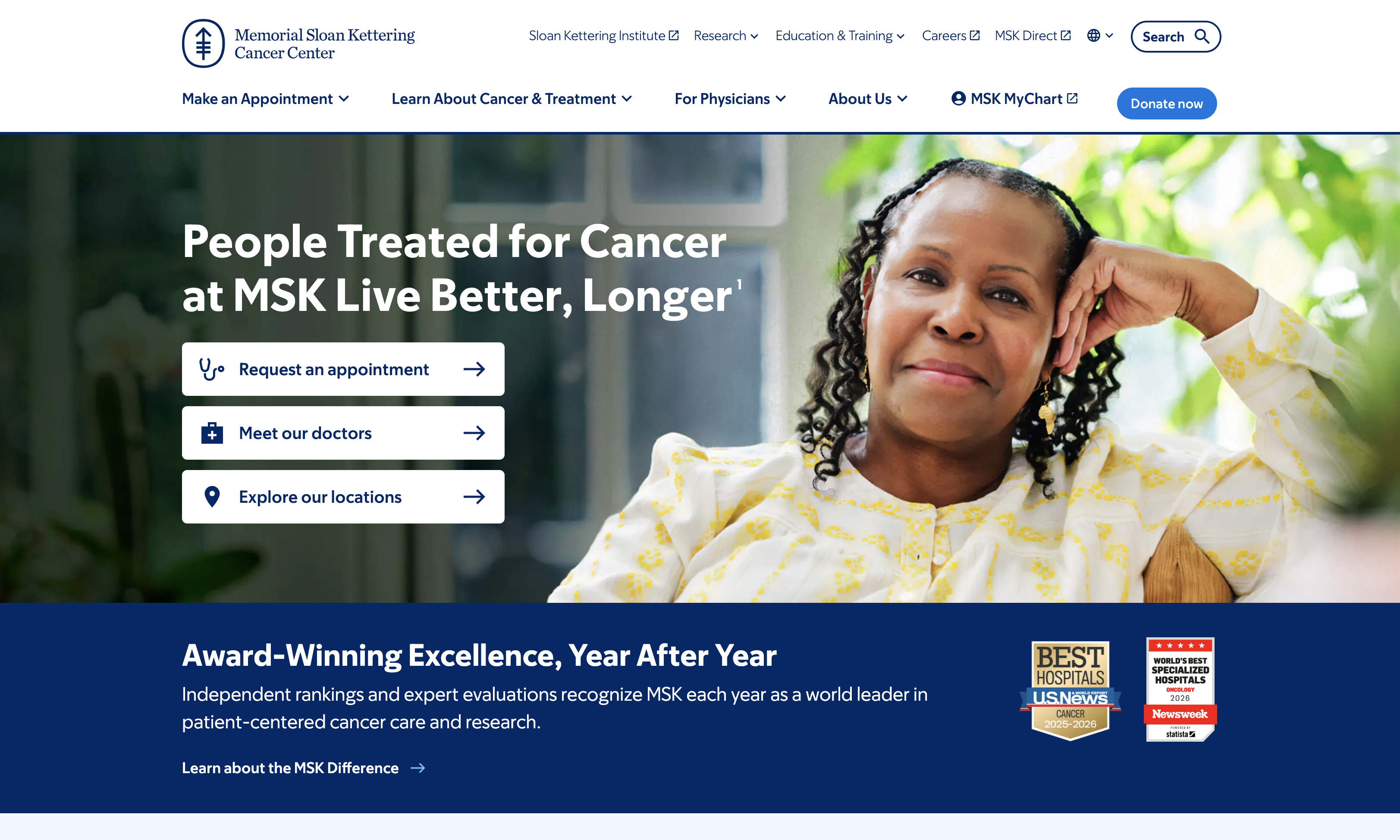
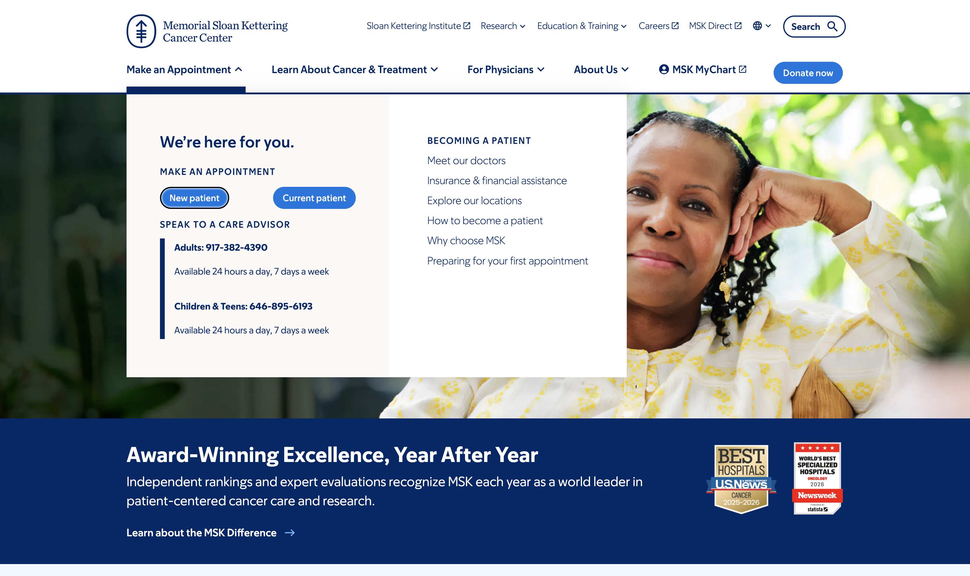
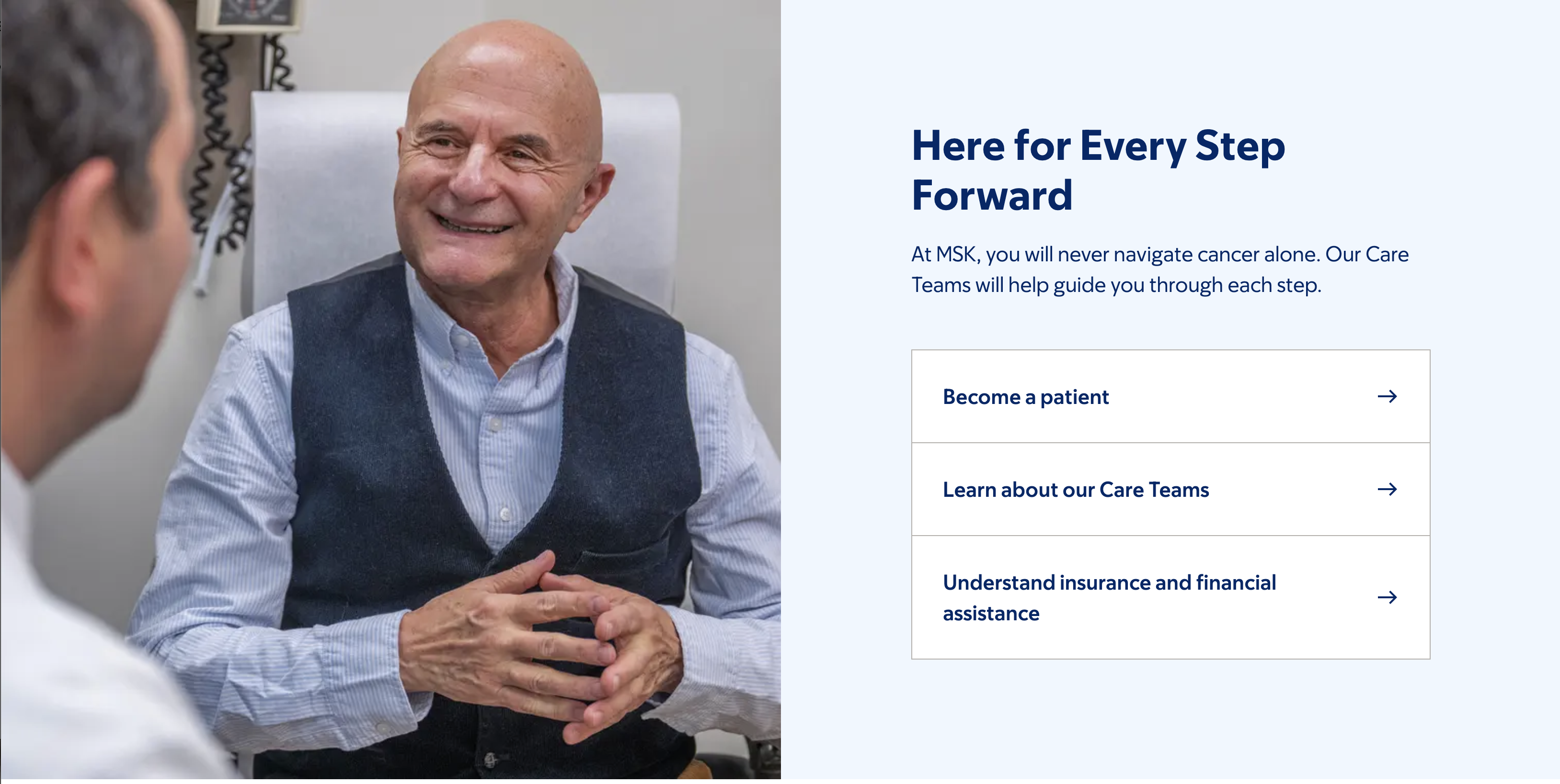
MSK balances clinical excellence with warmth and empathy, creating a digital experience that supports patients and families throughout their cancer journey.
What we love:
- Balances hope with scientific credibility.
- Patient stories feel authentic rather than promotional.
- Photography communicates compassion.
- Excellent use of whitespace.
- Strong editorial voice.
- Complex treatments are presented clearly.
- Research is integrated without overwhelming users.
UX Takeaway
Healthcare is emotional. Thoughtful storytelling, compassionate imagery, and reassuring language can reduce anxiety and help patients feel supported before they ever schedule an appointment.
Best Patient Journey
The best patient journeys anticipate what people need next, guiding them from questions to care with clarity and confidence. Building a digital experience reflecting the patient journey is at the core of this next healthcare website.
Northwestern Medicine
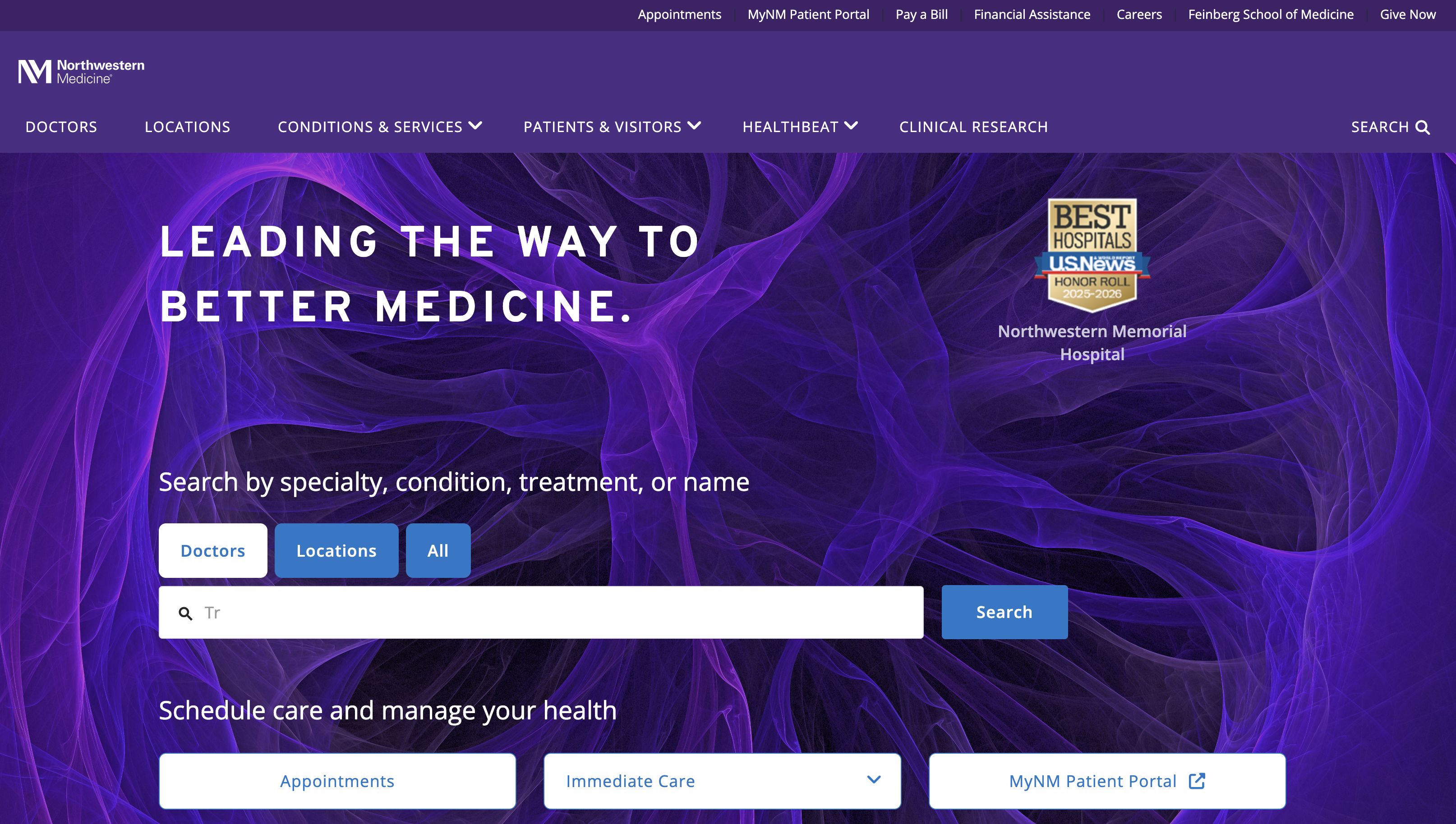
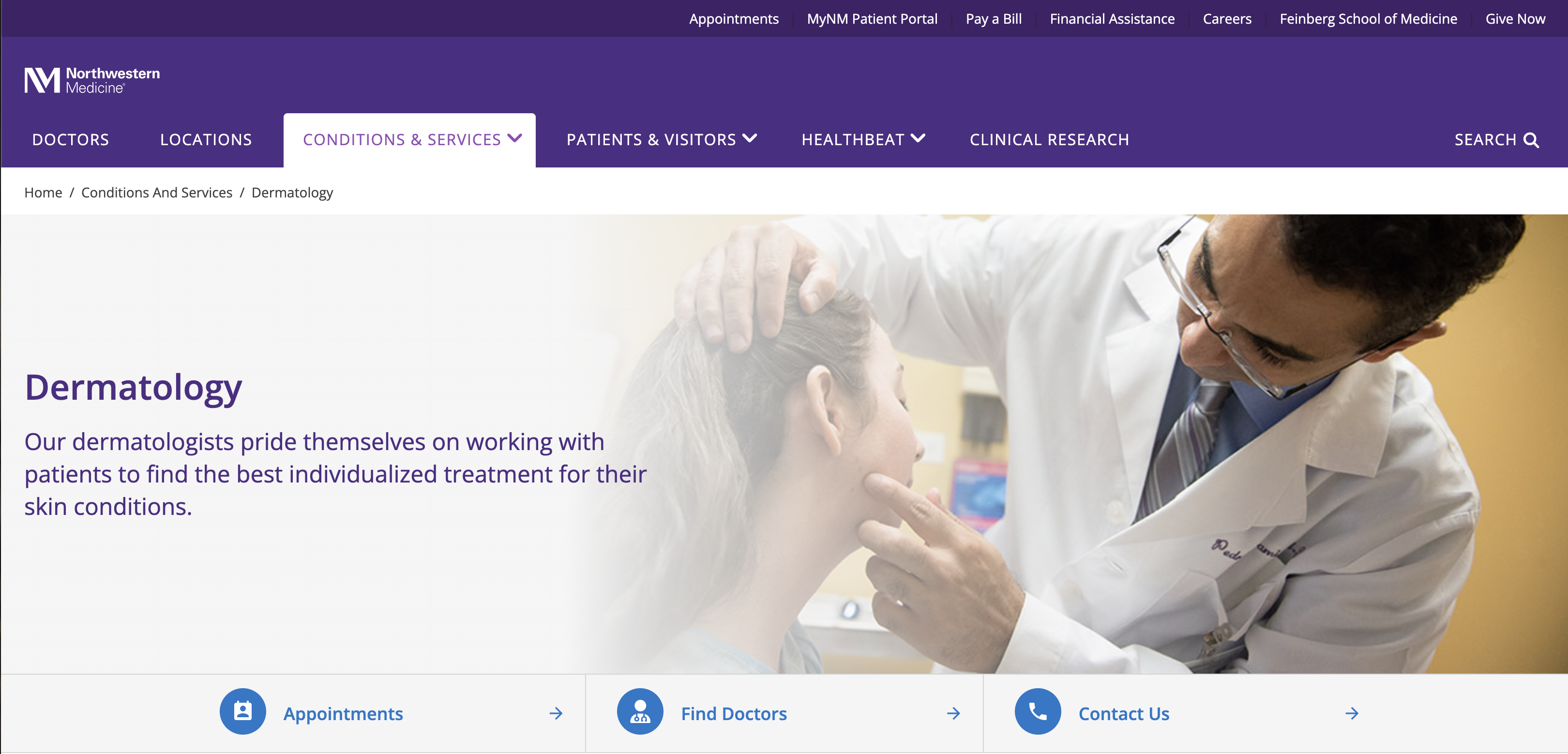
Northwestern Medicine creates a seamless experience by connecting providers, locations, specialties, and scheduling into an intuitive path that helps patients move forward with ease.
What we love:
- Scheduling is prominent throughout the experience.
- Strong integration between providers, locations, and services.
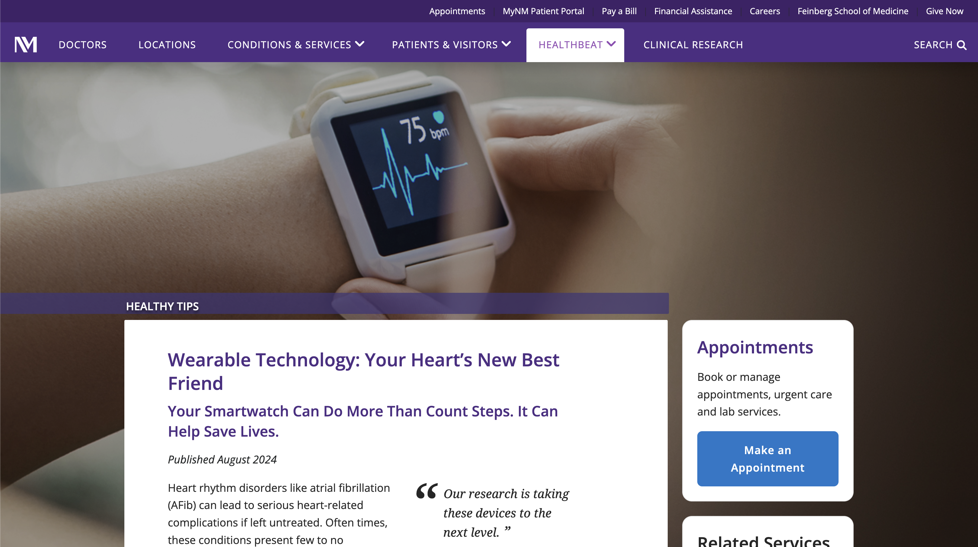
- Helpful next steps on nearly every page ensure patients rarely reach a dead end.
- Clear pathways from symptoms to care.
- Content supports decision-making.
UX Takeaway
Every page should answer one simple question: What should I do next? Clear pathways and well-placed calls to action help patients move confidently from research to care.
Best Trust Builder
Trust is the foundation of every healthcare experience, influencing whether patients feel confident enough to seek care, follow treatment plans, or make important health decisions. Trust is earned through clarity, not marketing. When many users think of a healthcare institution they trust, our next organization is usually at the top of the list.
Cleveland Clinic
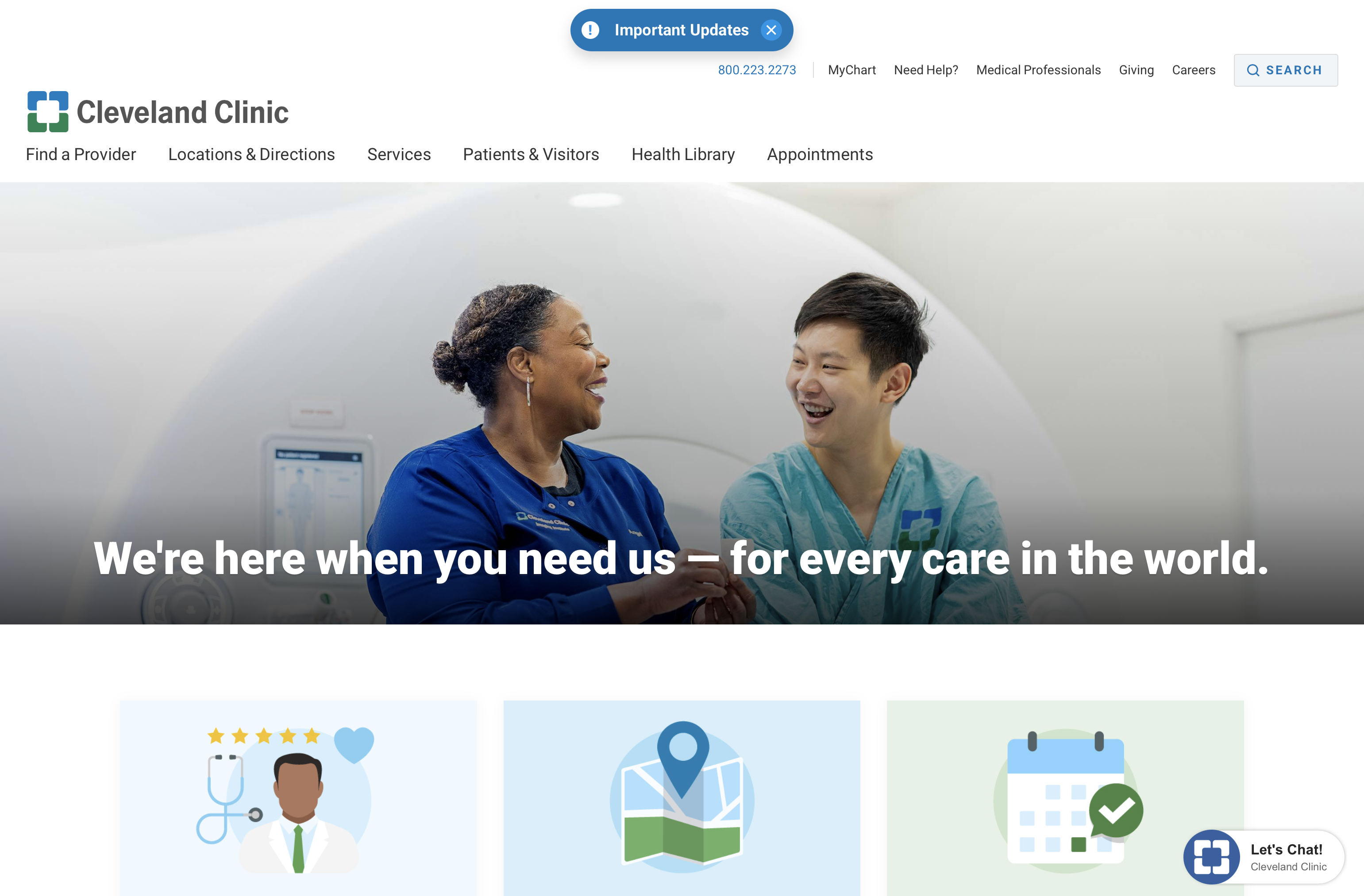
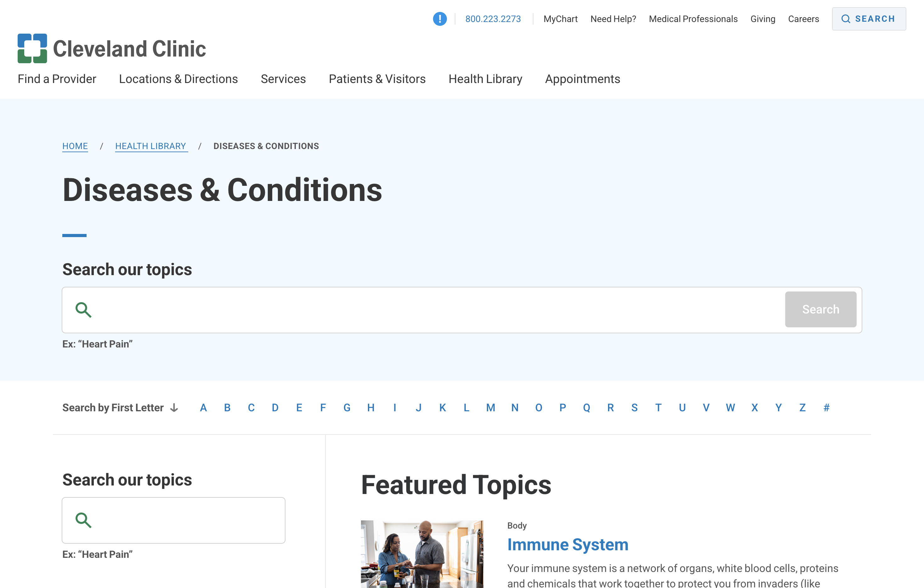
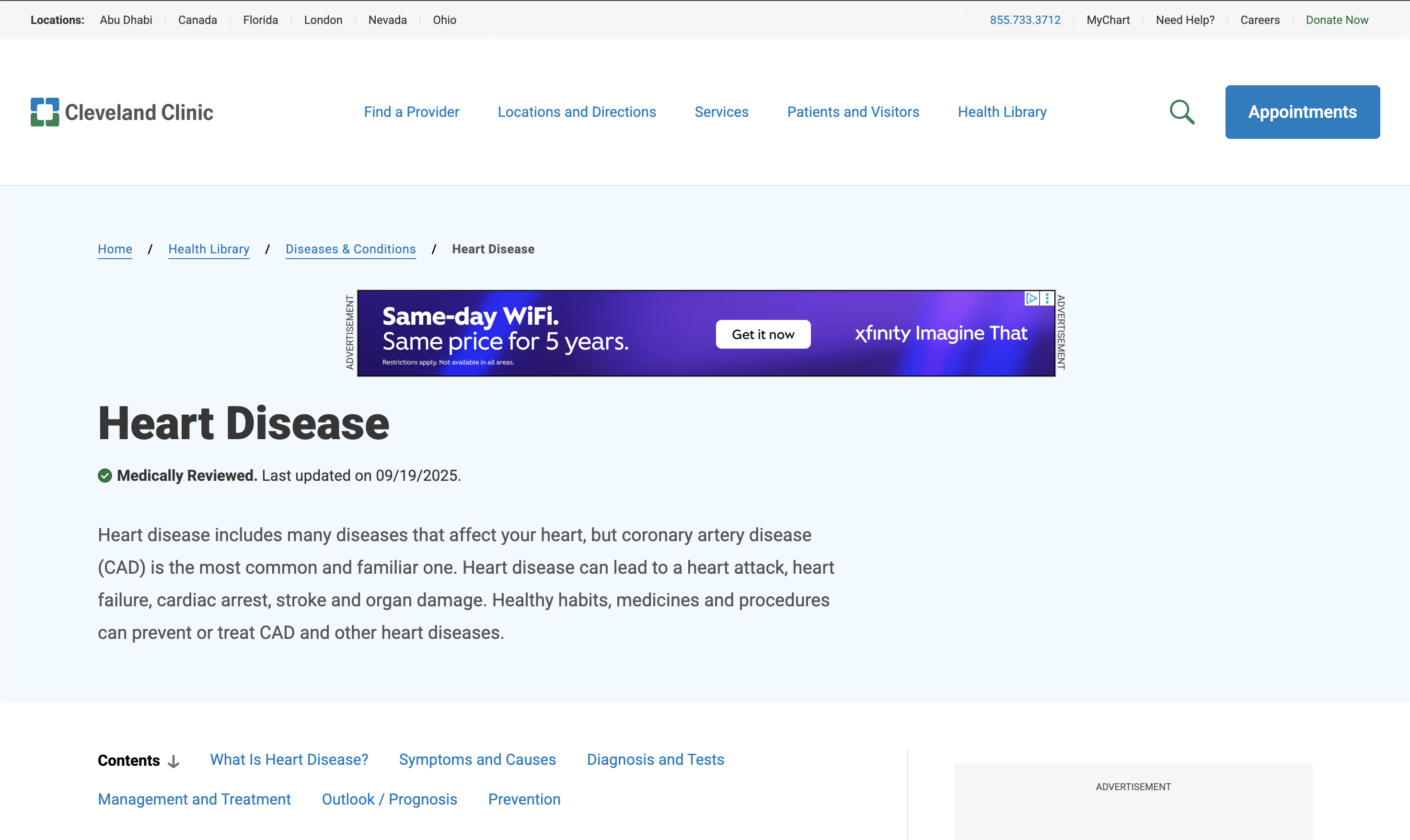
Cleveland Clinic has built one of the world's most trusted healthcare brands by combining world-class medical expertise with clear, evidence-based information that empowers patients.
What we love:
- Physician expertise is highlighted throughout.
- Medical content is evidence-based and easy to understand.
- Clear explanations build confidence.
- Transparent information about treatments.
- Professional but approachable design.
- Helpful FAQs reduce uncertainty.
UX Takeaway
Trust isn't built through marketing claims; it's earned through clear communication, expert-backed content, and a digital experience that consistently delivers on your promise.
Best “Find a Specialist” Experience
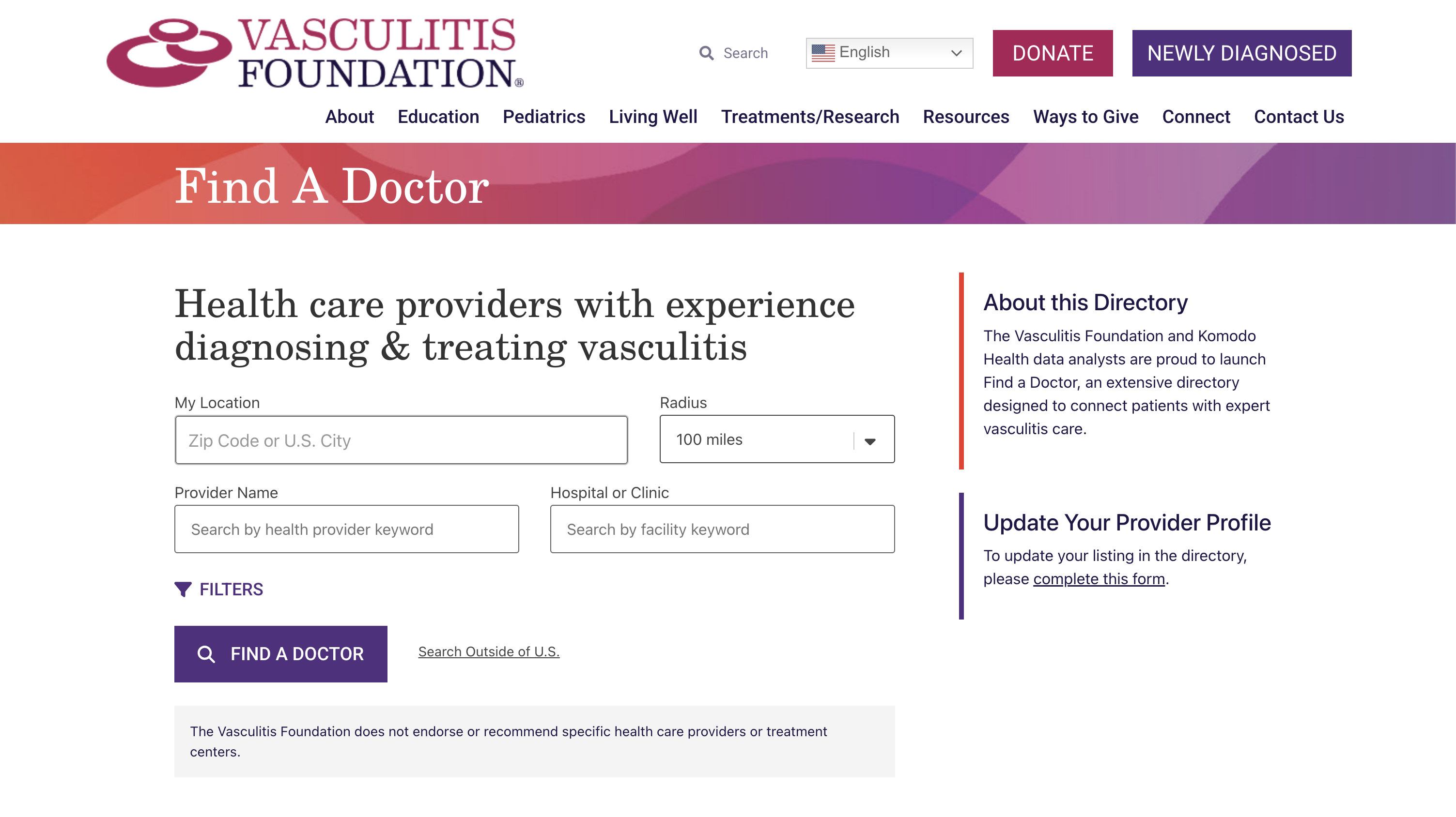
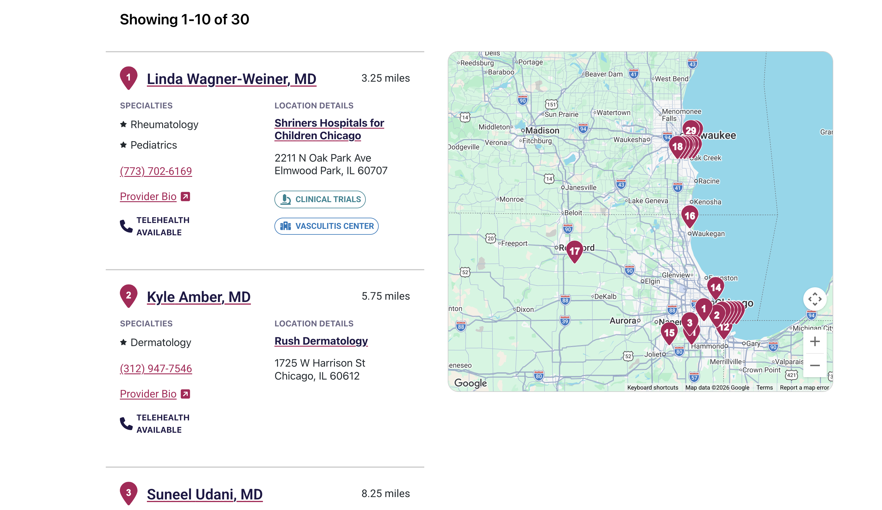
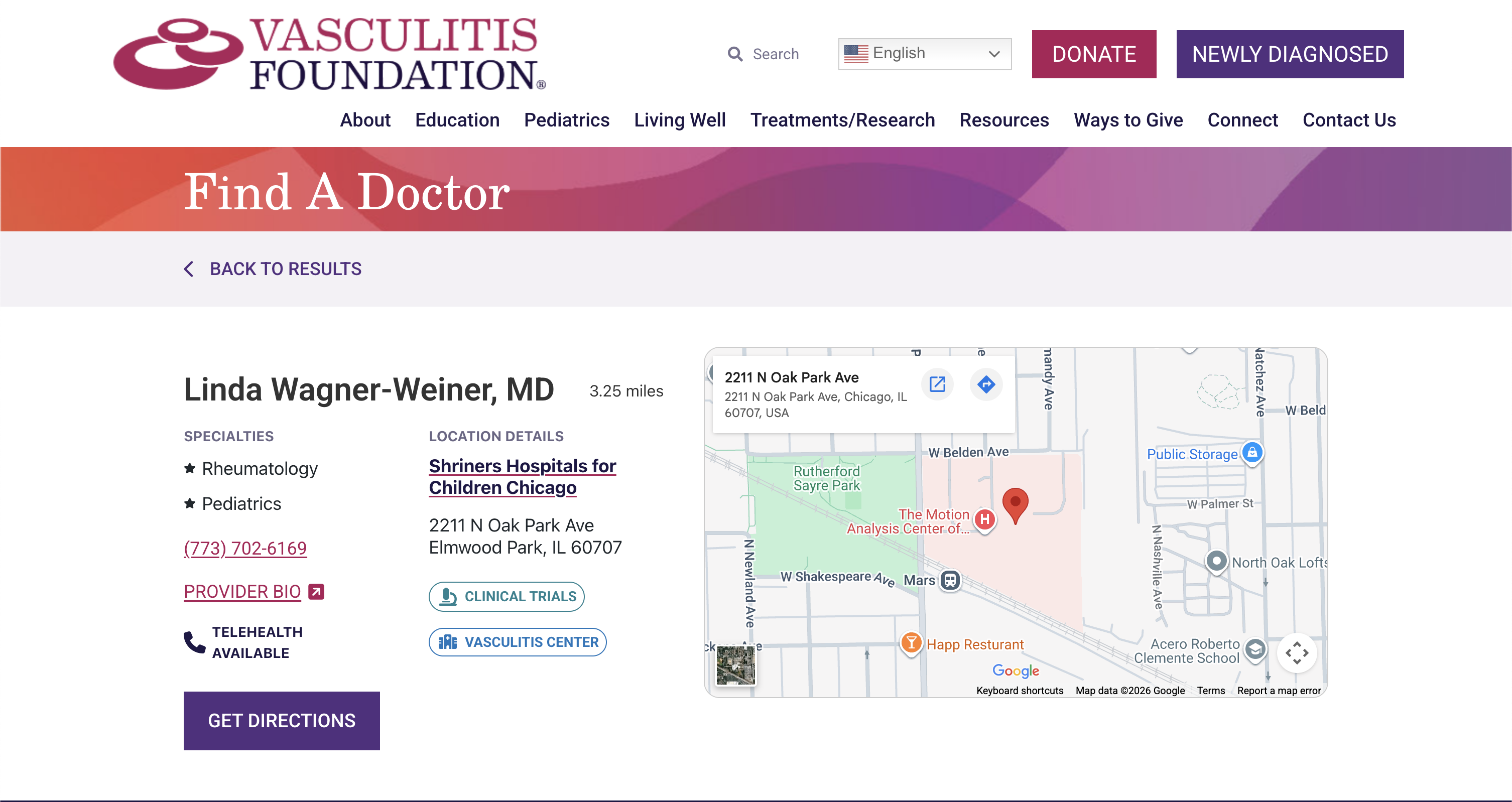
"Find a Doctor" is one of the most searched and most visited experiences on any healthcare system website. The best provider search experiences go beyond a simple directory: they help patients find the right doctor for their specific needs, insurance, location, and preferences, quickly and confidently. Below is the experience we find the most engaging.
Vasculitis Foundation
The Vasculitis Foundation serves patients with rare and complex autoimmune diseases. Finding a qualified vasculitis specialist isn't like finding a primary care doctor since the pool of experts is small, geographically dispersed, and the stakes of finding the right physician are extremely high.
What we love:
- Designed around a rare disease journey.
- Makes difficult-to-find specialists easier to discover.
- Focuses on patient needs rather than organizational structure.
- Supports patients who may not know where to begin.
- Encourages confidence in finding expert care.
- Strong integration with disease resources.
UX Takeaway
Patients don't want to browse a directory; they want confidence they've found the right provider. Design search experiences around patient goals, not organizational structure.
Best at Explaining Complex Medical Information
Healthcare information can be overwhelming, especially for patients facing a new diagnosis or caring for a loved one. Breaking complex medical topics into clear, plain language helps patients make informed decisions and feel more confident about their care. Here is our pick for a website that explains complex medical information.
Children's Hospital of Philadelphia (CHOP)
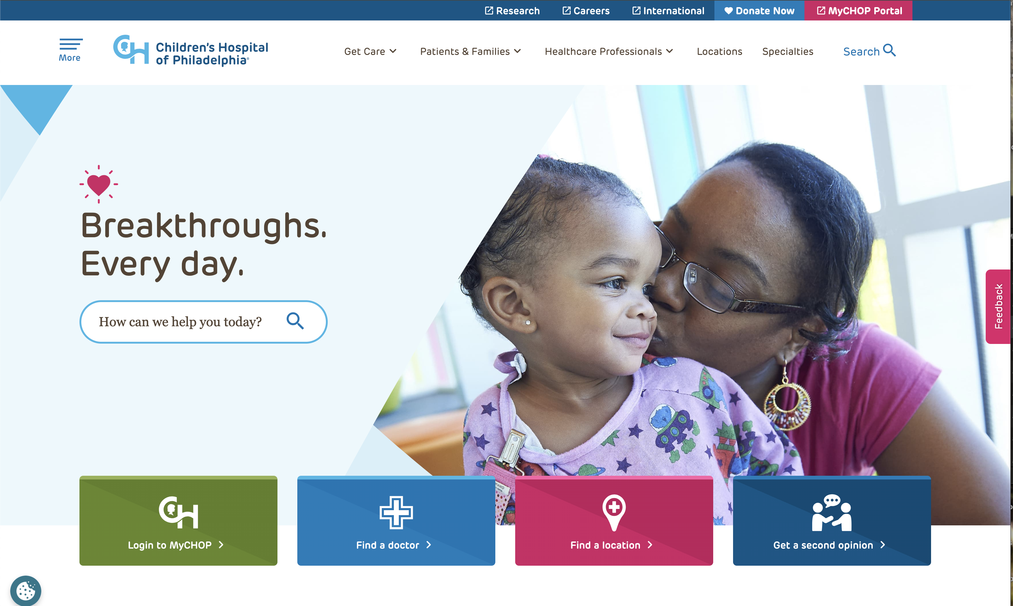
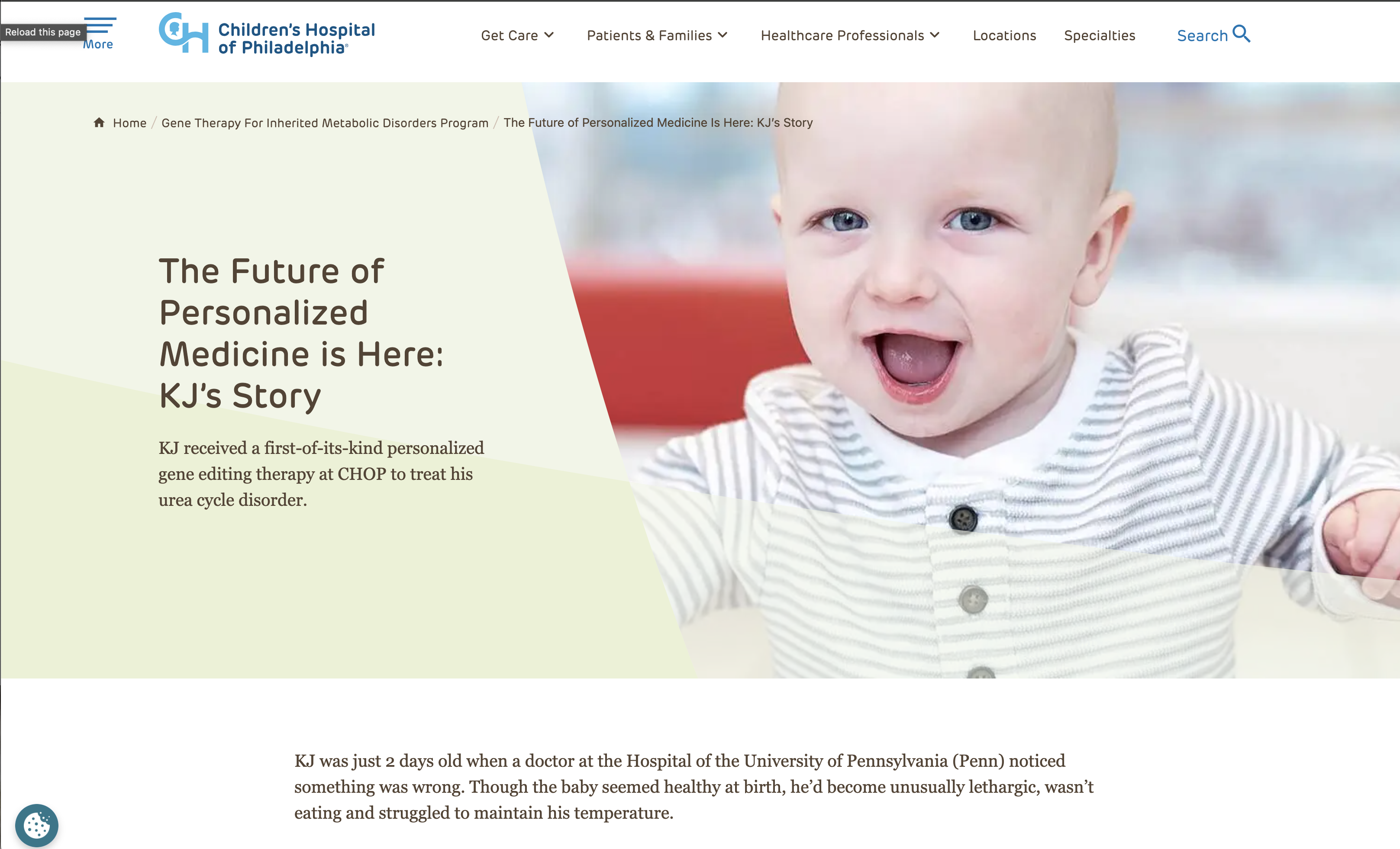
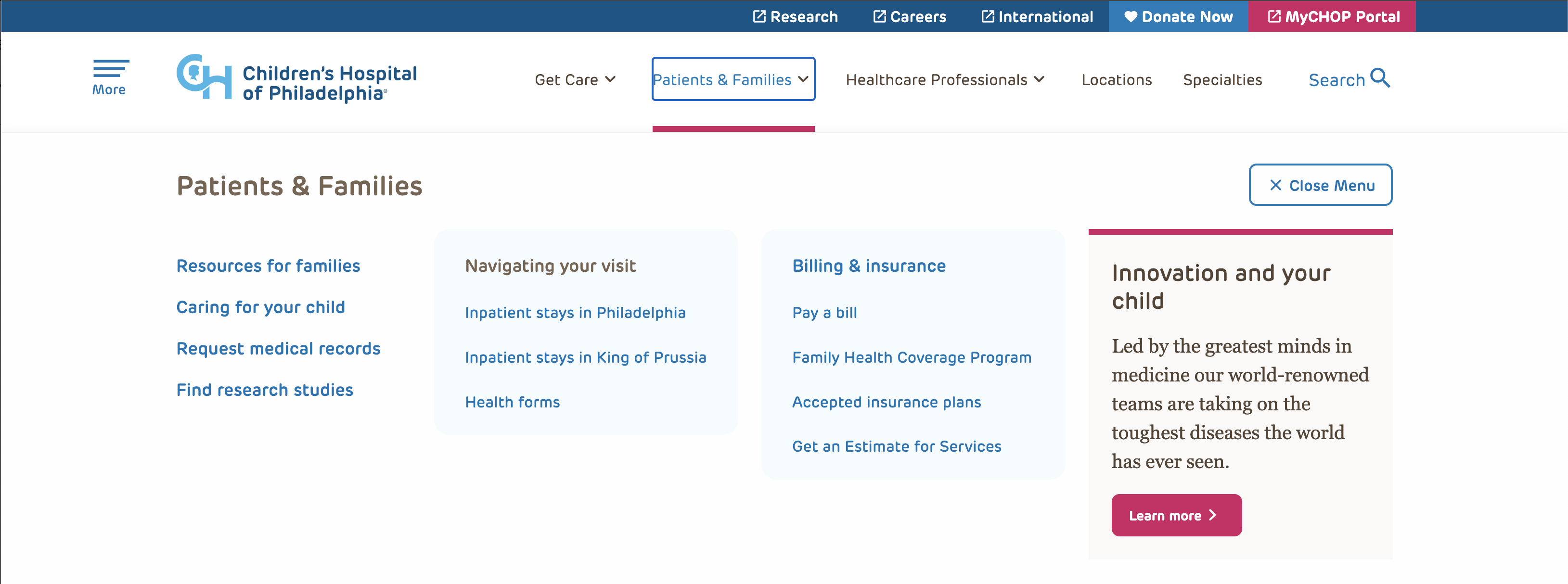
CHOP is consistently ranked among the top children's hospitals in the country, and its digital experience matches that reputation. The site excels at meeting the emotional complexity of a pediatric healthcare audience, from parents in fear, children in need, and families in transition.
What we love:
- Excellent plain language writing.
- Content is organized around parents' questions.
- Medical concepts are broken into digestible sections.
- Strong visuals support understanding.
- Educational resources are easy to scan.
- Age-specific guidance.
- Clear calls to action when additional care is needed.
UX Takeaway
Patients shouldn't need a medical degree to understand their health. Plain language, thoughtful organization, and scannable content help people make informed decisions with confidence.
Best Navigation for Complex Care
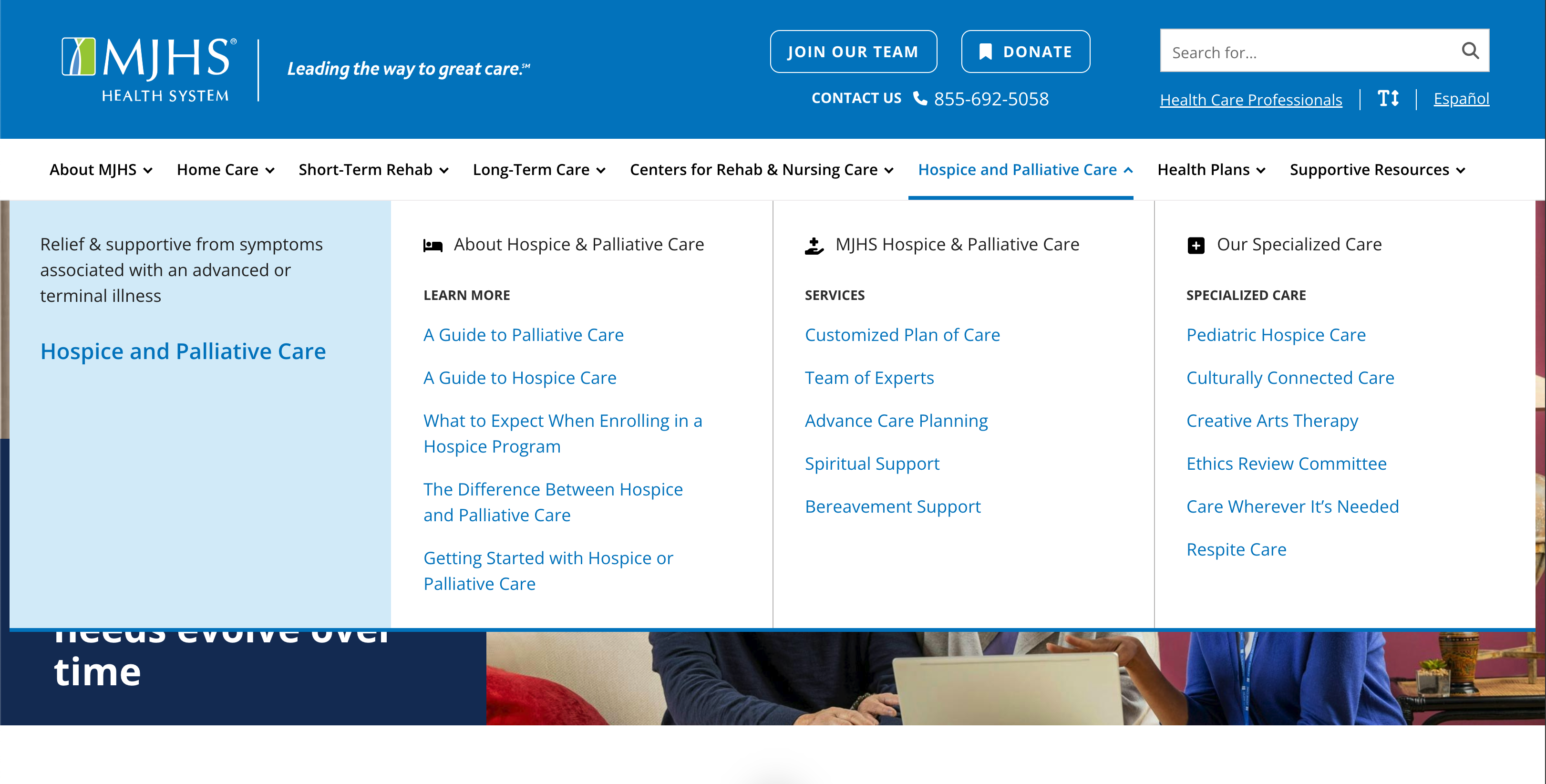
Healthcare websites are among the most content-heavy on the internet. A single health system may offer dozens of service lines, hundreds of providers, multiple locations, and thousands of pages of patient education content. Poor navigation in healthcare doesn't just frustrate users; it can prevent patients from getting care. Here is one organization doing navigation exceptionally well.
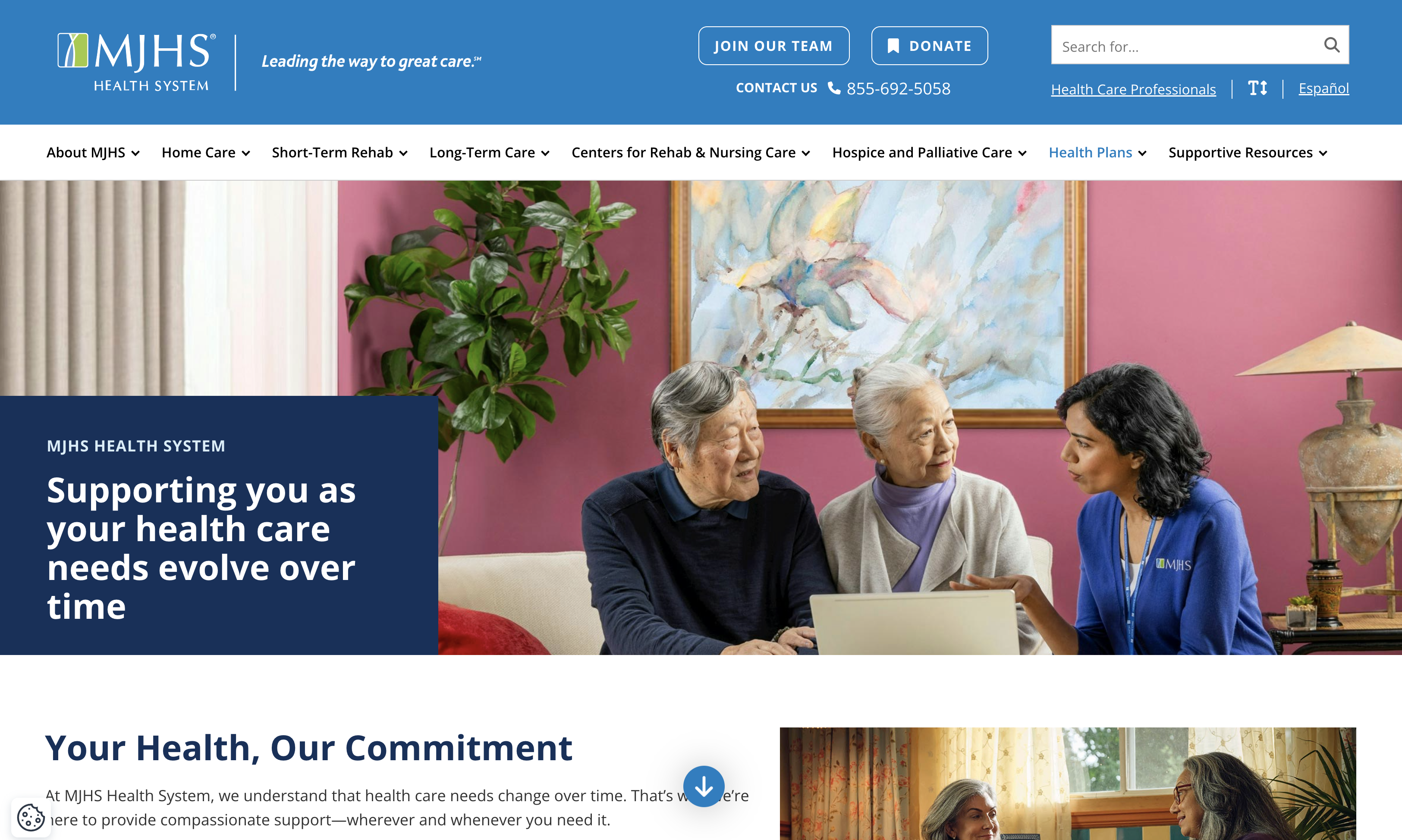
MJHS
MJHS (Metropolitan Jewish Health System) is a New York-based nonprofit health system serving older adults and people with serious illness. The MJHS brand experience is warm, dignified, and deeply human, all qualities that are essential when your audience includes patients and families navigating care. The navigation reflects how people think, not how the organization is structured.
What we love:
- Organizes content around patient needs instead of internal departments.
- Multiple services are presented without overwhelming users.
- Clear audience pathways.
- Strong landing pages connect related content.
- Easy to move between care options.
- Supports caregivers as well as patients.
- Simplifies a very complex organization.
UX Takeaway
Organize your navigation around how patients think, not how your organization is structured. A clear information architecture reduces frustration and helps people find care faster.
Best Integrated Digital Experience
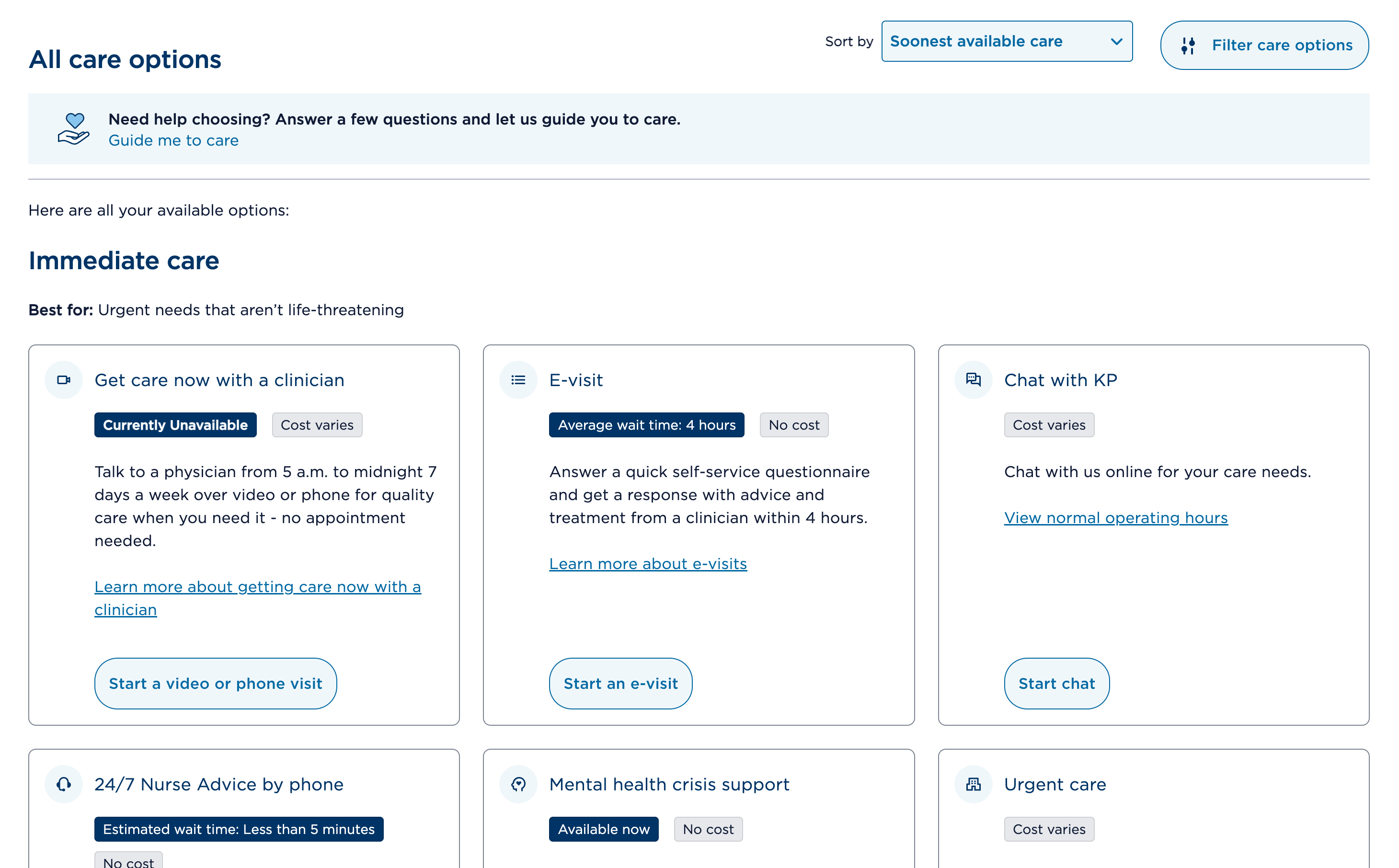
Patients don't think in terms of departments, providers, or insurance systems. They simply want to accomplish a task. An integrated digital experience connects appointments, providers, coverage, and health information into one seamless journey, reducing frustration and making it easier to get the care they need. Our next website is our pick for a great digital experience.
Kaiser Permanente
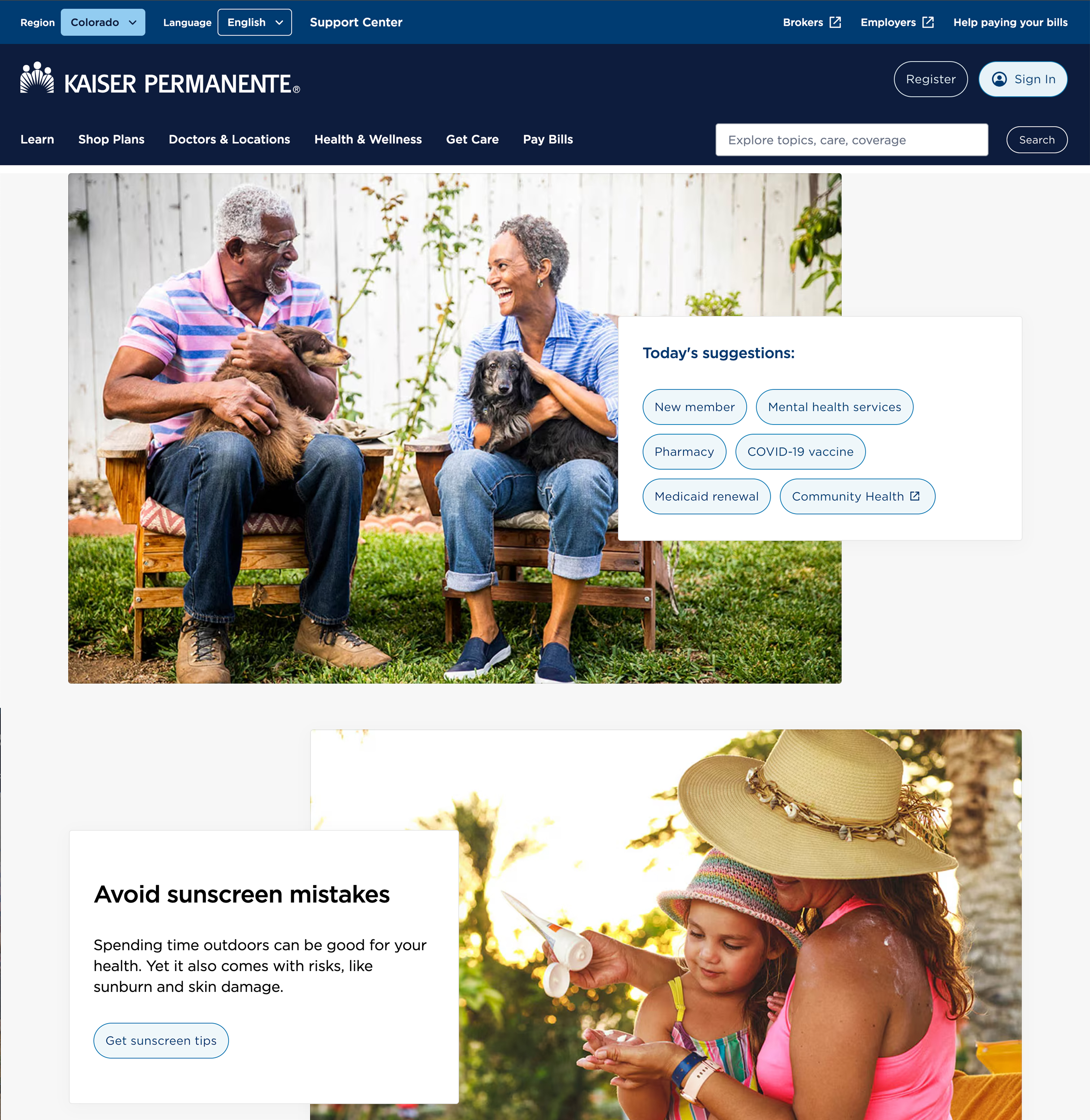
Kaiser Permanente operates as both a health plan and a health system, which means its navigation has to serve two distinct and sometimes overlapping audiences: members seeking care and people evaluating membership. They handle this complexity with clarity and discipline. Patients shouldn't have to think about organizational silos.
What we love:
- Insurance and care work together seamlessly.
- Strong integration between appointments, providers, and coverage.
- Consistent experience across services.
- Excellent mobile functionality.
- Unified brand experience.
- Convenient digital self-service.
UX Takeaway
Patients expect one connected experience, regardless of how many systems exist behind the scenes. Integrating appointments, providers, coverage, and digital services creates a more seamless journey.
Best Accessibility & Inclusive Design
Accessibility is essential in healthcare because every patient deserves equal access to information, services, and care, regardless of their abilities or the technology they use. An accessible website reduces barriers, builds trust, and helps more people confidently take the next step in their healthcare journey. Here is our pick for a great accessible healthcare website.
University of California San Francisco (UCSF Health)
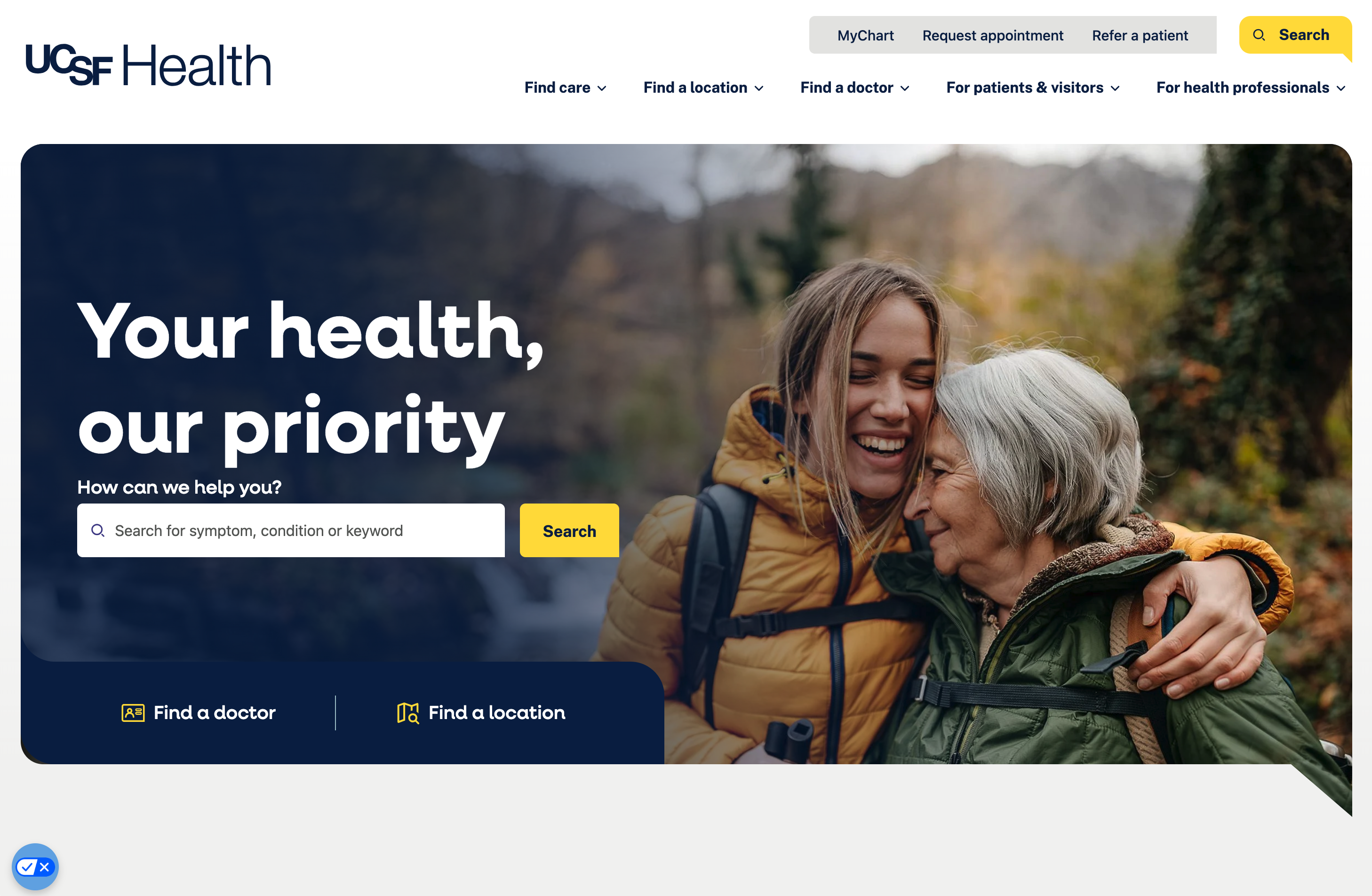
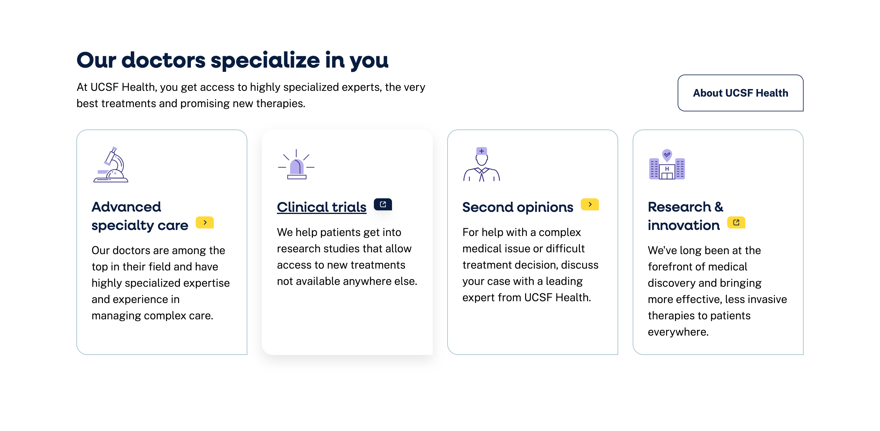
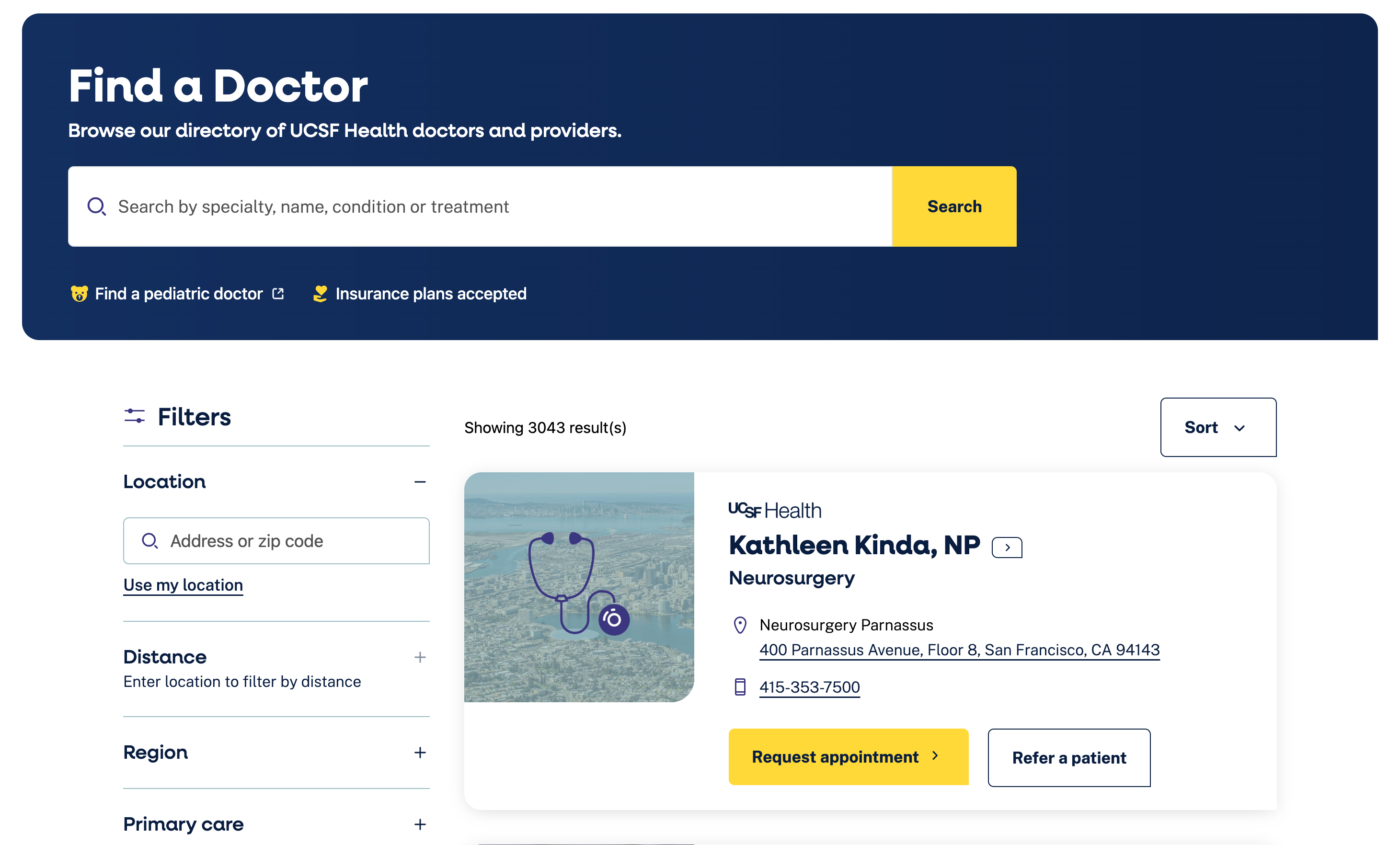
UCSF Health is one of the nation's leading academic health systems, recognized for its excellence in patient care, biomedical research, and health sciences education. Its digital experience reflects that commitment with accessible, easy-to-navigate content that helps patients confidently find information and care.
What we love:
- Clean, readable layouts with strong color contrast and typography.
- Logical heading hierarchy and plain-language content.
- Clear forms and interactions.
- Mobile-friendly design.
- Supports a wide range of users and abilities.
UX Takeaway
Accessibility benefits everyone. Designing for people with diverse abilities creates experiences that are easier to navigate, easier to understand, and more effective for every patient.
Best AI-Ready Content Experience
More patients are turning to AI tools to understand symptoms, explore treatment options, and prepare for conversations with their care team before ever visiting a healthcare website. Creating AI-ready content with clear structure, plain language, and trustworthy information helps ensure your expertise is accurately represented wherever patients are looking for answers. Below is our pick for the institution that is AI-content ready.
Johns Hopkins Medicine
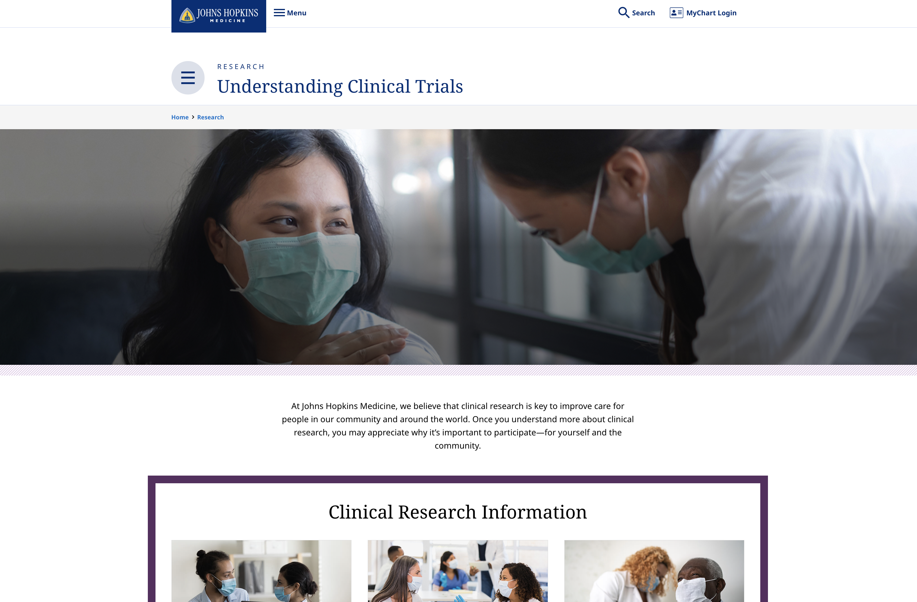
Johns Hopkins Medicine is one of the world's leading academic health systems, known for pioneering research, exceptional patient care, and medical education. Its website reflects that leadership by making complex medical information clear, trustworthy, and easy to understand.
What we love:
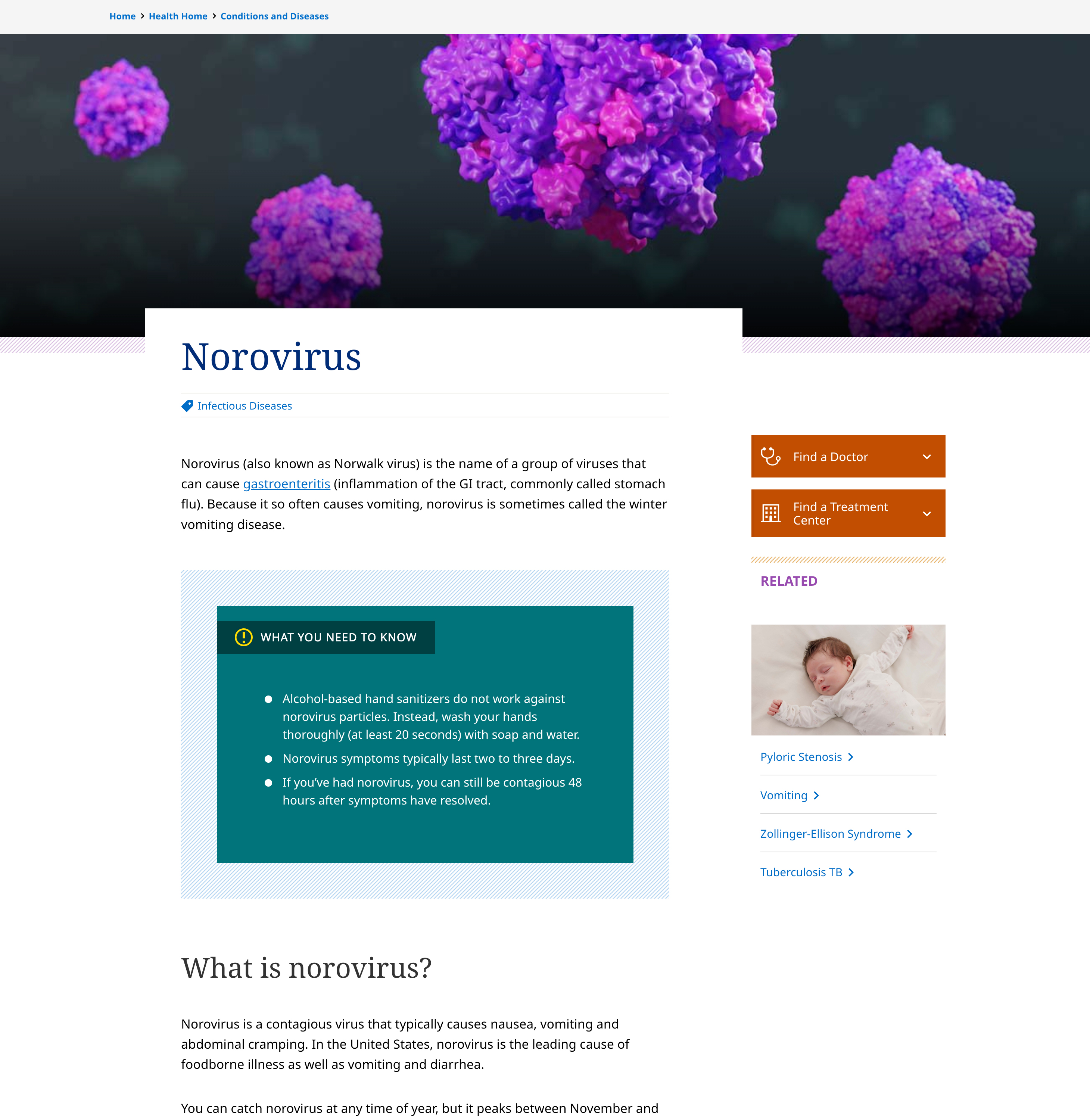
- Excellent example of progressive disclosure: readers get the essential information first, then can explore more detailed sections as needed.
- Clear takeaway content is being presented as “what you need to know”.
- Strong heading hierarchy.
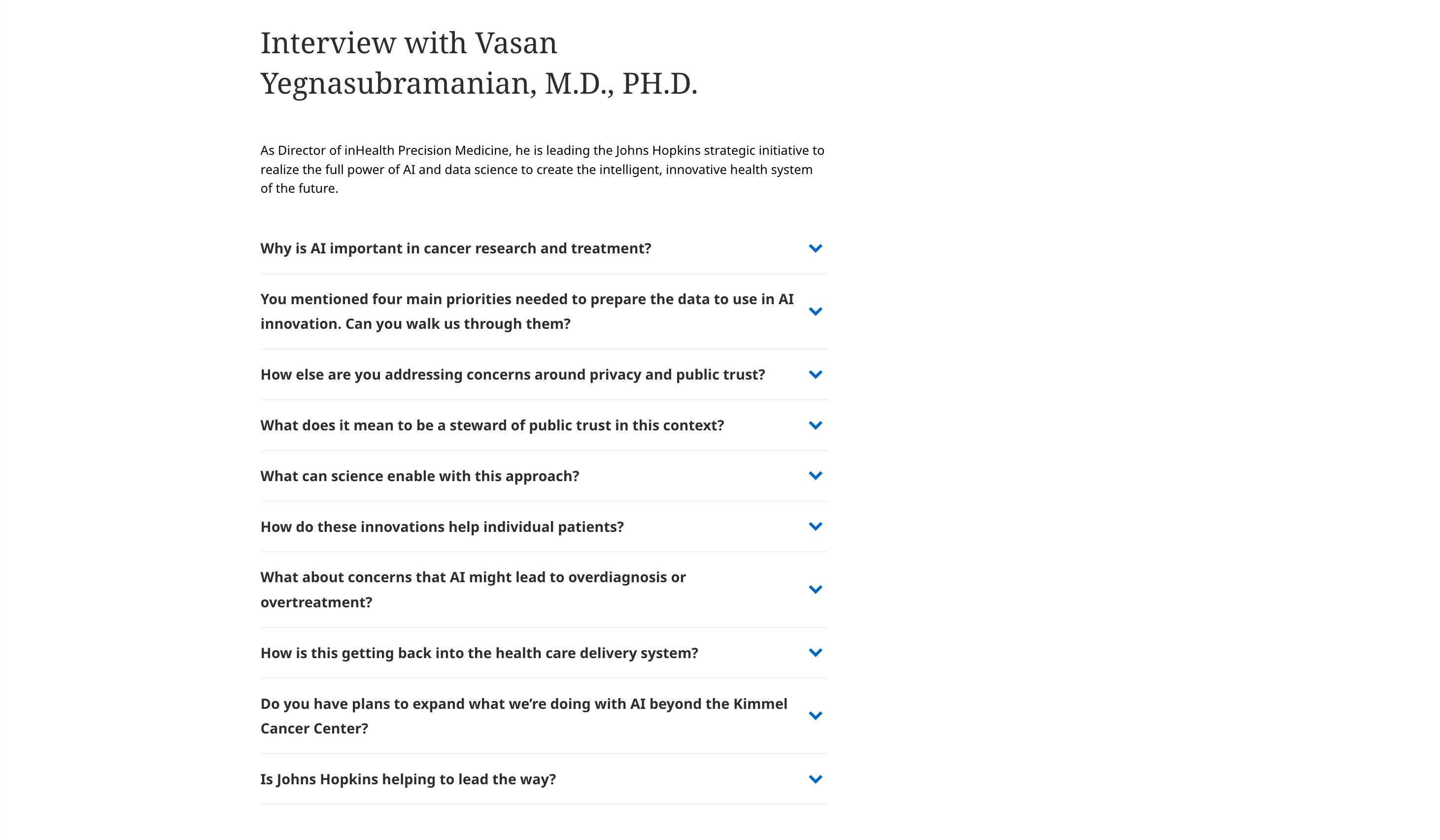
- Question-driven organization.
- Great use of FAQ modules within an interview.
- Related content presented in context.
UX Takeaway
The best AI-ready content is simply well-structured content written for humans first. Clear summaries, meaningful headings, question-based organization, and expert-backed information help patients and AI find the answers they're looking for.
Why This Matters For Your Healthcare Website Redesign
Your website is often the first interaction a patient has with your organization, and it may happen during one of the most stressful moments of their life. The healthcare organizations featured here understand that great digital design isn't just about aesthetics. It's about reducing anxiety, building trust, and removing barriers to care.
When strategy, UX research, and accessible design come together in healthcare, the result isn't just a beautiful website. It's an experience that changes how patients feel about their care before they ever walk through the door.
What to Do Next
If your healthcare website isn't earning patient trust, guiding users to the right care, or converting visitors into patients, use these examples to help spark some new ideas. And if you’re ready to start your own project, we’d love to help you align your site with your mission and your patients’ needs; contact us today.