
Create Custom GA4 reports with Looker Studio: Pt.1

Summary
In Part 1 of our Looker Studio blog series, we guide you through the foundational steps of building custom GA4 reports using Google's free Looker Studio tool. From connecting your GA4 property to creating filtered charts and exploring dimensions and metrics, this post is a hands-on walkthrough for marketers, analysts, and IT pros looking to gain deeper insights from their website data. Learn how to filter by geography, adjust date ranges, and visualize sessions—all within a user-friendly reporting dashboard designed to overcome GA4's native reporting limitations.
Why Use Looker Studio for GA4 Reporting?
For modern-day IT professionals and marketers, the use of analytics, data, and insights is crucial to inform our decision-making. A key tool in our suite is Google Analytics, which (not surprisingly) has almost 90% of the analytics market share.
You’ve likely dealt with the transition from Universal Analytics to Google Analytics 4 this past summer. The transition phase for many was rushed to ensure they didn’t lose any tracking or data. Now that we’re in this post-transition phase, many have realized that they don’t have the flexibility in reporting GA4 data that was readily available in Universal Analytics.
Luckily, Google offers Looker Studio, a free service that allows you to create custom reports in GA4 (as well as lots of first-party supported and third-party data sources) and build flexible, responsive reports.
What is Looker Studio?
Previously called Google Data Studio, Looker Studio is a responsive data analytics reporting dashboard that allows you to build custom reports primarily using Google Analytics data. We love it at Sandstorm because it offers much more flexibility than GA4’s built-in reporting, with many of the following features:
- Support for multiple data connections (such as Google Sheets, Google Ads, etc)
- Dynamic data tables that allow for user manipulation (such as scrolling past the top 10 items in a list)
- Access to every metric and dimension in your GA4 property (GA4 reporting can be stingy about which metrics can be used with which dimensions)
- A large library of third-party data connections and community-built dashboards and themes
- The ability to easily share reporting as a dynamic link or a PDF
- And much, much, much more!
Great! Where Do I Start?
As mentioned above, Looker Studio is free to use with a Google account. Some community and third-party data connectors do charge a fee, but Looker Studio has enough built-in to likely be robust enough for your reporting.
To get started, simply navigate to the Looker Studio homepage and click the blue call to action button to get started (note: if you’re not yet signed into a Google account, you’ll be prompted to sign in at this point). If this is your first time logging in to Looker Studio, you’ll likely be prompted to fill in some information about your organization and what your primary use for Looker Studio will be.
Getting a Lay of the Land
After filling out your onboarding information, you’ll be brought to a blank dashboard that should look similar to the one below:
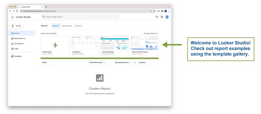
Before creating your own report, it may be helpful to have a look at some of the example templates that Google provides. This is a great opportunity to see what Looker Studio is capable of with different data connections. Now, let’s dive into how to create custom reports in GA4 using Looker Studio’s visual tools and connectors to define your metrics, dimensions, filters, and date ranges.
Creating a Connection
To create a new report, click on the “Create” button in the top-left corner of the dashboard, and then select “Report” from the dropdown menu that appears:
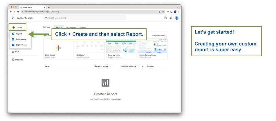
This will bring you to the Report Builder and immediately open the Connector menu.
The Connections Menu
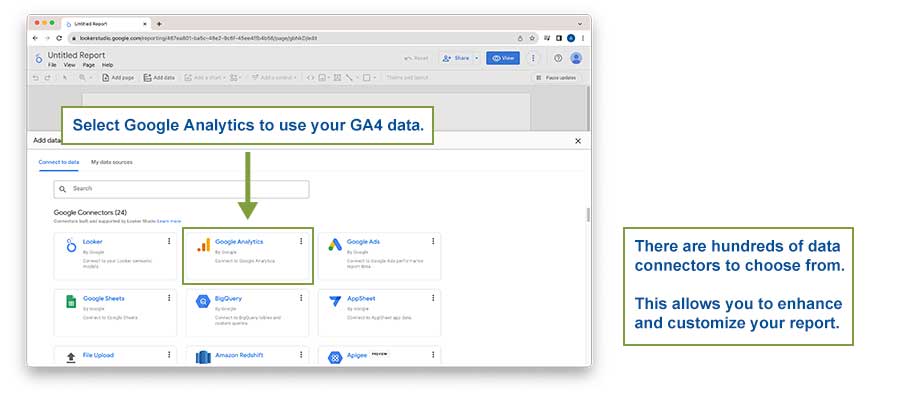
Here you can browse the wide variety of connectors Looker Studio includes out of the box (mostly for Google products). A connector is an API for a specific service that allows Looker Studio to pull data from said service.
The first twenty-four or so connectors are first-party, Google-built APIs. Scrolling further down the list reveals Partner Connectors, or third-party APIs given the Google seal-of-approval for use in Looker Studio. There are quite literally hundreds of these connectors that Google has approved for a wide variety of services, such as Trade Desk, Shopify, and AWS.
There are also third-party connectors that enhance the data coming from Google services, such as Supermetrics’ Google Analytics 4 connector. Many of these third-party connectors offer free trials, but it is important to note that a majority of these third-party connectors do eventually incur a fee for continued use. With hundreds of these third-party connectors, pricing models vary. Thankfully for us, everything within the “Google Connectors” is free of charge.
Let’s select the Google Analytics connector for now.
The Google Analytics Connector
Once selected, you’ll be brought to a list of all the accounts you have access to via your Google account. Once you select an account, select the property you would like to import into Looker Studio.
In this example, we’ll be importing data from our own website, www.sandstormdesign.com (shameless plug). Your path should look something similar to the below:
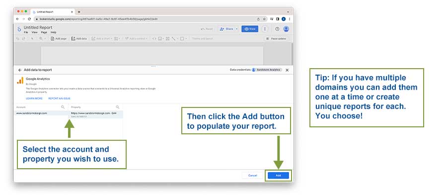
Once you’ve selected your data source, click the blue Add button in the bottom right corner of the Connector menu.
Congratulations - the connection has been made!
Chart Party!
You may have noticed that when you successfully added your data source, Looker Studio automatically created a data table with event data from your connection.
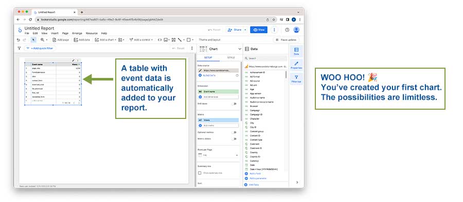
This is what Looker Studio calls a “Chart” - any type of data visualization you’d like to use can be found under the “Add a chart” menu at the top of the report.
If we click on this Chart, we see a new menu pop up on the right-hand side of the Report builder.
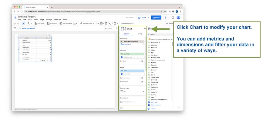
This is the Chart Setup menu. This is where you can add metrics and dimensions, define sorts, adjust the default date range, and filter the data that displays in your selected chart. This is likely where you’ll spend the majority of your time in Looker Studio.
Example Chart: Sessions by Page from Chicago-only traffic for Last 30 Days
Let’s walk through an example to show how to use the Chart Setup menu. Say our organization is 30 days out from our Annual Meeting in Chicago, and we’d like to see localized traffic that’s visiting the site in advance of the meeting. We can explore this by building a data table showing how many sessions each page generated in the last 30 days, using traffic from the city of Chicago only.
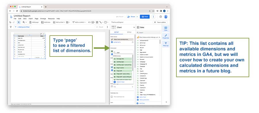
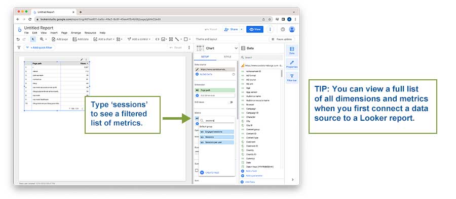
To start, we need to change our dimension (the item in green at the top of the Chart Setup menu). Looker Studio defaults to using Event name for a majority of new Charts that are added, but we can easily change it by simply clicking on the Event name dimension. This will bring up a lookup field of all available dimensions that are being pulled in from your GA4 property - even custom ones!
For this example, let's use the Page Path dimension. We can simply start typing “page” in the lookup menu and select Page Path once it appears in the menu. Clicking on the Page Path dimension will replace the Event name dimension.
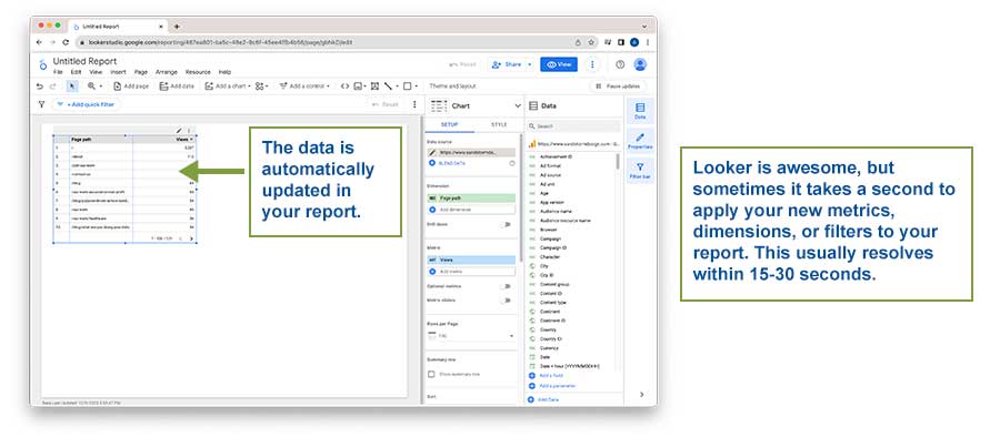
Once selected, you’ll see our Chart update automatically.
However, the Chart is defaulting to using Views as the metric, and we want to look at Sessions. The process of adding Sessions to our Chart is almost entirely similar to the way we added Page Path, except this time we are first clicking on the blue “Views” metric as opposed to the green dimension.
Simply click on the blue “Views” metric to bring up the metric lookup menu and start typing “Sessions.” Once you see it, click it to add it to the report.
The Chart will automatically update with the new metric! We’re almost complete with our example.
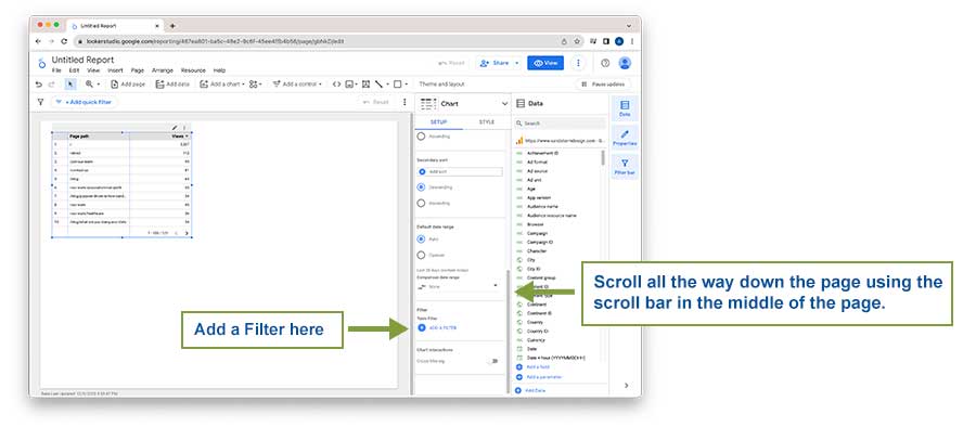
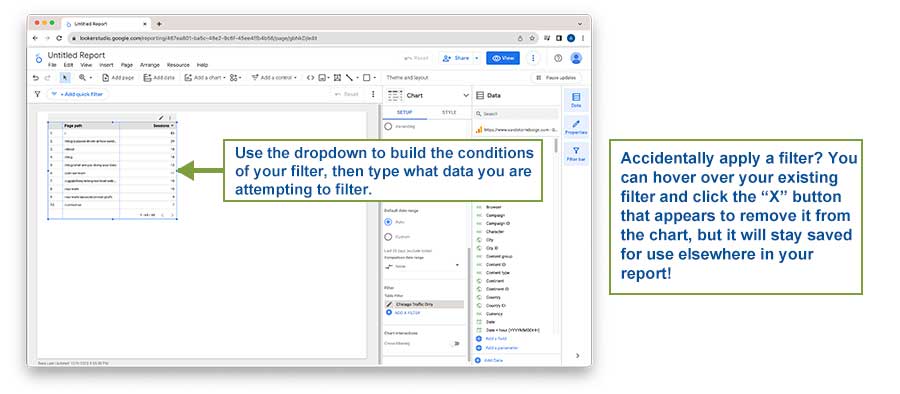
We now need to add a filter to our data. By scrolling all the way down in the Chart Setup menu, we can find the Chart Filter dropdown.
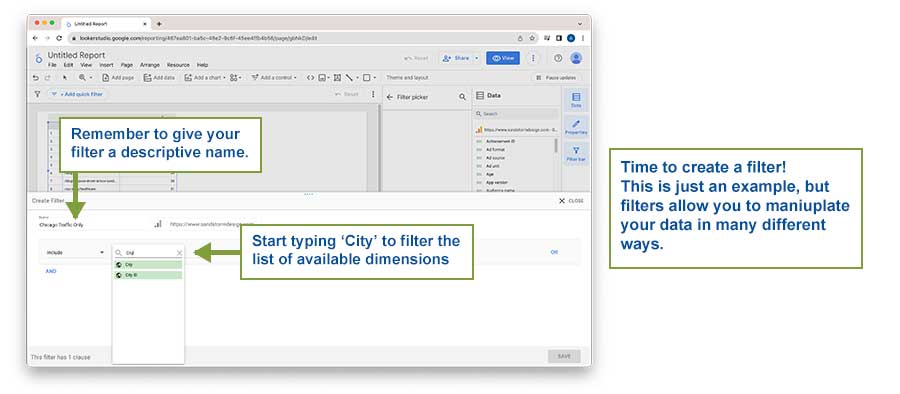
Clicking the blue Add a Filter button brings us to the Create Filter menu. To start, we need to give it a name.
Next, we need to build our filter logic using clauses. These are and/or statements that we can build to include or exclude certain dimensions or metric values. In this example, we want to filter traffic for the city of Chicago only, so let's set our clause to “Include” and use the lookup field to find the City dimension.
Once selected, another logic dropdown appears. We can choose from a variety of different logic options, but for our example let's select “Equal to (=)” from the dropdown.
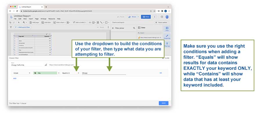
The final step is to enter the value we’d like to include with the filter. In this example, we would enter the word “Chicago”. Once entered, click the blue Save button at the bottom right of the Filter menu to add the filter to your report. The Chart will automatically update with the new filter.
One more step to go! In this example, we want to see traffic from the last 30 days. Just above the Filter area in the Chart Setup menu is the Default Date Range controls.
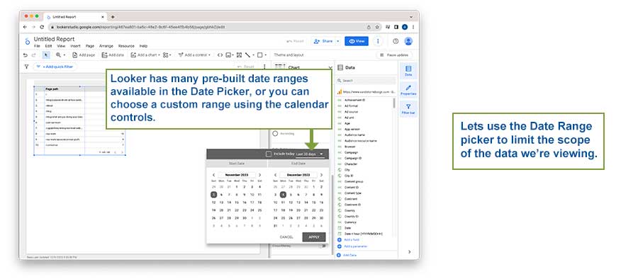
The automatic default in Looker Studio is the last 28 days of traffic. We can change this by clicking the “Custom” radio button underneath “Auto”. A new dropdown menu will appear once Custom is selected.
By clicking on this dropdown, we are shown a Calendar Date Picker. We can set our dates manually using the Calendar, or we can click the additional dropdown in the top right corner above the Calendar and look through a few built-in custom options that Looker Studio provides.
We can see “Last 30 days” as an option right underneath our default Last 28 days. After selecting it, be sure to click the gray Apply button underneath the Calendar to update the Chart to your new date range.
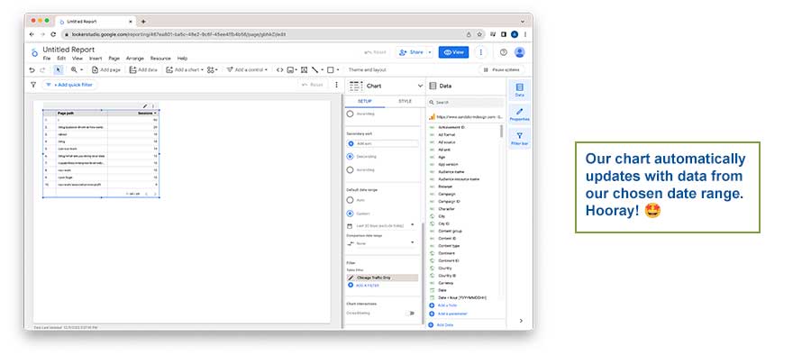
The chart will automatically update - and we’re done! We’ve successfully built a Chart from scratch that shows us Sessions on each page on our site from the last 30 days from the city of Chicago only.
Wrap-up
We’ve only begun to scratch the surface of what's possible in Looker Studio, but now you should be equipped with enough knowledge to create a sandbox and create custom reports in GA4. A key driver to any successful implementation is to have a well-defined data strategy that is utilized across the organization, to help break down the ever-present data silos that exist within organizations.
We’d love to connect if you need help setting up this kind of report or would like to schedule a training for your team. Get in touch!
Stay tuned for Part 2 of this blog series where we dive into each different Chart visualization, as well as how to build multi-page reports!